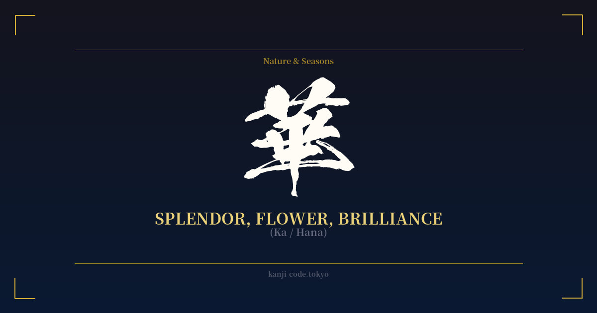
✍️ 華 (Ka / Hana) — Cultural Context
The kanji 華 (Ka/Hana) is one of the most elegant and poetic characters in the Japanese language, carrying a significance that goes far beyond a simple flower. While it can mean 'flower,' it is distinct from the more common character 花 (hana). Where 花 refers to the physical bloom, 華 captures the abstract essence of that bloom: its splendor, its brilliance, its peak moment of beauty and glory.
Originally derived from a pictograph of a lush, blossoming plant, 華 evolved to represent not just floral beauty but also concepts of prosperity, luxury, and cultural refinement. It speaks to a flourishing state, a moment of magnificent display. This is why it appears in words like 栄華 (eiga), meaning 'glory' or 'splendor,' often used to describe the peak of a dynasty or a person's life.
This character is central to the traditional Japanese art of flower arranging, 華道 (kadō), 'the Way of the Flower.' In this context, 華 is not just the material but the philosophy. It embodies the practice of finding and expressing the most beautiful, vital, and transient aspects of nature. It’s about capturing a moment of perfect, fleeting brilliance, a core concept in Japanese aesthetics known as mono no aware.
Historically, 華 was associated with the aristocracy and the imperial court of Heian-era Japan. It connoted the sophisticated, opulent, and highly aestheticized culture of the time. The character’s presence signifies something magnificent, polished, and of high society.
Furthermore, 華 is the character used in 中華 (Chūka), the name for China, literally meaning 'the Middle Splendor.' This usage underscores the prestigious and civilized connotations the character has held throughout East Asian history. To use 華 is to evoke a sense of grandeur, a deep appreciation for beauty that is both brilliant and poignantly temporary.
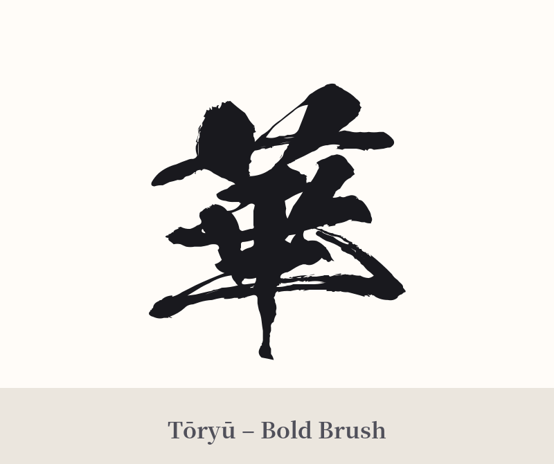
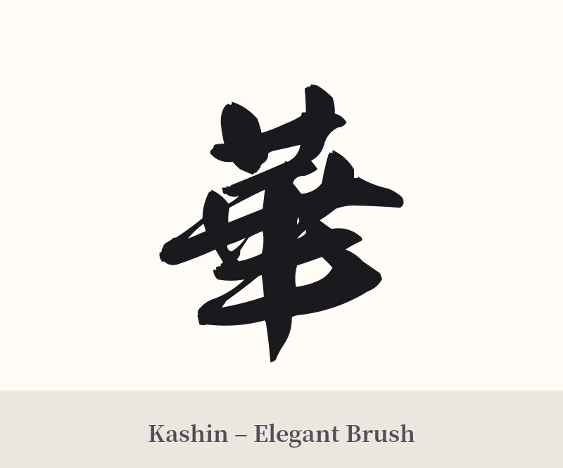
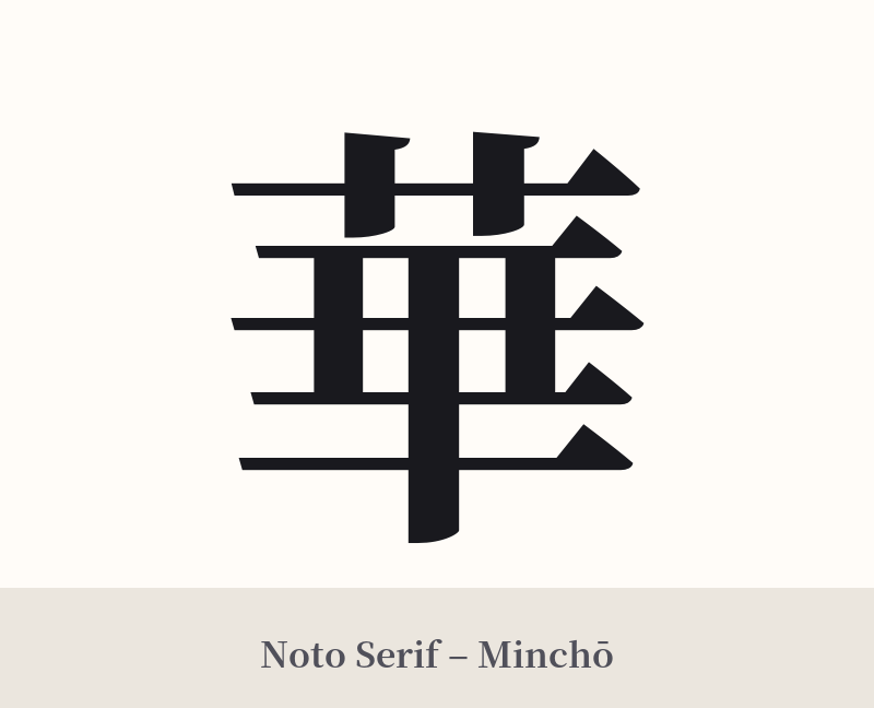
🖌️ Font Styles for 華
The same kanji can look dramatically different depending on the calligraphy style. Choose a font that matches the mood you want for your tattoo or design.
🎨 Tattoo Suitability
📐 Tattoo Design Guide
The elegant and vertically-oriented structure of 華 makes it incredibly versatile for tattoo placement. It looks stunning running down the spine, along the forearm, on the back of the calf, or behind the ear for a more subtle touch.
– Font Style: To emphasize its connection to nature and beauty, consider a dynamic calligraphy script. A semi-cursive (gyōsho) or full cursive (sōsho) style can give the character a flowing, organic feel, like a plant moving in the wind. For a more formal and dignified look, a crisp block script (kaisho) highlights its balanced structure.
– Visual Elements: This kanji pairs beautifully with imagery. Consider having it emerge from or be entwined with a lotus, cherry blossom branch, or peony. A minimalist approach, with just the character in a bold red stamp-style seal (hanko), can also be very powerful. A watercolor splash effect behind the character can enhance the feeling of artistic expression.
Comments