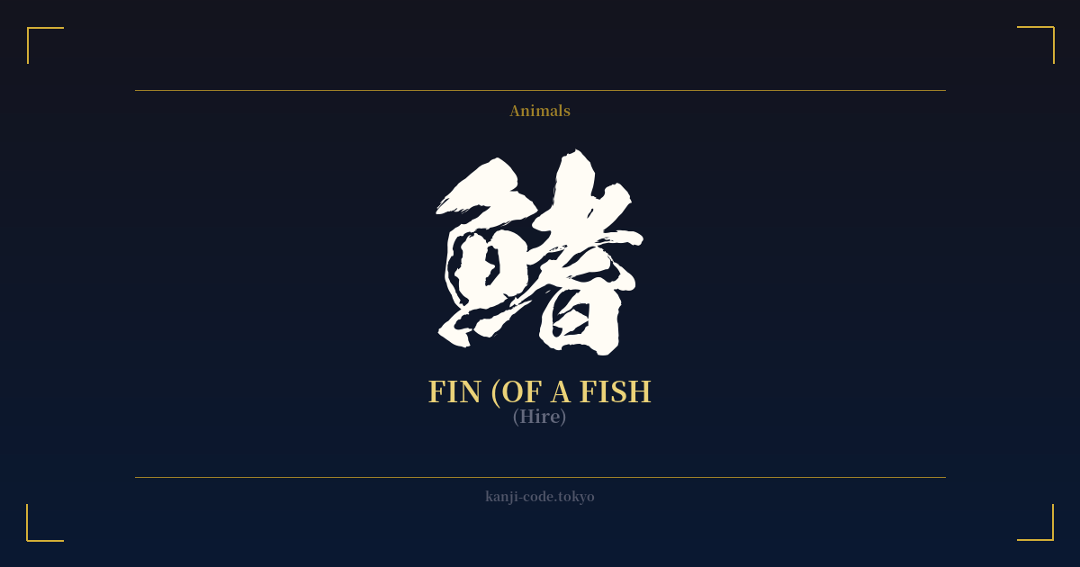
✍️ 鰭 (Hire) — Cultural Context
The kanji 鰭 (hire) is a fascinating character that, while simple in its direct translation of 'fin,' is deeply embedded in the culture of an island nation. Its very structure tells a story. The character is a phono-semantic compound, combining the radical 魚 (sakana), meaning 'fish,' on the left with the character 耆 (ki or oi) on the right. The 'fish' radical clearly places the character in a marine or aquatic context, while 耆, which means 'old' or 'venerable,' serves primarily as a phonetic component to give the character its sound.
In everyday Japanese, 鰭 is used exactly as you would expect: to refer to the fins of a fish. You might encounter it in terms like 背鰭 (sebire) for dorsal fin, 尾鰭 (obire) for tail fin, or 胸鰭 (munabire) for pectoral fin. It is a biological term, precise and functional, used in contexts from fishing and biology to the culinary arts. This specificity is key to understanding its cultural weight; it is not a broad, abstract symbol but a concrete part of the natural world.
Perhaps the most unique and culturally rich context for 鰭 is in Japanese cuisine. The term ひれ酒 (hire-zake) refers to a famous delicacy: hot sake infused with a grilled fugu (pufferfish) fin. The toasted fin imparts a smoky, savory umami flavor to the rice wine, creating a complex and highly prized drink enjoyed in the winter. Similarly, the word フカヒレ (fukahire) means shark fin, a key ingredient in a luxurious and often controversial soup. These culinary associations tie the character 鰭 not just to the fish in the sea, but directly to the Japanese table and its sophisticated gastronomy.
Unlike kanji such as 'courage' or 'love,' 鰭 carries very little inherent symbolic meaning. Its power lies in its literalness. It represents movement, agility, and the ability to navigate the aquatic world. For a culture so intrinsically linked to the ocean, the fin is a fundamental tool of the creatures that provide sustenance and inspire art. However, as a standalone concept, it does not carry the philosophical or emotional weight found in other characters. It is a word of function and form, a testament to the detailed and observant nature of the Japanese language in describing the world around it.
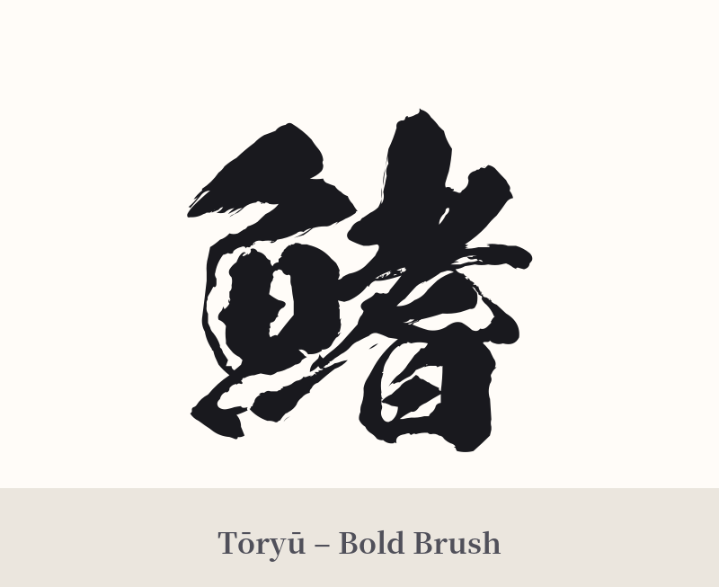
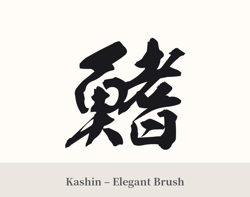
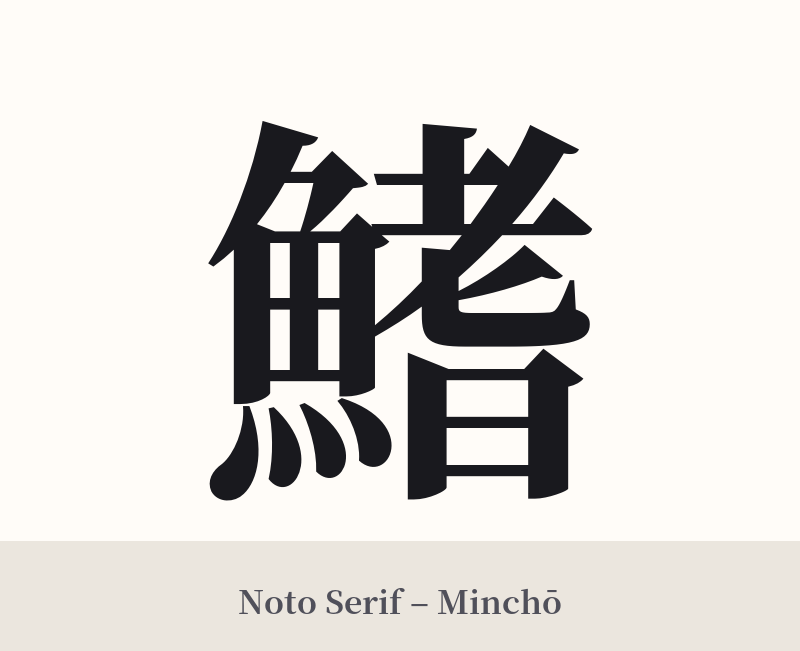
🖌️ Font Styles for 鰭
The same kanji can look dramatically different depending on the calligraphy style. Choose a font that matches the mood you want for your tattoo or design.
🎨 Tattoo Suitability
📐 Tattoo Design Guide
Due to its high stroke count (21 strokes), 鰭 demands careful consideration for a tattoo design.
– Placement: This character works best in a vertical orientation where its complexity can be appreciated. Consider the forearm, calf, or along the spine. Avoid placing it where skin folds or stretches significantly, which could distort the intricate lines.
– Sizing: Do not get this tattoo in a small size. The dense strokes on the right side will blur together and become an illegible smudge over time. A medium to large size is essential for clarity.
– Font Style: A clear, crisp font is crucial. Kaisho (block script) is highly recommended to ensure each stroke is distinct. A clean Mincho style could also work well, lending an elegant, print-like quality. Cursive or semi-cursive styles (Gyōsho or Sōsho) are not advised unless you are working with a master calligrapher who specializes in them, as the character can easily become unrecognizable.
– Visual Context: Because 鰭 is so literal, it often benefits from being part of a larger piece. Consider pairing it with a wave motif, a koi fish, or other marine elements to create a cohesive and understandable narrative. As a standalone piece, it may appear confusing or overly technical.
Comments