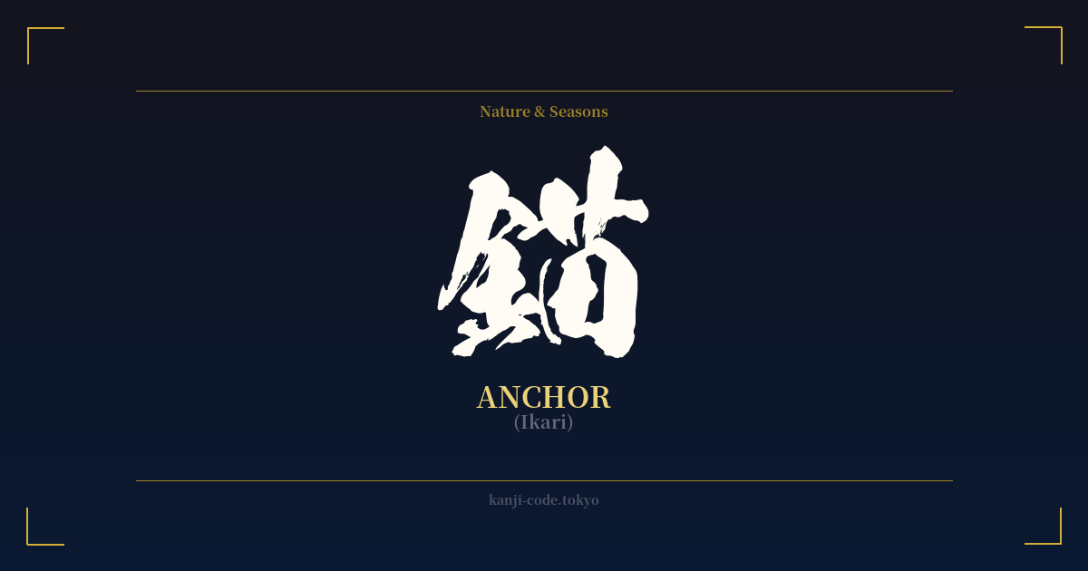
✍️ 錨 (Ikari) — Cultural Context
The kanji 錨 (ikari) directly translates to 'anchor,' the heavy device used to moor a vessel to the sea bed. Its composition tells a clear story: the radical on the left, 金 (kane), means 'metal,' while the component on the right, 苗 (byō), contributes to the sound. Together, they form the concept of a 'metal tool' for mooring.
As an island nation, Japan's cultural identity is inextricably linked to the sea. The anchor is not just a piece of maritime equipment; it's a potent symbol of safety, stability, and the end of a perilous journey. For sailors and coastal communities, the dropping of the anchor signifies a return to the security of the harbor, a moment of relief and grounding after facing the unpredictable power of the ocean. It represents a firm foundation in an ever-shifting world.
This literal meaning extends into powerful metaphors that resonate deeply in Japanese culture. The anchor symbolizes steadfastness, unwavering resolve, and a connection to something that keeps you grounded, whether it be family, a hometown, or a core belief. It is the force that prevents one from being 'adrift' in life's challenges. In this sense, 錨 embodies a quiet, resilient strength—not the aggressive power of a warrior, but the enduring strength of conviction.
Interestingly, the word 'ikari' is a homophone for 'anger' (怒り). This is a complete coincidence of pronunciation, as the characters and their origins are entirely unrelated. A Japanese person would never mistake the kanji for an anchor with the emotion of anger. This linguistic quirk highlights the importance of the written word in Japanese, where kanji provide visual context that spoken language alone cannot.
While the anchor is a classic tattoo motif in Western cultures, often associated with naval service or Christian symbolism (representing hope), its Japanese interpretation is more secular and elemental. It focuses on the universal human need for stability, security, and a safe harbor to return to, making it a symbol that transcends cultural boundaries while retaining a distinct maritime flavor.
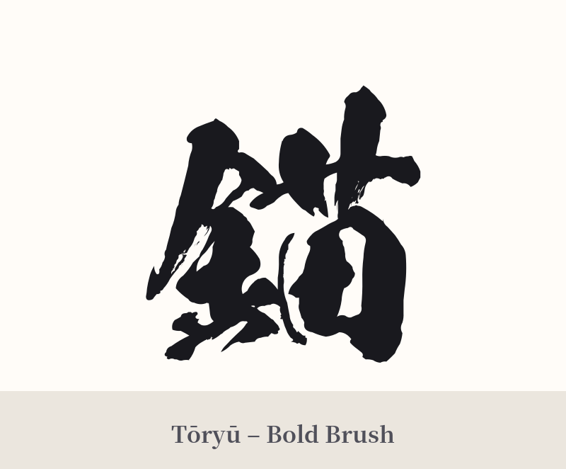
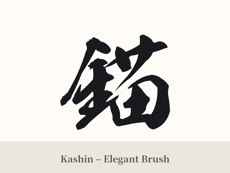
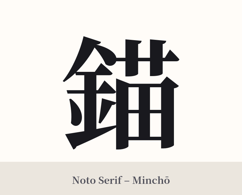
🖌️ Font Styles for 錨
The same kanji can look dramatically different depending on the calligraphy style. Choose a font that matches the mood you want for your tattoo or design.
🎨 Tattoo Suitability
📐 Tattoo Design Guide
The kanji 錨 is detailed, so its design requires careful consideration to maintain clarity.
– Placement: This character works best on flatter, larger areas of the body where the intricate strokes won't be compressed. Consider the forearm, calf, back, or shoulder blade. Avoid smaller spots like the wrist, fingers, or ankle, as the lines may blur together over time.
– Style: For a traditional feel, a bold shodō (calligraphy) style with strong, deliberate brushstrokes can emphasize the anchor's symbolism of strength and stability. For a more modern look, a clean and precise Mincho or Gothic font can highlight the character's structure, giving it a sharp, engineered aesthetic.
– Visual Tips: While 錨 is powerful enough to stand alone, it can be integrated into a larger piece. Pairing it with subtle wave patterns (波) or a rope motif can enhance its maritime context. Ensure your artist is experienced with kanji and pays close attention to stroke order and spacing to create a balanced and legible design.
Comments