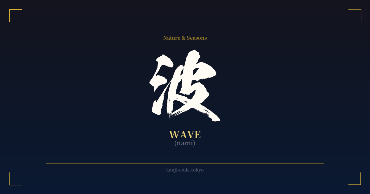
✍️ 波 (nami) — Cultural Context
The kanji 波 (nami) is more than just a character for 'wave'; it is a profound symbol woven into the very fabric of Japanese culture. As an island nation, Japan's relationship with the sea is intimate and complex, and 'nami' captures this duality perfectly. The character itself offers a clue to its meaning: on the left is the 'sanzui' radical (氵), signifying water, while the right side, 皮 (kawa), meaning 'skin' or 'surface,' acts as a phonetic component. Together, they paint a picture of the water's surface in motion.
This single character evokes a vast spectrum of imagery, from the gentle lapping of waves on a quiet shore to the terrifying might of a tsunami. This duality is a recurring theme in Japanese art and philosophy. On one hand, waves represent the rhythmic, cyclical nature of life, tranquility, and the cleansing power of water. The famous 'seigaiha' (青海波) pattern, an endlessly repeating motif of layered circles, symbolizes this peaceful continuity and is often used on textiles and ceramics to wish for good fortune and resilience.
On the other hand, the wave is a symbol of immense, untamable power. This is most famously immortalized in Katsushika Hokusai's woodblock print, 'The Great Wave off Kanagawa.' In this iconic image, a colossal, monstrous wave threatens to engulf boats and fishermen, with Mount Fuji appearing small and distant in the background. Here, the 'nami' is a force of nature that dwarfs human endeavor, a reminder of both nature's beauty and its terrifying power.
In language, the concept of waves extends metaphorically. The phrase 'jinsei no nami' (人生の波) refers to the 'waves of life,' its ups and downs. To 'nami ni noru' (波に乗る) means to 'ride the wave,' signifying catching onto a trend or seizing an opportunity. This reflects a deep-seated understanding of life as a current that one must navigate with skill and acceptance. Whether representing a peaceful flow or an unstoppable force, 波 is a powerful and versatile symbol of life's constant motion.
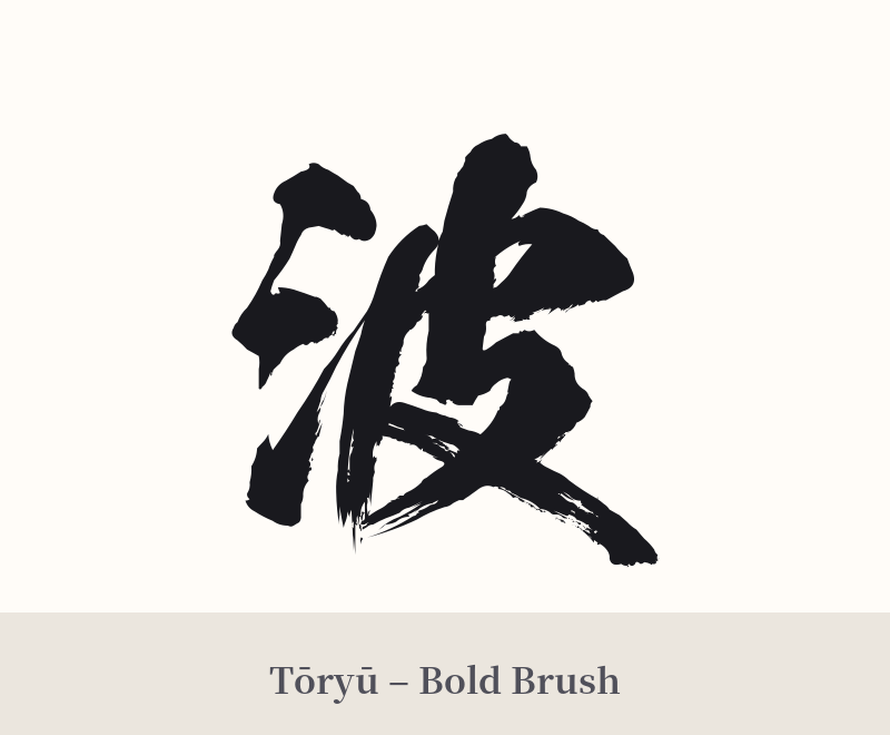
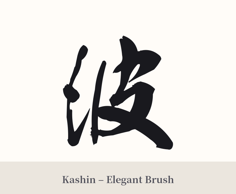
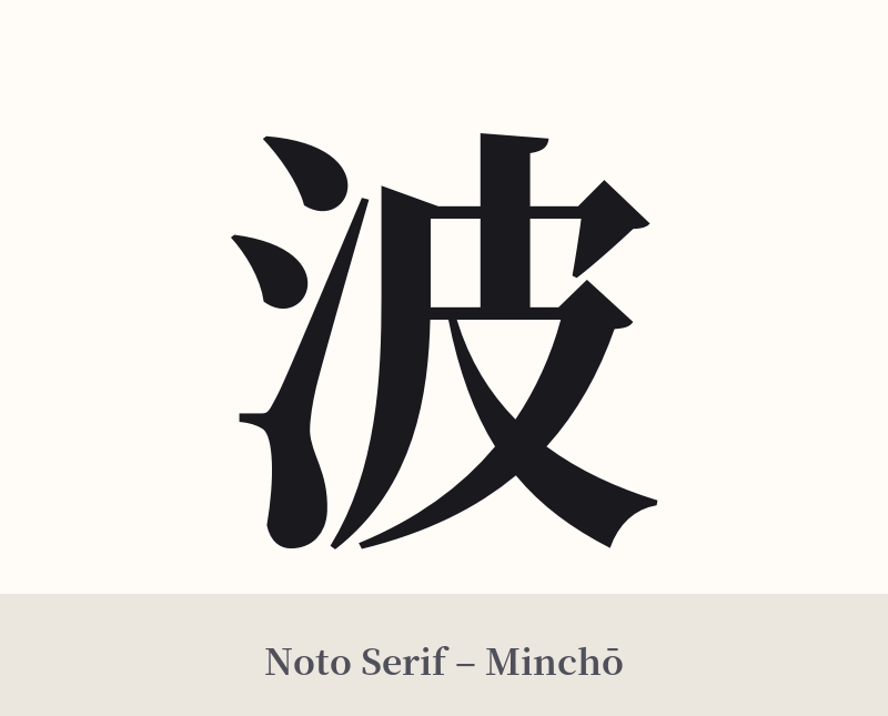
🖌️ Font Styles for 波
The same kanji can look dramatically different depending on the calligraphy style. Choose a font that matches the mood you want for your tattoo or design.
🎨 Tattoo Suitability
📐 Tattoo Design Guide
The kanji 波 is a fantastic choice for a tattoo due to its visual appeal and symbolic depth. Its form naturally suggests movement and flow, offering many creative possibilities.
– Placement: This character works well on areas of the body that complement its flowing nature. Consider the forearm, where it can wrap slightly, the calf, the back shoulder blade, or along the ribs. A central placement on the back or chest can create a powerful focal point.
– Font Style: A dynamic, semi-cursive 'gyōsho' style can enhance the feeling of water in motion. For a more dramatic and abstract look, a full cursive 'sōsho' style is an excellent option. Conversely, a bold, clean 'kaisho' (block) style can emphasize the wave's power and solidity.
– Visual Tips: Consider integrating the kanji into a larger design. The character could be formed from the lines of a traditional Japanese wave, or placed within a 'seigaiha' pattern. Pairing it with other symbols like a koi fish swimming upstream, a dragon (a master of water), or a lotus flower can add layers of meaning about resilience and purity.
Comments