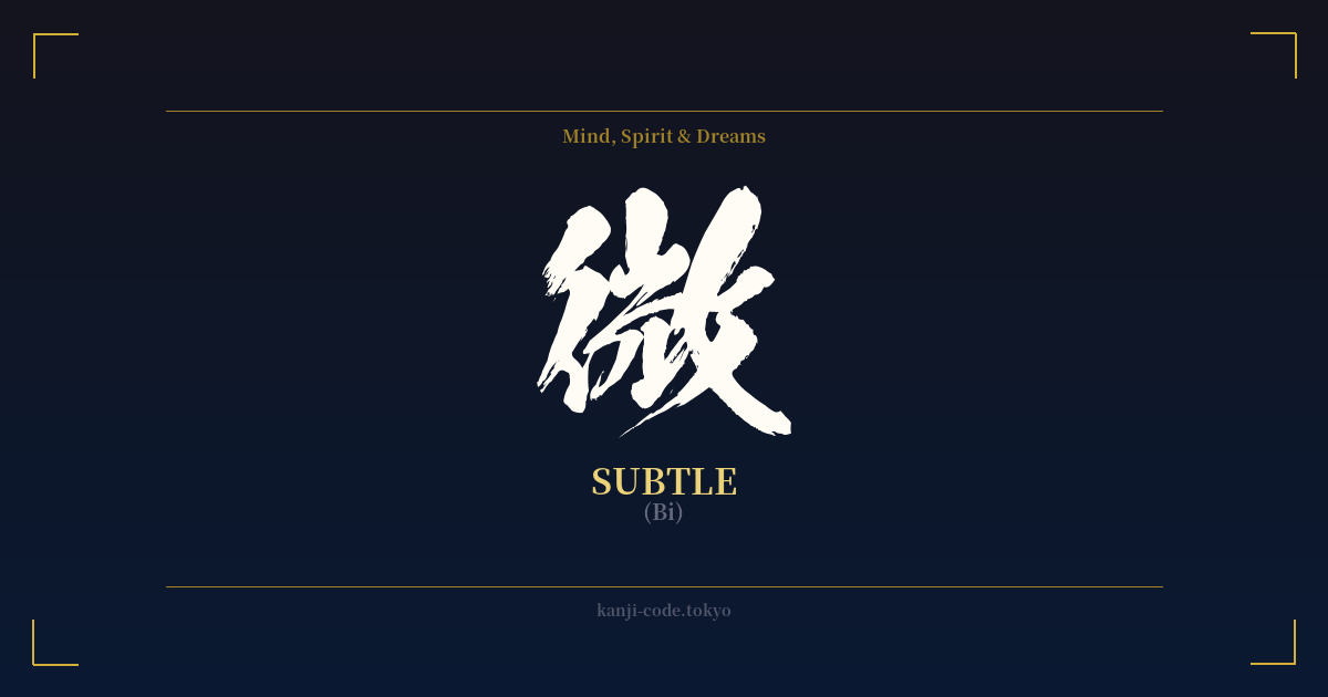
✍️ 微 (Bi) — Cultural Context
The kanji 微 (bi) is a quiet giant in the Japanese language, embodying concepts that are central to the nation's traditional aesthetics. Its meanings are layered, ranging from 'subtle,' 'faint,' and 'delicate' to 'minute' or 'trivial.' This single character opens a door to understanding a worldview that values what is understated and barely perceptible.
Historically, the character's form hints at its original meaning. It combines radicals that suggest a person walking stealthily or inconspicuously, capturing the essence of being unobtrusive. This idea of subtlety is deeply woven into Japanese culture, most notably in the aesthetic principles of 'wabi-sabi' (侘寂) and 'yūgen' (幽玄).
Wabi-sabi is the appreciation of beauty in imperfection, impermanence, and incompleteness. 微 aligns with this by celebrating the small, overlooked details—the faint crack in a teacup, the subtle shift in color on a leaf. It is the beauty found not in grand statements, but in quiet whispers.
Yūgen refers to a profound, mysterious grace that cannot be easily expressed in words. It is the feeling one gets watching the sun disappear behind a flower-clad hill, or seeing a ship vanish into the distant fog. 微 is the kanji of yūgen, representing the faint, almost invisible, presence of something vast and deep just beyond our immediate perception.
In everyday language, 微 appears in many common words. For example, 微笑 (bishō) means 'smile,' but literally translates to 'faint laugh,' perfectly capturing the gentle, quiet nature of a smile. The word 微妙 (bimyō) means 'subtle' or 'delicate,' but can also carry the nuance of being 'tricky' or 'questionable,' highlighting how something so subtle can be difficult to grasp. A 微風 (bifū) is a gentle breeze, a 'faint wind' that you feel more than you hear.
Philosophically, 微 can be linked to Buddhist thought, where small, mindful actions can have significant ripple effects. It encourages an awareness of the minute details of existence, a focus on the present moment, and an acceptance of the transient, delicate nature of life. It stands in direct contrast to concepts of power, strength, and overt expression, offering instead a path of quiet observation and deep appreciation for the unseen.
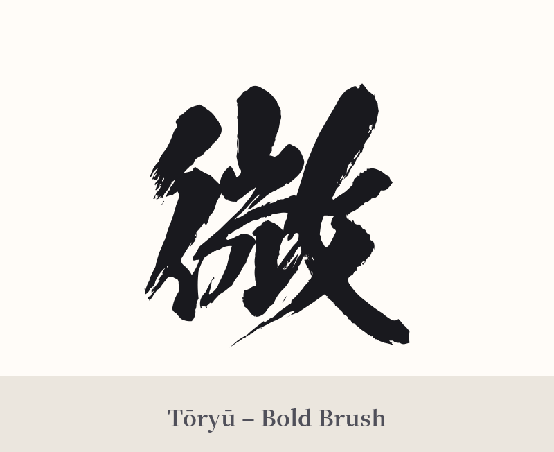
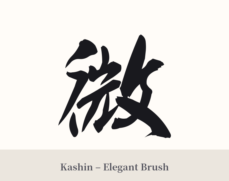
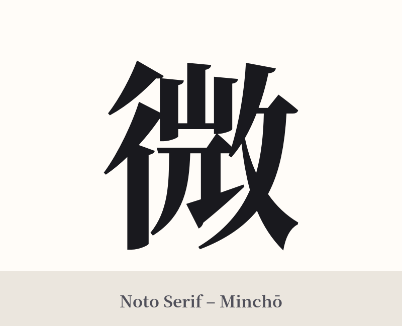
🖌️ Font Styles for 微
The same kanji can look dramatically different depending on the calligraphy style. Choose a font that matches the mood you want for your tattoo or design.
🎨 Tattoo Suitability
📐 Tattoo Design Guide
The kanji 微 is best suited for a design that reflects its delicate and subtle meaning. Its elegance can be lost if the execution is too bold or overpowering.
– Placement: Consider intimate or graceful placements. The inner wrist, behind the ear, along the collarbone, on the ankle, or vertically along the spine are excellent choices. Avoid large, muscular areas like the bicep or chest, where this character might appear small and insignificant.
– Font Style: A flowing, cursive calligraphy style (草書, sōsho) or semi-cursive style (行書, gyōsho) would beautifully capture the character's gentle nature. A thin, elegant Mincho (serif) font can also work well, emphasizing its delicate structure. Avoid thick, blocky, or aggressive brushwork.
– Visual Tips: To enhance its meaning, consider integrating 微 into a larger, thematic design. It could be drawn as if dissolving like smoke, embedded within the ripples of water, or placed next to a single falling cherry blossom petal. This provides context and reinforces the idea of something faint and beautiful.
Comments