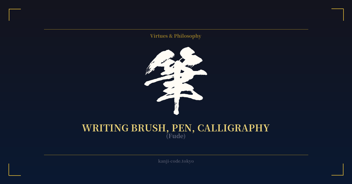
✍️ 筆 (Fude) — Cultural Context
The kanji 筆 (fude) literally means 'writing brush,' but to understand its significance is to delve into the heart of Japanese aesthetics and philosophy. The fude is not merely a tool; it is one of the 'Four Treasures of the Study' (文房四宝, Bunbō Shihō) alongside ink (墨, sumi), paper (紙, kami), and the inkstone (硯, suzuri). This quartet forms the foundation of East Asian calligraphy and painting, making the brush a symbol of high culture, art, and scholarship.
The character's very structure tells a story. Its upper part is the radical 竹 (take), meaning 'bamboo,' the traditional material used for the brush's handle. The lower part, 聿, is a pictograph of a hand holding a writing instrument. Together, they form a vivid image of the act of writing, grounding the character in its physical origin.
Beyond the physical, 筆 is inextricably linked to Shodō (書道), 'the Way of the Brush.' Shodō is far more than decorative handwriting; it is a meditative art form, a spiritual discipline akin to martial arts. It emphasizes the flow of energy (ki), mindfulness, and the expression of the artist's spirit through the strokes on paper. A single brushstroke can convey strength, grace, hesitation, or confidence. Therefore, the fude represents not just the act of writing, but the discipline and character required to master it.
In Japanese history, skill with a brush was as respected as skill with a sword. Samurai warriors were often accomplished calligraphers, believing the two disciplines cultivated the same virtues: precision, focus, decisiveness, and a calm mind (不動心, fudōshin). The famous swordsman Miyamoto Musashi, for example, was also a master ink painter. This duality highlights the Japanese ideal of a warrior-scholar, a person balanced in both martial and literary arts (文武両道, bunbu ryōdō).
Today, in a world dominated by keyboards and screens, the 筆 stands as a powerful symbol of tradition, human touch, and the enduring beauty of analog creation. It represents the power of the written word, the pursuit of artistic mastery, and a deep connection to a rich cultural heritage.
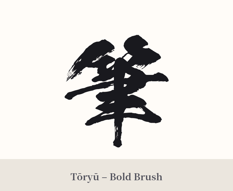
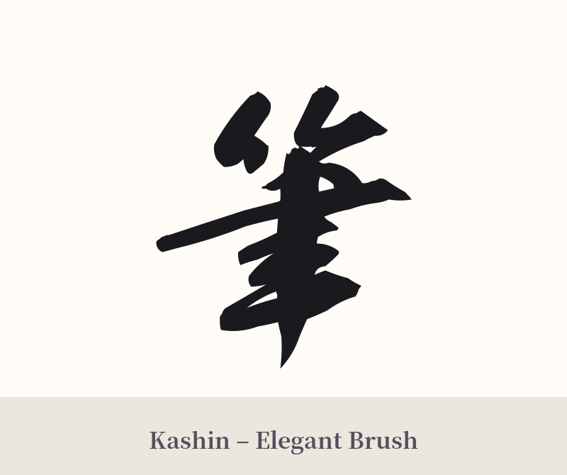
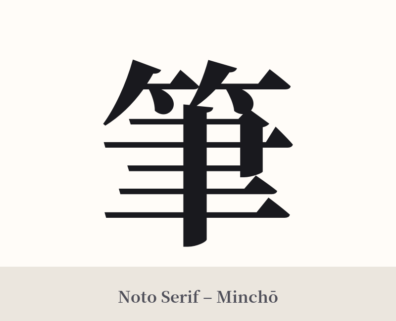
🖌️ Font Styles for 筆
The same kanji can look dramatically different depending on the calligraphy style. Choose a font that matches the mood you want for your tattoo or design.
🎨 Tattoo Suitability
📐 Tattoo Design Guide
For a 筆 (fude) tattoo, consider styles and placements that honor its artistic and vertical nature.
– Placement: This kanji works exceptionally well in vertical orientations. The forearm, the calf, or running down the spine are all excellent choices that complement the flow of traditional Japanese writing.
– Font Style: Avoid generic computer fonts. This kanji truly shines in expressive, calligraphic styles. A semi-cursive 'gyōsho' (行書) style can capture a sense of fluid movement, while a full cursive 'sōsho' (草書) offers a more abstract and dynamic feel. A formal 'kaisho' (楷書) block style can convey strength and stability.
– Supporting Elements: To create a larger piece, consider incorporating imagery related to the 'Four Treasures of the Study.' A splash of black or red sumi ink behind the character can add energy and contrast. A small, red artist's seal (hanko) is a classic addition that authenticates the 'artwork.' Elements like bamboo stalks or a full inkstone can also build a richer narrative.
Comments