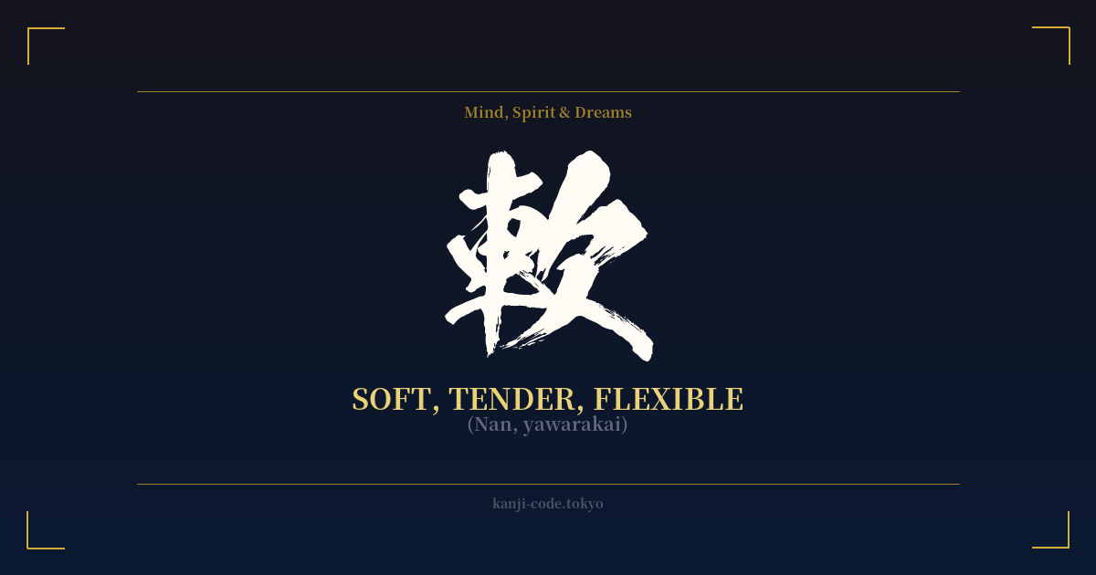
✍️ 軟 (Nan, yawarakai) — Cultural Context
The kanji 軟 (nan) is a character of profound duality, embodying both the virtue of flexibility and the vice of weakness. Its meaning is deeply dependent on context, making it one of the more nuanced characters in the Japanese language. Etymologically, it is composed of the radicals 車 (kuruma), meaning 'vehicle' or 'cart,' and 欠 (ketsu), meaning 'to lack' or 'be deficient.' The original image was of a cart axle that was not sturdy, one that was pliable and easily bent—in other words, 'soft' in a negative, structural sense.
In modern Japanese, this sense of physical softness is its most common and neutral meaning. It's used to describe soft ground (軟弱地盤, nanjaku jiban), soft water (軟水, nansui), and flexible plastics (軟質プラスチック, nanshitsu purasuchikku). This is the straightforward, literal application of the character.
However, when applied to people or character, 軟 takes on a more complex and often negative dimension. To be called 'soft' can imply a lack of mental fortitude, indecisiveness, or a weak will. The term 軟弱 (nanjaku) directly translates to 'weakness' or 'feebleness.' This stands in stark contrast to its antonym, 硬 (kō, katai), meaning 'hard' or 'rigid,' which often implies strength and steadfastness.
This dichotomy is central to understanding Japanese culture and philosophy. While the concept of 'softness overcoming hardness' (柔よく剛を制す, jū yoku gō o seisu) is a celebrated ideal, particularly in martial arts like Judo, the kanji used there is 柔 (jū). 柔 carries a philosophical weight of yielding strength and skillful adaptability. 軟, on the other hand, rarely achieves this positive philosophical status. It tends to remain in the realm of the physically pliable or the metaphorically weak.
A significant cultural warning comes from the term 軟派 (nanpa). Originally used to describe a 'soft' or liberal political faction in the Meiji era, it has evolved into modern slang for men who try to pick up women on the street. This association casts a frivolous, and to many, a negative shadow over the character, especially when used by a man.
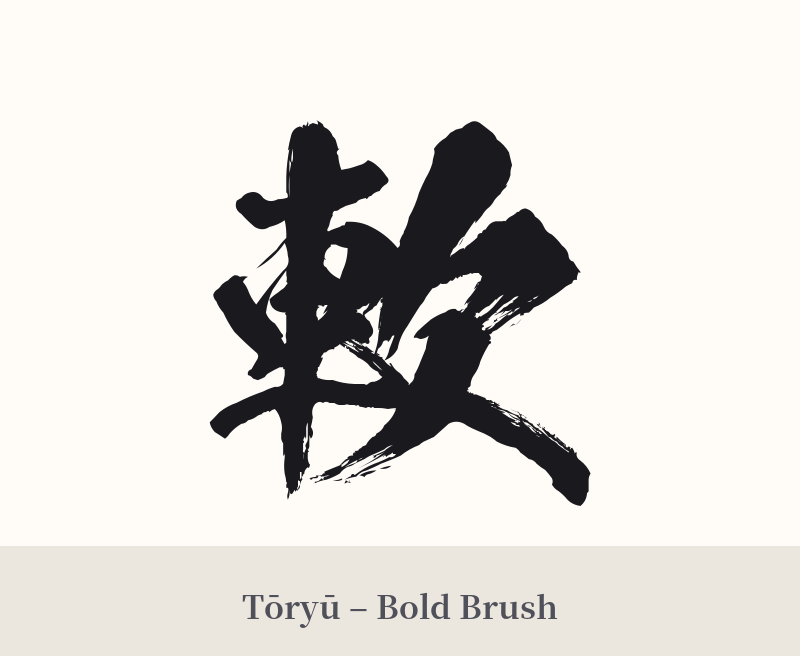
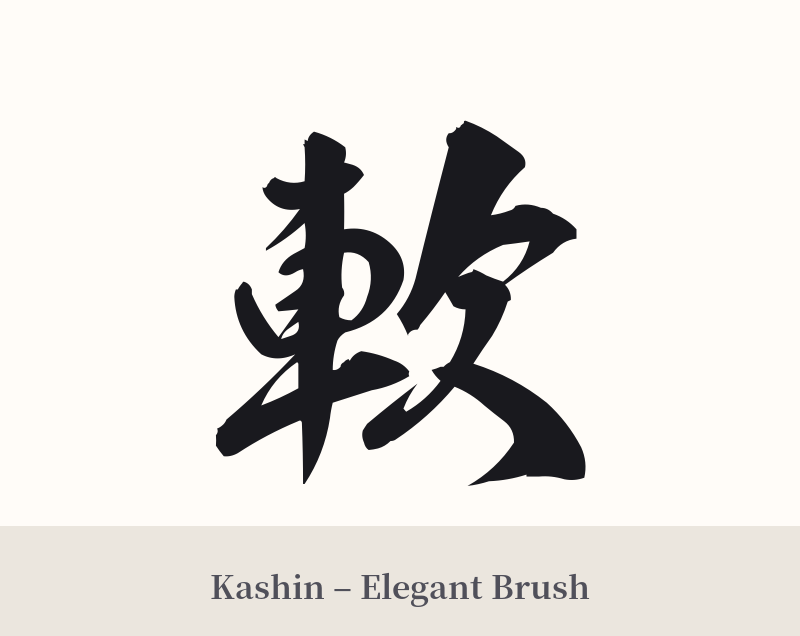
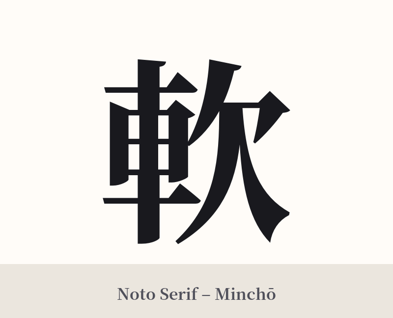
🖌️ Font Styles for 軟
The same kanji can look dramatically different depending on the calligraphy style. Choose a font that matches the mood you want for your tattoo or design.
🎨 Tattoo Suitability
📐 Tattoo Design Guide
Given the ambiguous and potentially negative connotations of this kanji, a tattoo requires careful consideration. If you are set on this character, the design should aim to guide the interpretation toward its more positive aspects.
– Placement: A more private or subtle placement, such as the inner forearm, ankle, or along the ribs, might be more appropriate than a prominent, public location. This reflects the nuanced, less assertive nature of the character.
– Font Style: Avoid aggressive or blocky fonts. A flowing, cursive script (草書, sōsho) or a gentle, rounded typeface like a classic Mincho style would visually reinforce the meaning of 'softness' and 'flexibility.' The character's form, with its curves and open spaces, lends itself well to these styles.
– Pairing: This kanji is much safer and clearer when used in a compound word. For a tattoo, consider the word 柔軟 (jūnan – flexibility), which is unambiguously positive. If using 軟 alone, pairing it with a visual element like a blade of grass bending in the wind or a flowing stream could help provide context and steer the meaning away from 'weakness.'
Comments