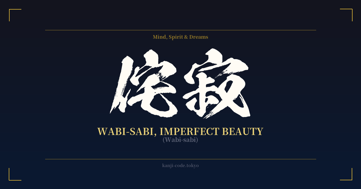
✍️ 侘寂 (Wabi-sabi) — Cultural Context
Wabi-sabi is one of the most significant concepts in Japanese aesthetics, a worldview centered on the acceptance of transience and the celebration of imperfection. It is not merely an artistic style but a profound way of seeing the world, finding beauty in things that are modest, humble, and unconventional.
The term is a composite of two distinct but related ideas. 'Wabi' (侘) originally connoted the loneliness of living in nature, away from society. Over time, it evolved to represent a rustic simplicity, freshness, or quietness. It's an appreciation for the understated, a contentment with less, and a freedom from the attachments of the material world.
'Sabi' (寂), on the other hand, speaks to the beauty that comes with age. It is the bloom of time, the visible patina and wear that an object accumulates through its life. Think of the weathered wood of an old temple, the rust on a forgotten gate, or the moss growing on a stone lantern. Sabi appreciates the marks of time as a testament to a rich history and the inevitable journey toward non-existence.
Together, 侘寂 (Wabi-sabi) offers a powerful counter-narrative to the Western pursuit of monumental, symmetrical, and enduring beauty. Its origins are often traced back to the 16th-century tea master Sen no Rikyū, who championed a simple, rustic approach to the Japanese tea ceremony (chanoyu). He intentionally used imperfect, handmade utensils from local artisans rather than the technically perfect, imported Chinese ceramics that were in vogue among the elite. This was a radical act that codified wabi-sabi as a core tenet of Japanese culture.
In practice, wabi-sabi is embodied in arts like 'kintsugi' (金継ぎ), the craft of repairing broken pottery with lacquer dusted with powdered gold. Instead of hiding the damage, kintsugi highlights the cracks, making the object more beautiful and unique for having been broken. It is also found in the serene, asymmetrical design of Japanese rock gardens and the poignant, fleeting imagery in the haiku of Matsuo Bashō. Choosing wabi-sabi is to embrace authenticity, to value the natural cycle of growth and decay, and to find peace in the imperfect beauty of everyday life.
🖌️ Font Styles for 侘寂
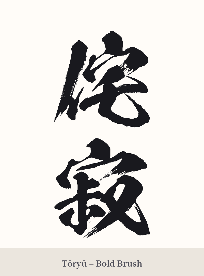
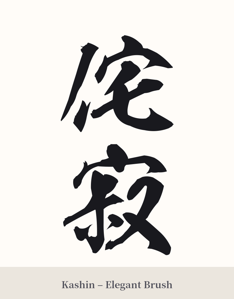
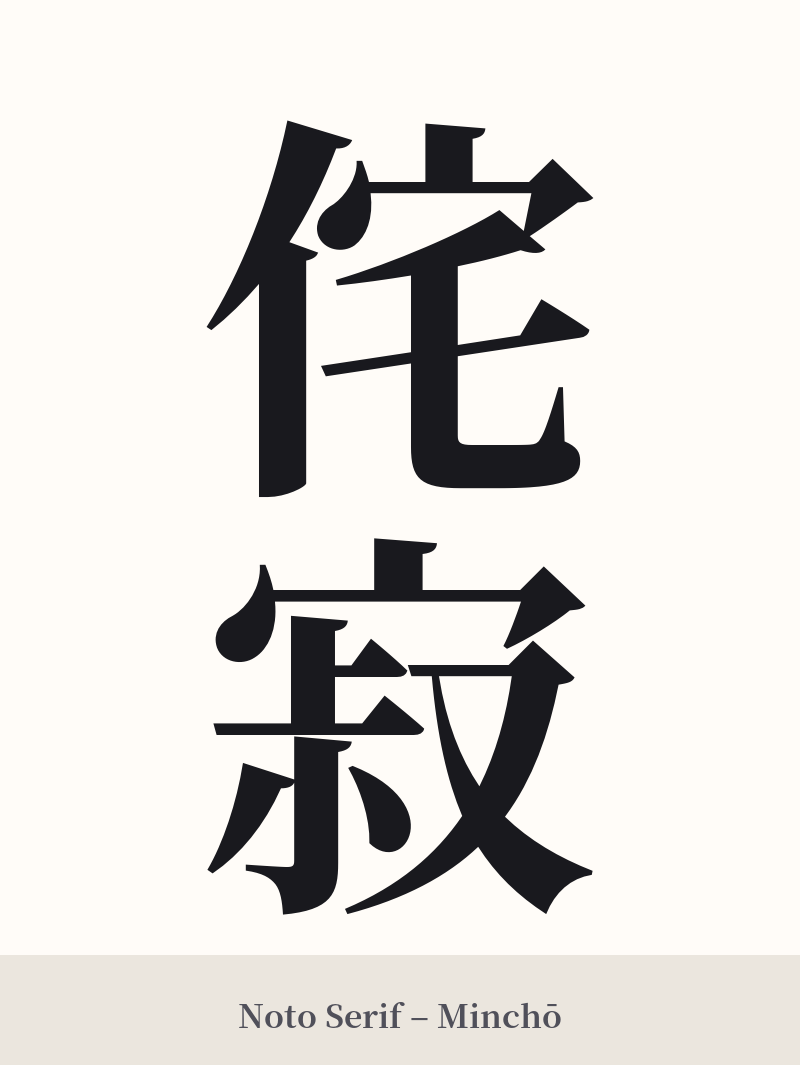
The same kanji can look dramatically different depending on the calligraphy style. Choose a font that matches the mood you want for your tattoo or design.
🎨 Tattoo Suitability
📐 Tattoo Design Guide
A tattoo of 侘寂 (Wabi-sabi) should reflect its core principles of rustic simplicity and naturalness.
– Font Style: A hand-brushed script like Gyosho (semi-cursive) or Sosho (cursive) is highly recommended. These styles capture a sense of fluidity, imperfection, and spontaneity that perfectly aligns with the wabi-sabi aesthetic. Avoid rigid, blocky, or perfectly symmetrical fonts, as they contradict the meaning of the word.
– Placement: Vertical alignment is traditional and works beautifully on the forearm, calf, or along the spine. A horizontal placement across the collarbone or on the inner bicep can also be effective. Choose a spot that allows the characters enough space to be legible without feeling cramped.
– Visual Elements: Consider incorporating subtle elements that evoke the wabi-sabi feeling. This could be a faint enso circle behind the kanji, a cracked or weathered texture within the strokes, or pairing it with a single, imperfect cherry blossom branch to symbolize impermanence.
Comments