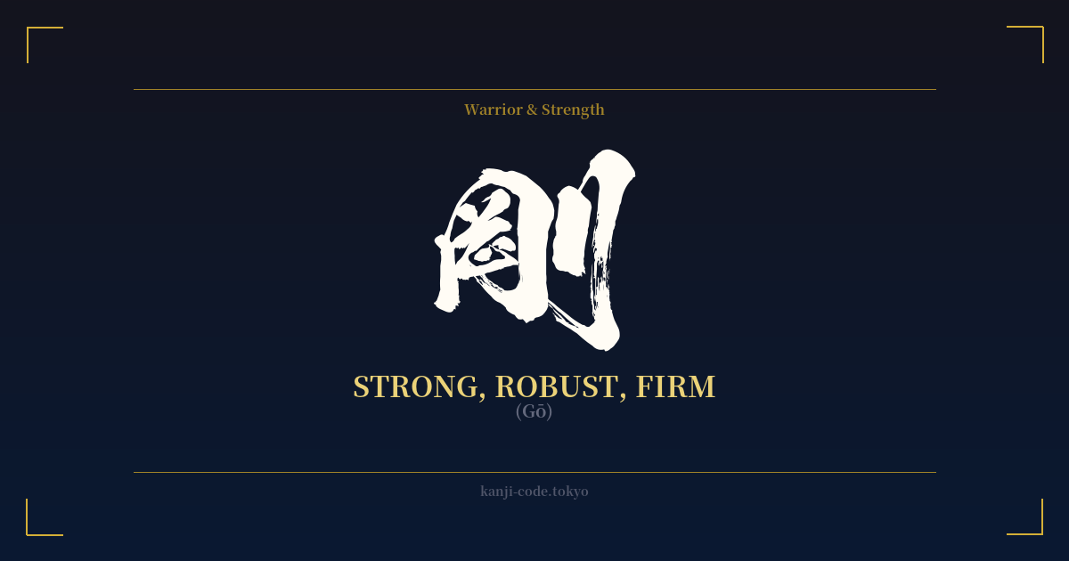
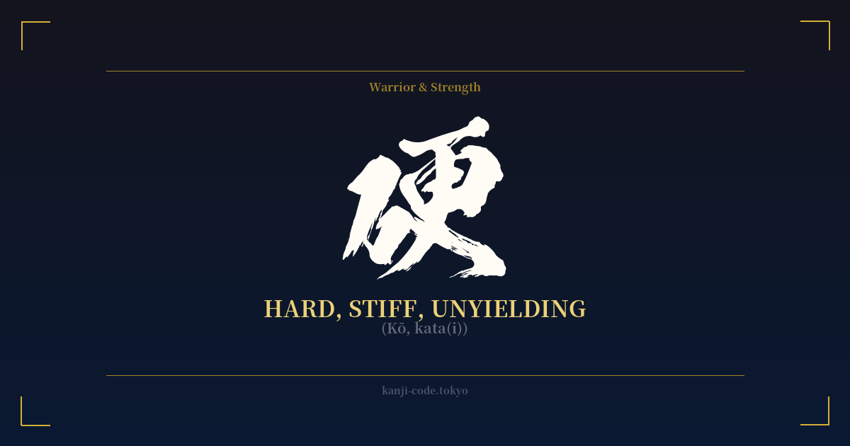
✍️ 剛 (Gō) — Cultural Context
The kanji 剛 (Gō) is a powerful symbol in Japanese culture, embodying a specific kind of strength that is hard, unyielding, and robust. It’s more than just physical power; it represents an inner fortitude and an unbreakable spirit.
The character’s construction offers a clue to its meaning. It is composed of 岡 (oka – hill or ridge) and 刀 (tō/katana – sword or knife). The original form suggested a strong, firm hill or mound, something solid and immovable. The addition of the sword radical on the right side reinforced the idea of hardness—something that can withstand a blade or is as hard as steel itself. This etymology paints a picture of resilience and durability, a strength that does not bend or break under pressure.
In the context of Bushido, the code of the samurai, 剛 was a highly valued virtue. It represented the warrior's physical prowess and their unbending will in the face of adversity. A samurai was expected to be 'gōken' (剛健), meaning robust and healthy, possessing a strong constitution. However, this concept was often balanced by its counterpart, 柔 (jū), meaning softness or gentleness. The famous martial arts principle, '柔能く剛を制す' (Jū yoku gō o seisu), translates to 'Softness can overcome hardness,' highlighting a deep philosophical understanding that brute force alone is not the only path to victory.
This duality shows that 剛 is not just about blind aggression but a specific type of firm, resolute strength. It's the strength of a diamond (金剛, kongō), which is famously hard and unbreakable. It's the power of a mighty fastball in baseball, called a 'gōsokkyū' (剛速球), which overwhelms with sheer force and speed.
In modern Japan, 剛 continues to be a popular character. It is frequently used in male names, such as Tsuyoshi or Gō, bestowing upon the individual a wish for a strong and resolute character. It describes objects that are built to last, structures that are firm, and people who are unwavering in their convictions. To choose 剛 is to embrace an ideal of steadfast, unshakeable, and resilient strength.
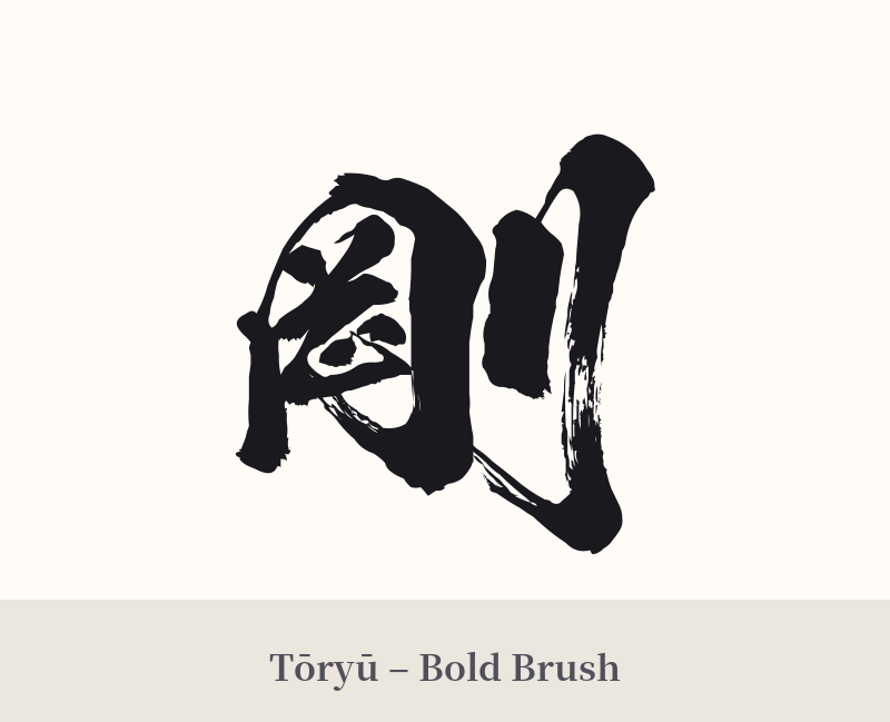
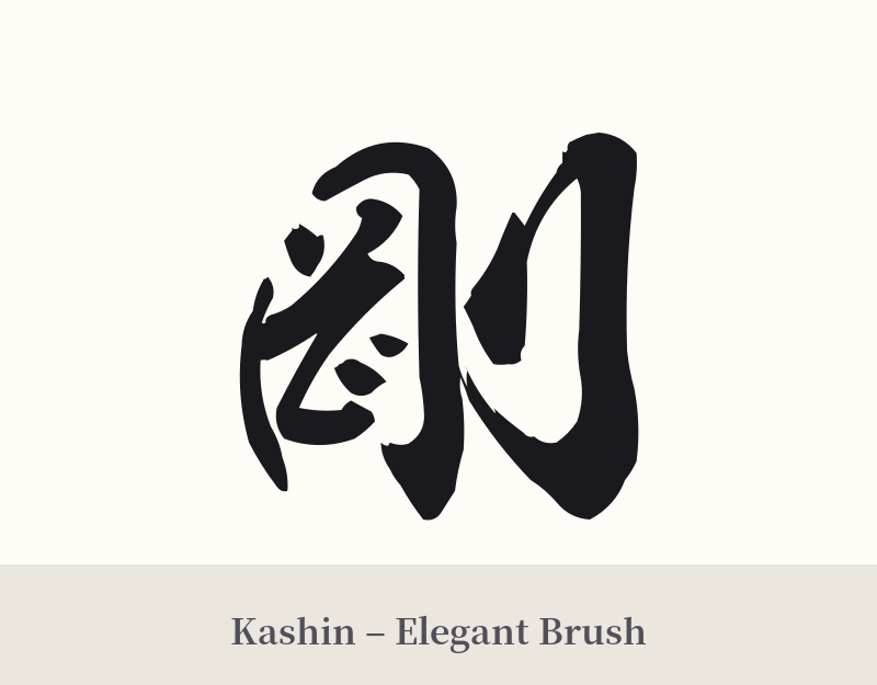
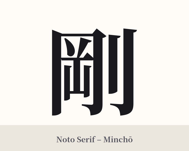
🖌️ Font Styles for 剛
The same kanji can look dramatically different depending on the calligraphy style. Choose a font that matches the mood you want for your tattoo or design.
🎨 Tattoo Suitability
📐 Tattoo Design Guide
The kanji 剛 carries a feeling of solidity and power, and your tattoo design should reflect that.
– Placement: This character works well in areas that suggest strength and stability. Consider the forearm, bicep, chest, or calf. A larger version across the shoulder blades or back can also be very impactful.
– Font Style: Bold and angular calligraphic styles are a natural fit. A strong Kaisho (block script) emphasizes its firmness and structure. A dynamic Gyosho (semi-cursive script) can add a sense of powerful movement while retaining its strong presence. Avoid overly thin or delicate fonts, as they would contradict the core meaning.
– Visual Tips: While 剛 is powerful enough to stand alone, it can be paired with other motifs to enhance its meaning. Consider integrating it with classic symbols of power like a tiger, a dragon, or crashing waves. Alternatively, placing it within a simple Enso (Zen circle) can create a beautiful contrast between unyielding strength and the concept of infinity or wholeness.
Comments