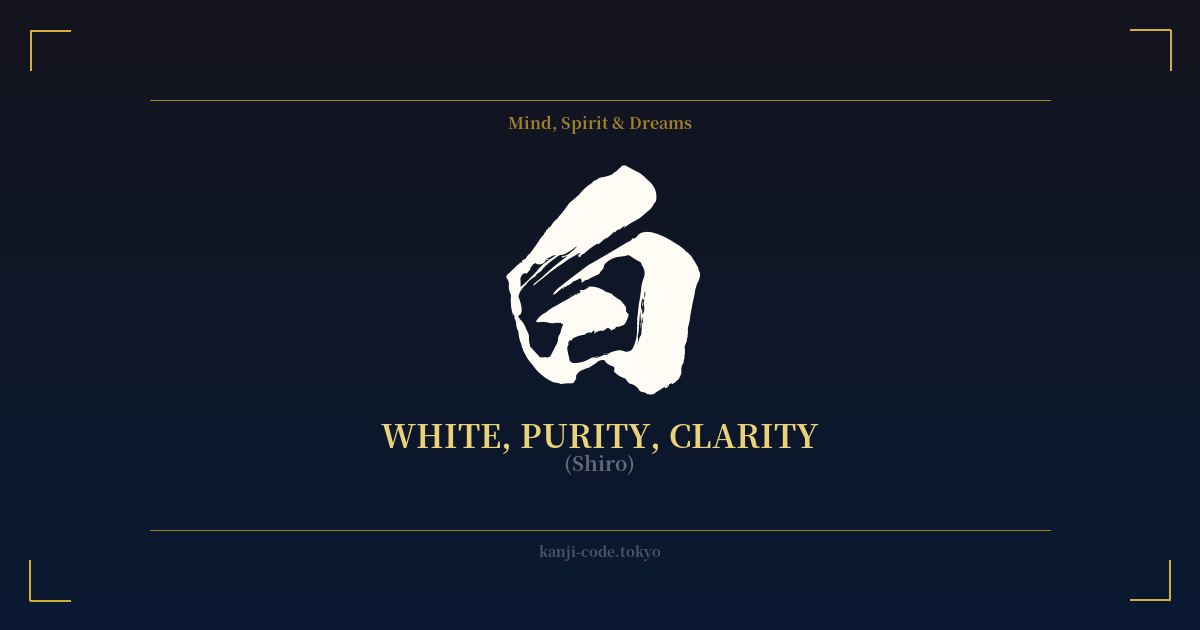
✍️ 白 (Shiro) — Cultural Context
The kanji 白 (shiro) is one of the most fundamental characters in the Japanese language, yet it carries a cultural weight far beyond its simple appearance. On the surface, it means 'white,' the color of snow, paper, and light. Its etymological origin is thought to be a pictogram of a sunbeam or a single grain of polished rice, both foundational elements of life and purity in Japanese culture.
This connection to purity is one of its most powerful symbolic meanings. In Shintoism, Japan's indigenous religion, white is the color of the divine. Shinto priests wear white robes (hakujōe), and sacred spaces are often adorned with white paper streamers called 'shide,' which signify a purified space fit for the gods (kami). In this context, 白 represents a state of being untainted, sacred, and spiritually clean. It is the color of new beginnings, a blank slate full of potential, and the clarity of an uncluttered mind.
However, this is only half the story. In stark contrast to Western traditions where black is the color of mourning, in Japan, white holds this role. It is the color of death. The deceased are traditionally dressed in a white kimono for their journey into the afterlife, a practice rooted in Buddhist and Shinto beliefs about purification. This makes the color white a common sight at funerals, where it evokes a sense of solemnity and departure. This duality is critical to understanding the character's full meaning; it is both the sacred and the somber, the beginning and the end.
Beyond these two powerful poles, 白 appears in everyday language to mean 'blank,' 'empty,' or 'innocent.' For example, the term 告白 (kokuhaku), meaning 'confession,' literally translates to 'announcing the white,' implying a desire to make things clear and pure. Similarly, 潔白 (keppaku) means 'innocence' or 'integrity,' reinforcing the link between white and moral purity. This simple, five-stroke character encapsulates a complex web of Japanese aesthetics and philosophy, from the beauty of empty space (余白の美, yohaku no bi) in art to the most profound questions of life, divinity, and death.
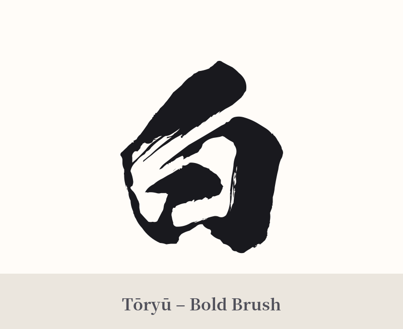
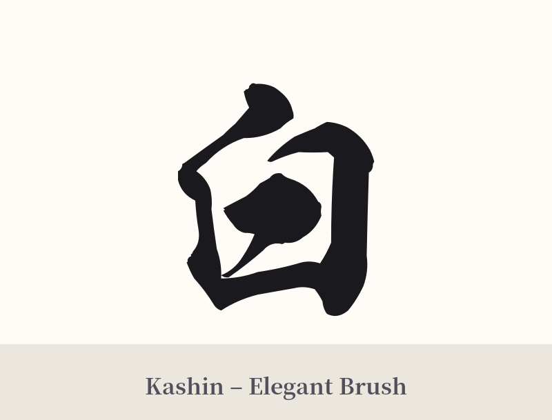
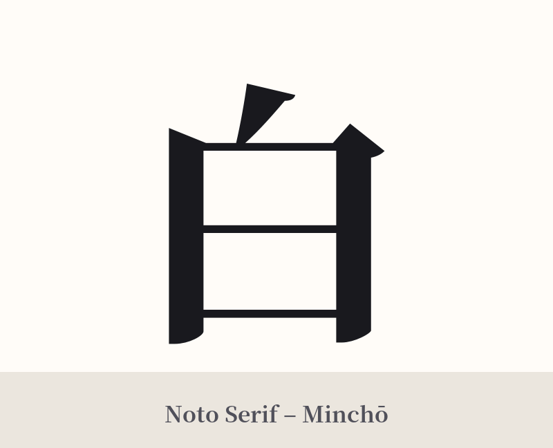
🖌️ Font Styles for 白
The same kanji can look dramatically different depending on the calligraphy style. Choose a font that matches the mood you want for your tattoo or design.
🎨 Tattoo Suitability
📐 Tattoo Design Guide
The kanji 白 is a testament to minimalist beauty, and its design should reflect that. Its simplicity makes it versatile, but also means that font and placement are key to conveying its intended meaning.
– Placement: For a subtle and personal tattoo, consider the inner wrist, behind the ear, or on the ankle. Its small, simple form works well in these discreet locations. For a more prominent statement, it can be placed on the forearm or the nape of the neck. As part of a larger piece, it can serve as a central, grounding element.
– Font Style: A crisp, clean font like the Mincho style emphasizes the kanji's meaning of 'clarity' and 'purity.' For a more organic and spiritual feel, a flowing shodō (calligraphy) script with a single, confident brushstroke can be very powerful. Avoid overly complex or decorative fonts that would contradict its inherent minimalism.
– Visual Tips: Consider the context. A standalone 白 tattoo is a bold statement on its own. To steer the meaning towards 'purity,' you could incorporate it with other elements like a lotus flower. A unique approach is a 'negative space' tattoo, where the skin forms the character, surrounded by black ink. While white ink tattoos exist, they are notoriously difficult to execute well and often fade or yellow over time, so proceed with caution.
Comments