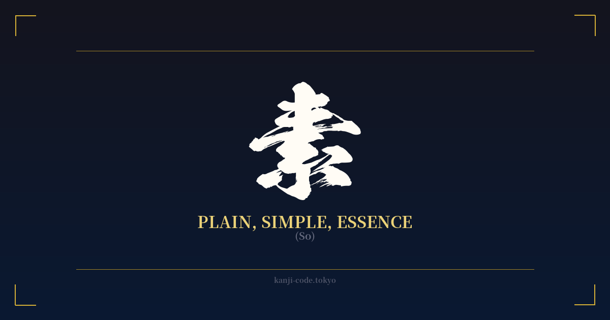
✍️ 素 (So) — Cultural Context
The kanji 素 (so) is a quiet giant in the Japanese language, a character that embodies a foundational pillar of the nation's aesthetic and philosophical worldview. On the surface, its meanings are straightforward: plain, simple, raw, uncovered. Yet, beneath this simplicity lies a profound appreciation for the unadorned, the authentic, and the essential nature of things.
To truly grasp the weight of 素, one must look to concepts like Zen Buddhism and wabi-sabi. It represents the state of things before they are decorated, processed, or assigned a specific function. It is the raw silk before it is dyed, the plain wood before it is carved, the fresh ingredient before it is cooked. This isn't a celebration of the crude or unfinished, but rather an acknowledgment of the inherent beauty and potential within the fundamental essence of something.
The character's etymology offers a beautiful visual story. It is composed of 垂 (to hang down) and 糸 (thread). This combination originally depicted threads hanging to dry after being bleached, returning them to their natural, white, and unadorned state. It’s a process of stripping away to reveal the core—a concept central to its meaning.
This idea permeates Japanese culture. You see it in the term 素朴 (soboku), which describes a rustic, unpretentious simplicity found in rural life or handcrafted objects. You find it in 素人 (shirouto), meaning 'amateur' or 'layman,' literally a 'white person'—someone with a blank, uncolored slate, open to learning. The word 素敵 (suteki), meaning 'wonderful' or 'lovely,' is a fascinating evolution. It originally meant something like 'of the base' or 'of the origin,' implying something so authentic and fundamental that it was, in itself, wonderful.
In a modern context, 素 speaks to a desire for authenticity in a world of artifice. It is the idea of being true to one's '素'—one's natural self, without pretense. It’s the appreciation for a simple meal made with high-quality ingredients (素材, sozai). It is the 'element' (要素, yōso) that forms the building block of a larger whole.
Choosing the kanji 素 is to choose a symbol of minimalism, authenticity, and a return to the essential. It’s a quiet declaration that value lies not in addition and ornamentation, but in the purity of the original form. It is the beauty of the unpainted canvas, filled not with emptiness, but with pure potential.
🖌️ Font Styles for 素
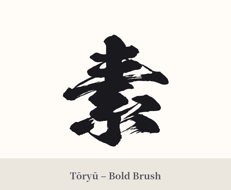
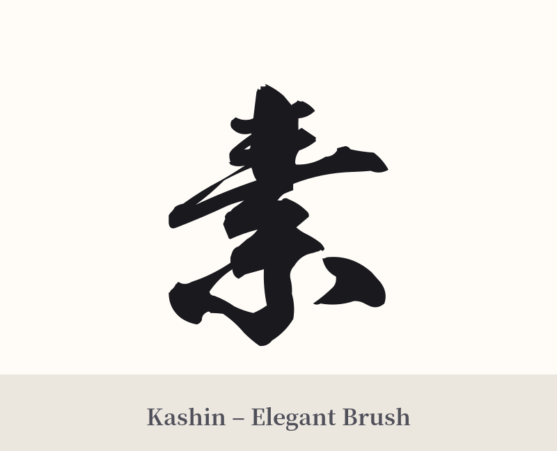
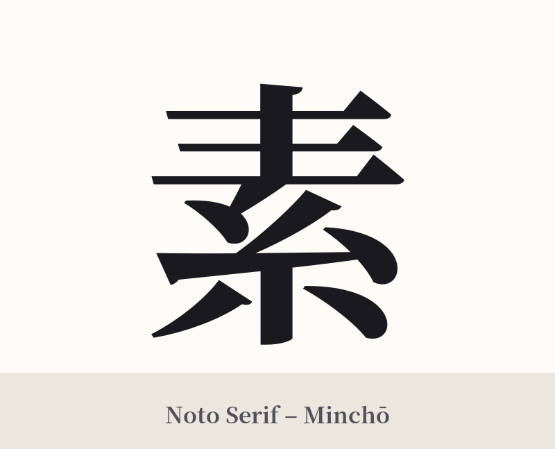
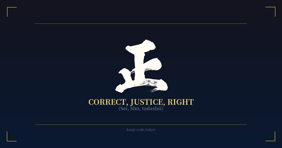
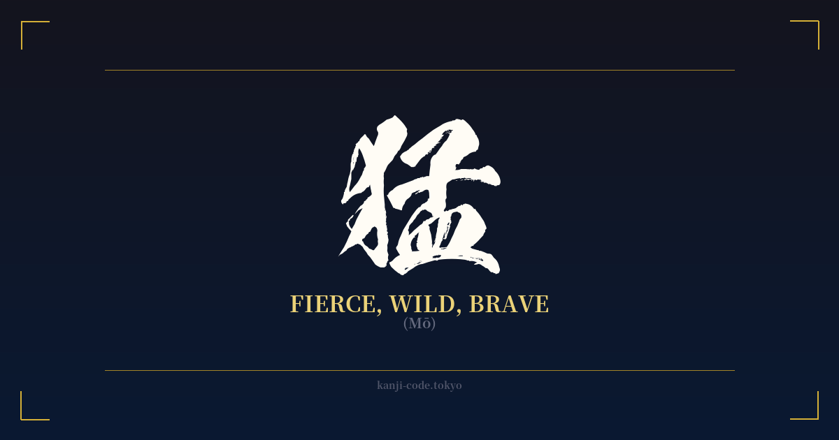
The same kanji can look dramatically different depending on the calligraphy style. Choose a font that matches the mood you want for your tattoo or design.
🎨 Tattoo Suitability
📐 Tattoo Design Guide
The kanji 素 embodies minimalism, and its design should reflect that philosophy. Simplicity is key.
– Placement: This character works beautifully in small, discreet locations that complement its subtle nature. Consider the inner wrist, behind the ear, on the ankle, or along the collarbone. These placements suggest a personal, introspective meaning rather than a loud declaration.
– Font Style: A traditional, hand-brushed calligraphic style is highly recommended. A semi-cursive Gyosho script can add a touch of fluid elegance, while a full cursive Sosho script can make it more abstract and artistic. For a modern, stark look, a clean and sharp Mincho (serif) font is an excellent choice.
– Visual Tips: Keep any accompanying elements minimal. 素 pairs well with other symbols of Japanese aesthetics, such as a simple enso circle (symbolizing enlightenment and the void) or a single, delicately drawn natural element like a bamboo leaf or a smooth stone. The goal is to enhance its meaning, not to clutter or overshadow it.
Comments