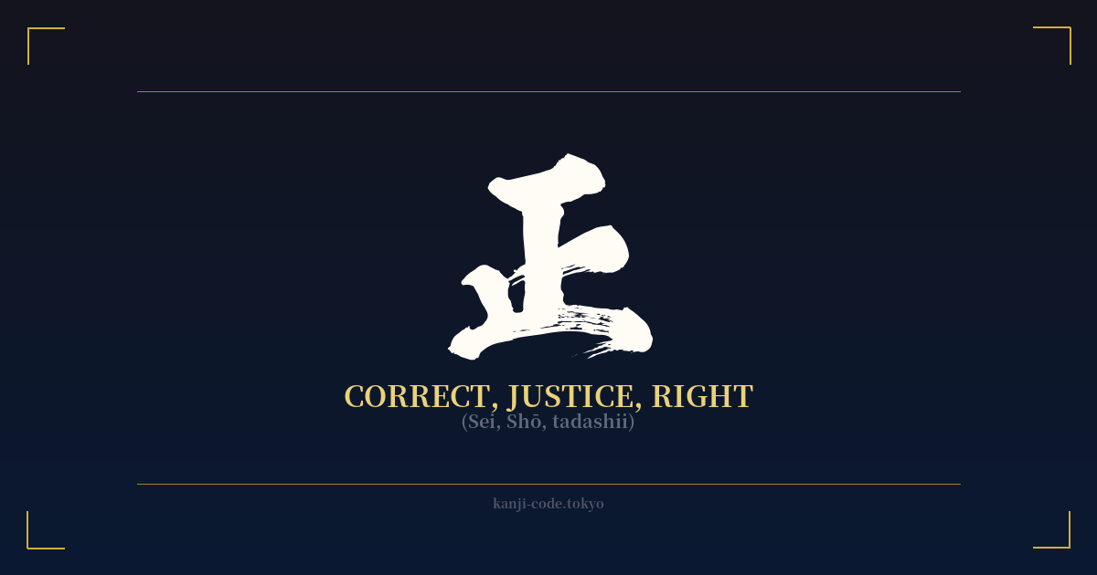
✍️ 正 (Sei, Shō, tadashii) — Cultural Context
The kanji 正 (Sei) is one of the most fundamental and philosophically rich characters in the Japanese language. Its form is simple, yet its meaning resonates deeply within Japanese culture, embodying concepts of correctness, righteousness, justice, and truth.
Originally, the character is thought to depict a foot (止) stopping at a line (一), representing the act of halting at a boundary or standard—the very essence of 'correctness.' It's the idea of aligning oneself with a proper, established measure. This simple etymology blossoms into a vast conceptual field.
In daily life, 正 is ubiquitous. It’s the character for a correct answer, 正解 (seikai), and the mark a teacher might use on a student’s paper. It forms the word for justice, 正義 (seigi), a cornerstone of moral and legal philosophy. It’s also present in 正直 (shōjiki), which means honesty and integrity, speaking to the virtue of being true and upright in one's actions and words.
The influence of 正 extends into Japanese traditional arts and disciplines. In Shodō (calligraphy), mastering the balance and proportion of 正 is a foundational exercise. Its perfect symmetry—a central vertical stroke precisely bisecting the character—is a microcosm of the balance calligraphers strive for in all their work.
This sense of 'correct form' is also physical. The term 正座 (seiza) refers to the traditional, formal way of sitting on the floor. While it can be physically demanding, it is considered the 'correct' and most respectful posture, reflecting a disciplined and composed inner state. This links the abstract idea of correctness to a tangible, bodily practice.
In the context of Bushido, the way of the samurai, 正 represents moral rectitude and unwavering principle. A warrior was expected to live and die by a strict code, and this kanji encapsulates the ideal of walking the 'straight' and 'right' path without deviation. It is the moral compass that guides one’s actions, ensuring they are just and honorable.
Ultimately, 正 is more than just 'right' versus 'wrong.' It is a symbol of alignment—with truth, with moral law, with cosmic order, and with one's own true nature. It represents a state of being that is balanced, centered, and fundamentally sound.
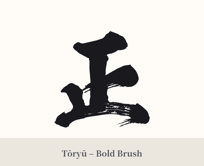
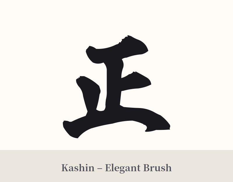
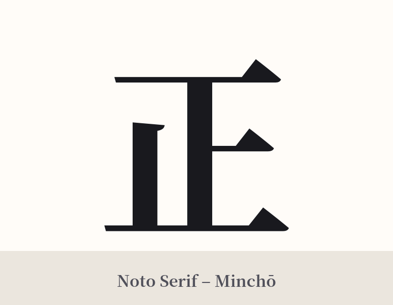
🖌️ Font Styles for 正
The same kanji can look dramatically different depending on the calligraphy style. Choose a font that matches the mood you want for your tattoo or design.
🎨 Tattoo Suitability
📐 Tattoo Design Guide
The beauty of 正 lies in its minimalist and symmetrical structure, which offers surprising versatility in tattoo design.
– Placement: Its clean and compact nature makes it ideal for subtle placements like the inner wrist, behind the ear, or on the ankle. For a more prominent statement, the forearm, back of the neck, or centered on the chest can emphasize its theme of balance.
– Font Style: A standard, crisp Kaisho (block script) style will highlight the kanji's perfect symmetry and formal meaning. For a more dynamic and personal feel, a Gyosho (semi-cursive) or Sosho (cursive) brushstroke style can add a sense of life and energy, suggesting that justice and truth are active, flowing principles.
– Visual Tips: Consider having the tattoo artist render it with a 'hanko' (personal seal) effect, often done in red ink, to give it a traditional and official feel. It can also be the centerpiece of a larger design, such as being placed within an Enso circle to symbolize the perfection and correctness found within the universe's wholeness.

Comments