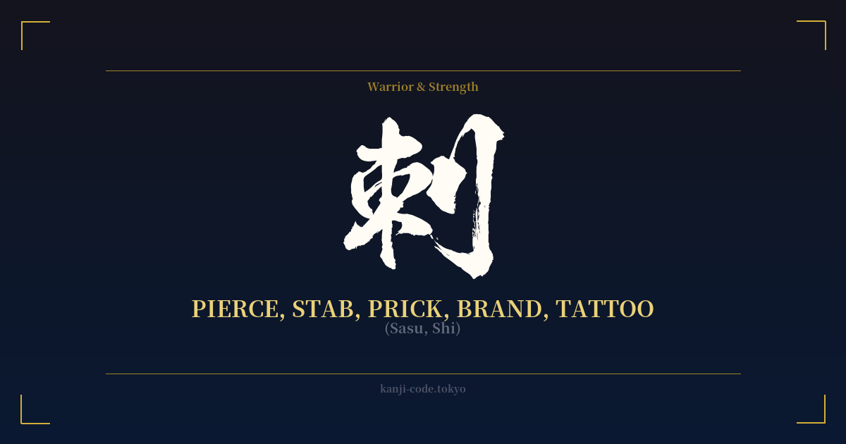
✍️ 刺 (Sasu, Shi) — Cultural Context
The kanji 刺 (shi, sasu) is a character of sharp edges and deep implications, embodying the very act of piercing a surface. Its origin story is written directly into its form. The right side features the radical 刂 (ritō), a variant of 刀, meaning 'sword' or 'knife.' The left side, 朿 (soku), is a pictogram of thorns on a tree. Together, they create a visceral image: a blade meeting a thorny, resistant object. This is the essence of 刺—the act of penetration, of making a mark with force and precision.
In its most common usage, 刺 is the root of the verb 刺す (sasu), which means to pierce, stab, or sting. A bee stings you (蜂が刺す – hachi ga sasu). A chef pierces fish for sashimi (魚を刺す – sakana o sasu). A criminal stabs someone (人を刺す – hito o sasu). This grounds the character in a raw, physical reality that is often associated with pain, attack, or the precise application of a sharp point.
Beyond its literal, violent connotations, 刺 extends into the metaphorical. It can describe a sharp, cutting remark that 'pricks' one's conscience or pride. The word 刺激 (shigeki) means 'stimulus' or 'provocation,' an external force that pierces through apathy. Similarly, 皮肉 (hiniku), meaning 'sarcasm' or 'irony,' literally translates to 'skin meat,' evoking the feeling of a sharp comment getting under your skin.
For those interested in body art, the most compelling connection is its role in the word for tattoo: 刺青 (irezumi or shisei). Here, 刺 (to pierce) is combined with 青 (blue/green), referencing the traditional color of the ink being inserted into the skin. Choosing 刺 as a tattoo is, in a way, a meta-statement. It is the verb of the art form itself, representing the needle, the act, and the permanence of the mark left behind.
This duality is what makes 刺 so fascinating. It lives in the world of both the warrior and the bureaucrat. While it evokes images of swords and daggers, it is also the first character in 名刺 (meishi), the everyday word for a business card. In this context, it refers to the act of 'presenting' or 'announcing' one's name. This stark contrast between a fatal blow and a polite introduction encapsulates the complexity and evolution of the Japanese language. To wear 刺 is to embrace this spectrum—a symbol of anything that leaves a sharp, indelible impression.
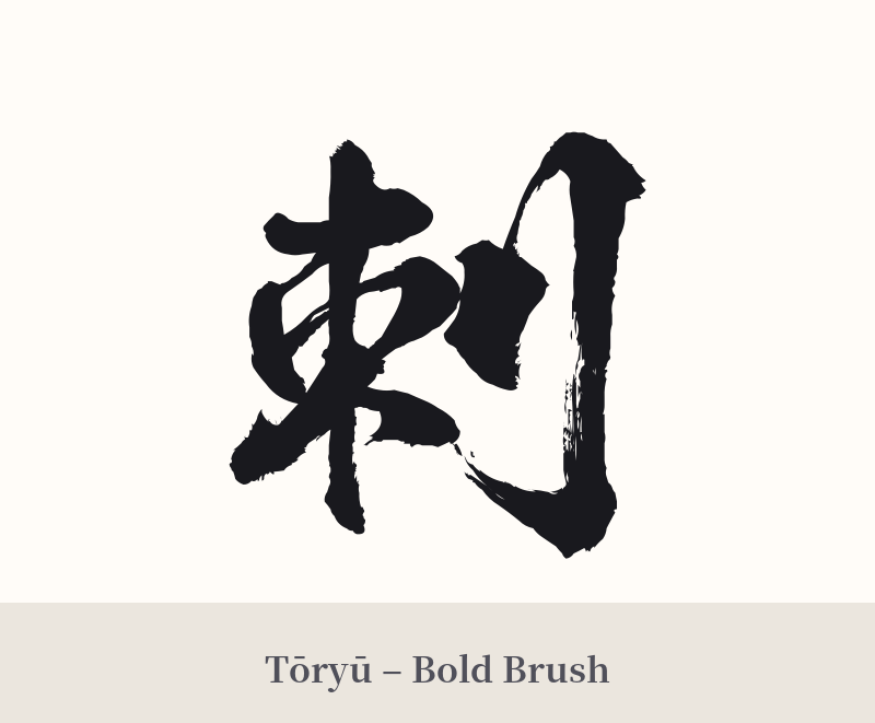
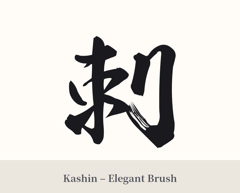
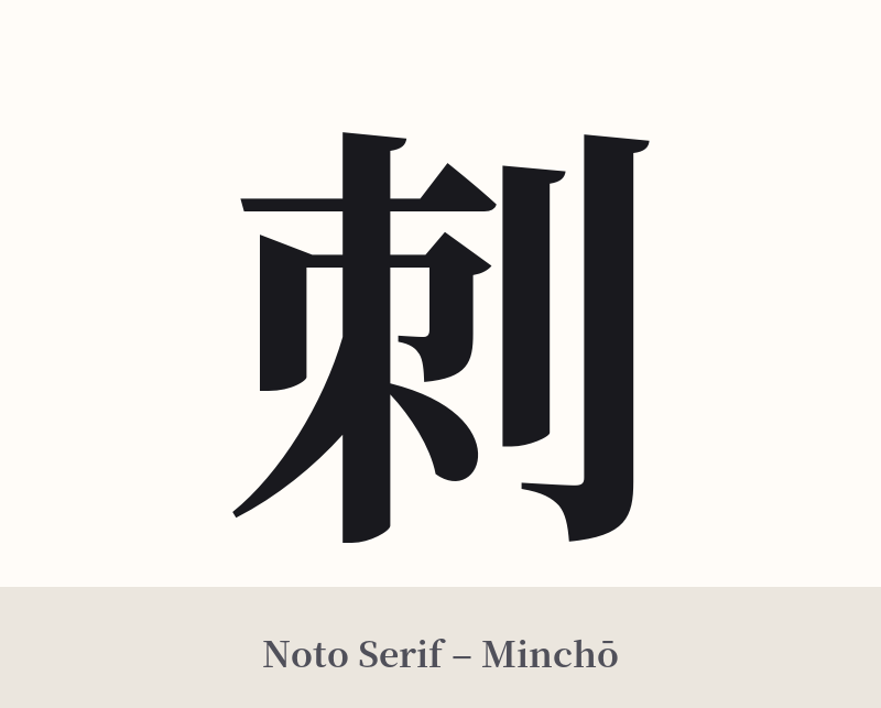
🖌️ Font Styles for 刺
The same kanji can look dramatically different depending on the calligraphy style. Choose a font that matches the mood you want for your tattoo or design.
🎨 Tattoo Suitability
📐 Tattoo Design Guide
The kanji 刺 has a balanced, aggressive form that works well for a tattoo. Its sharp lines and pointed elements lend themselves to bold design choices.
– Placement: Consider areas that allow the character to stand alone with impact, such as the center of the upper back, the forearm, or the calf. Its vertical structure makes it suitable for running along a limb.
– Font Style: A strong, angular script like Kaisho (block style) will emphasize its 'piercing' nature. For a more dynamic and aggressive feel, a well-executed Gyosho (semi-cursive) or Sosho (cursive) script can mimic the swift motion of a blade.
– Visual Tips: Because 刺 is about the act of piercing, some people choose to incorporate this into the design itself. A 'skin-rip' effect or a design where the kanji appears to be branded or cut into the skin can be powerful. Alternatively, adding a small splash of red ink can highlight its visceral connotations without being overly graphic.
Comments