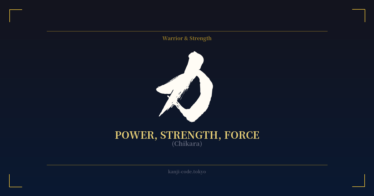
✍️ 力 (Chikara) — Cultural Context
The kanji 力 (Chikara) is one of the most fundamental and potent characters in the Japanese language. Its origins as a pictograph are beautifully direct, believed to depict either a muscular arm flexed to show strength or an ancient farming plow, a tool requiring immense physical exertion. Both images root the character in the tangible world of effort, labor, and raw physical power.
In modern Japanese, 力 transcends its simple origin to encompass a vast spectrum of meanings. It represents physical strength, as in 体力 (tairyoku, stamina) or 腕力 (wanryoku, arm strength). But its true depth lies in its application to abstract concepts. It signifies ability or faculty in 能力 (nōryoku), effort and endeavor in 努力 (doryoku), and influence or authority in 権力 (kenryoku).
This versatility makes 力 a cornerstone of Japanese philosophy and cultural expression. In the world of martial arts (武道, Budō), practitioners strive not just for brute force but for a refined power, a harmony of body and mind. Here, 力 is often paired with 気 (ki, spirit or energy) to form 気力 (kiryoku), meaning willpower or drive. This concept highlights that true strength is not just physical might but mental and spiritual fortitude.
This idea of inner strength is what gives 力 its profound resonance. It speaks to the power of perseverance, the force of one's will to overcome obstacles, and the energy required to achieve goals. It's the silent strength of resilience, the driving force behind cooperation (協力, kyōryoku), and the very essence of potential. The word can even be used to describe the impact of nature, like the force of a wave or the power of the wind.
In calligraphy (書道, Shodō), the character 力 is a favorite subject for artists. Its two simple strokes must be executed with perfect balance, tension, and release to convey a sense of dynamic energy. The first stroke, a downward hook, grounds the character, while the second sweeping stroke projects outward, capturing the essence of force in motion. It is a testament to the Japanese aesthetic of finding profound beauty and meaning in simplicity.
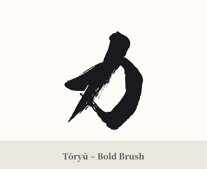
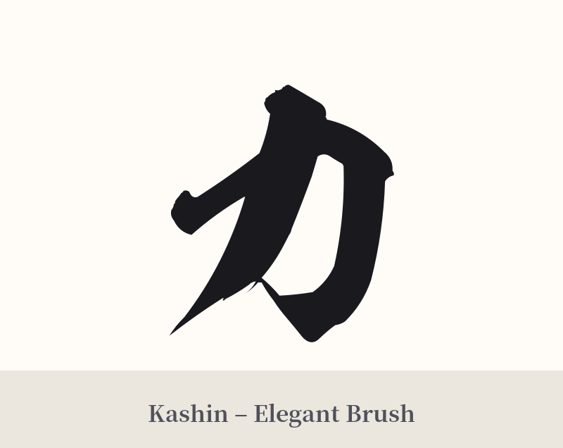
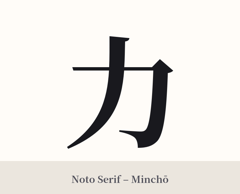
🖌️ Font Styles for 力
The same kanji can look dramatically different depending on the calligraphy style. Choose a font that matches the mood you want for your tattoo or design.
🎨 Tattoo Suitability
📐 Tattoo Design Guide
The simple and bold nature of 力 makes it incredibly versatile for a tattoo design. Its clean lines ensure it remains legible and impactful, regardless of size or placement.
– Placement Suggestions: For a prominent display, consider the forearm, bicep, or calf, where the design can complement the muscle's form. It also works exceptionally well as a smaller, more discreet tattoo on the wrist, behind the ear, or on the back of the neck.
– Font Style Choices: A thick, blocky Kaisho (block script) or Gothic-style font will emphasize its meaning of raw, unyielding strength. For a more fluid and dynamic feel, a Gyosho (semi-cursive) or Sosho (cursive) calligraphic style can represent flowing energy, ki, or the application of force with grace.
– Visual Tips: While 力 is a powerful standalone piece, it can be integrated into larger designs. Encircling it with an Ensō (Zen circle) can symbolize the application of strength within the context of enlightenment and the universe. It can also serve as a key element alongside imagery of a dragon, tiger, or koi fish to amplify themes of power, courage, and perseverance.
Comments