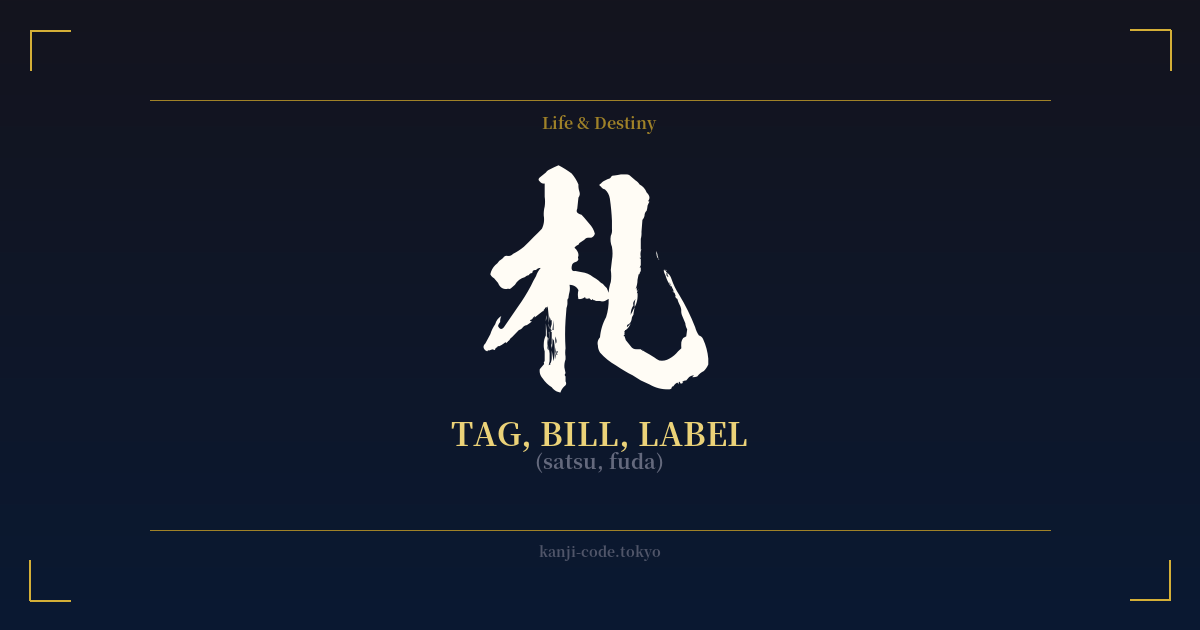
✍️ 札 (satsu, fuda) — Cultural Context
The kanji 札 (satsu, fuda) is a fascinating character whose meaning splits between the utterly mundane and the deeply sacred. Its origin lies in its components: the radical 木 (ki), meaning 'tree' or 'wood', and a single stroke representing something attached. The original image is that of a thin wooden slip or tablet used for writing, a simple tag.
In modern Japanese, this humble origin is still visible. When read as 'fuda', it refers to cards, tags, and labels of all kinds. You'll find it in 名札 (nafuda), a name tag, or in トランプの札 (toranpu no fuda), the cards in a deck of playing cards. Read as 'satsu', it becomes the counter for banknotes, as in 一万円札 (ichiman'en satsu), a 10,000 yen bill. In these contexts, 札 is purely functional, a marker of identity or value.
However, the character undergoes a profound transformation in a spiritual context. Here, it becomes 御札 or お札 (ofuda), a sacred talisman or amulet issued by Shinto shrines and Buddhist temples. These are not mere pieces of paper or wood; they are considered conduits for the divine power of the kami or deities enshrined at that location. An ofuda acts as a protective ward for a home or business, bringing good fortune and warding off evil spirits.
These ofuda are treated with immense respect. They are typically placed in a household altar called a 'kamidana' and are never to be handled carelessly. Each year, around the New Year, people return their old ofuda to the shrine or temple from which they were received. The old talismans are then ritually purified and burned in a sacred bonfire, and new ones are acquired for the year ahead. This cycle represents renewal and the continuous relationship between the devotee and the divine.
This duality is what makes 札 so compelling. It is a character that exists simultaneously in the world of commerce and the world of faith. It can be a simple price tag or a powerful symbol of divine protection. Understanding 札 is to understand how Japanese culture can imbue a simple object—a slip of wood or paper—with layers of meaning, from the practical to the profound.
🖌️ Font Styles for 札
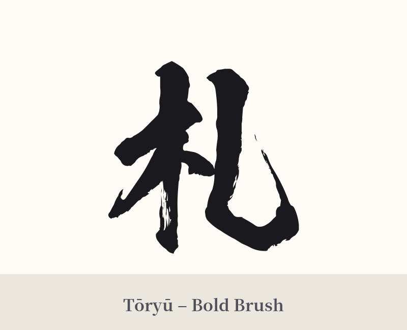
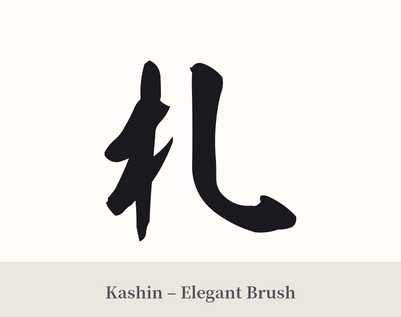
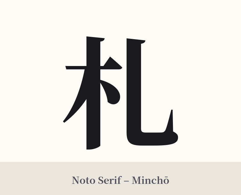
The same kanji can look dramatically different depending on the calligraphy style. Choose a font that matches the mood you want for your tattoo or design.
🎨 Tattoo Suitability
📐 Tattoo Design Guide
Due to its simplicity, the kanji 札 presents some design challenges. By itself, it can look sparse and may not carry the visual weight you desire for a tattoo.
– Placement: Small, discreet areas are often best for a simple character like this. Consider the inner wrist, ankle, behind the ear, or on the collarbone. It can get lost in larger areas like the back or chest unless it's part of a bigger composition.
– Font Style: Style is crucial here. A standard, blocky font (like Mincho) will emphasize its functional, 'tag' or 'bill' meaning. To evoke the spiritual 'ofuda' side, a more artistic, flowing script like Gyosho (semi-cursive) or Sosho (cursive) is highly recommended. The brush strokes add movement and a sense of history that the simple form lacks.
– Visual Tips: The best way to use 札 in a tattoo is to give it context. Consider incorporating it into a larger piece. For example, the character could be 'written' on a wooden plank that is part of a shrine design, or paired with other spiritual symbols like a lotus flower, a torii gate, or flowing water to explicitly reference its connection to purification and protection.
Comments