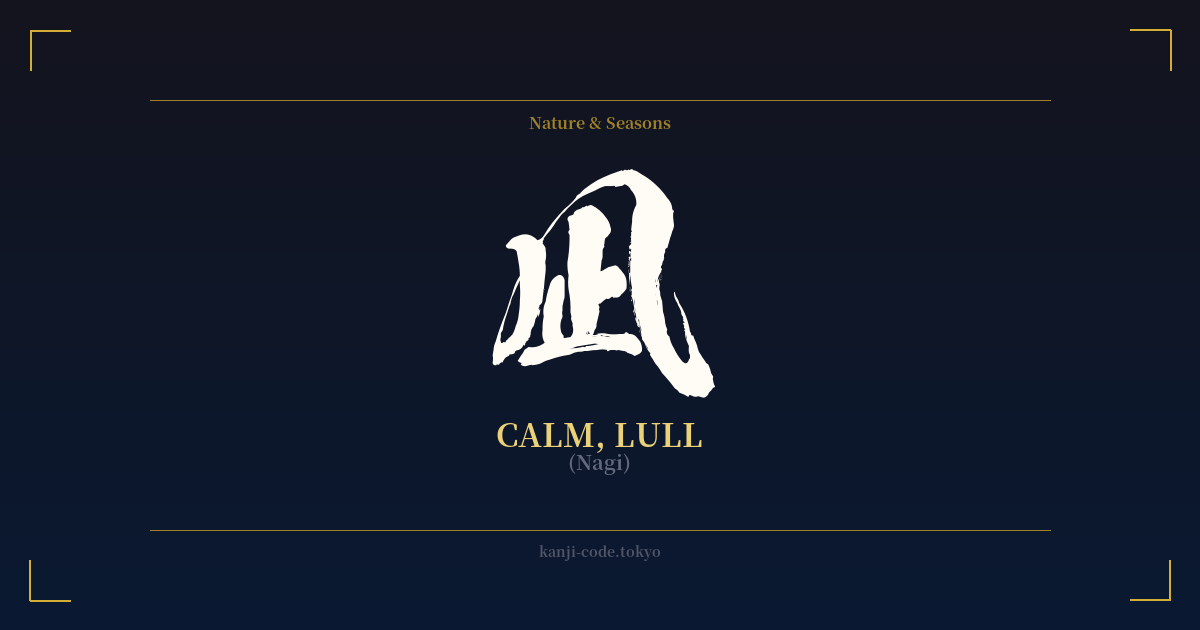
✍️ 凪 (Nagi) — Cultural Context
The kanji 凪 (nagi) is a beautiful and uniquely Japanese character, embodying a very specific type of tranquility. It refers to a 'lull' or 'calm,' particularly the moment when the wind ceases and the sea becomes still and glassy. This isn't just a general sense of quiet; it's a distinct natural phenomenon with deep cultural resonance in an island nation like Japan.
What makes 凪 so special is that it is a 'kokuji' (国字), a character created in Japan rather than being imported from China. Its very structure tells a story. It is a composite of two other kanji: 風 (kaze), meaning 'wind,' and 止 (tomaru), meaning 'to stop.' Together, they literally depict 'wind stop,' a brilliant and intuitive piece of visual poetry that captures the essence of the word perfectly.
For a country whose history, livelihood, and culture are inextricably linked to the ocean, the concept of 'nagi' holds profound significance. For fishermen and sailors, a 'nagi' represents a period of safety and calm, a welcome respite from the unpredictable and often dangerous nature of the sea. It is a moment to pause, to breathe, and to appreciate the stillness. This is why the character evokes such a strong sense of peace and serenity.
Beyond its literal meaning, 凪 is often used metaphorically to describe a state of inner peace or a lull in the chaos of life. It can represent a quiet period after a storm, both literally and emotionally. In literature and art, it is used to create an atmosphere of profound stillness and contemplation. It’s the quiet that isn't empty, but full of potential and reflection.
The character is also popular as a name, most commonly a female given name, 'Nagi' or 'Nagisa' (which adds the character for 'shore'). As a name, it imparts a feeling of gentleness, serenity, and a calm, steady nature. This usage further cements its positive and cherished place in Japanese culture, making it a symbol of quiet strength and natural beauty.
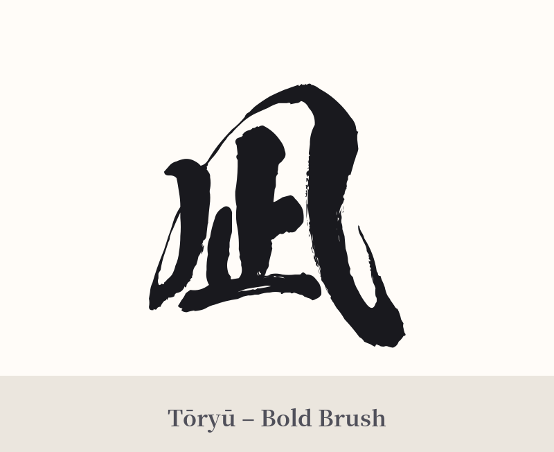
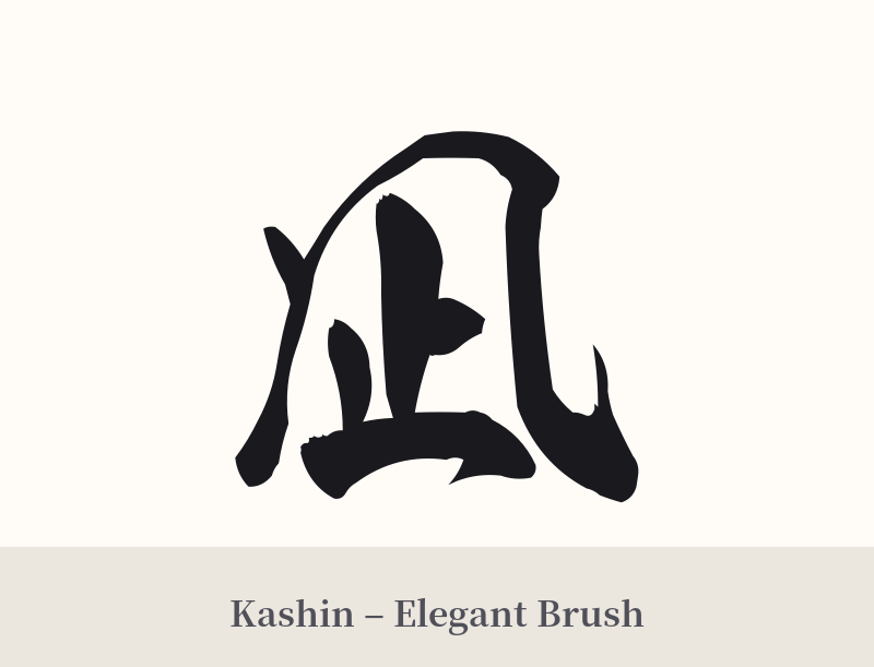
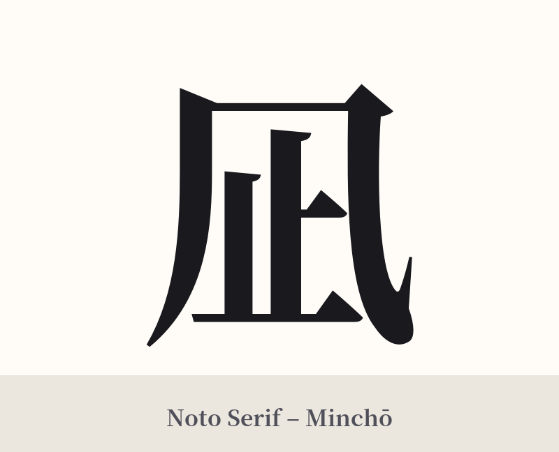
🖌️ Font Styles for 凪
The same kanji can look dramatically different depending on the calligraphy style. Choose a font that matches the mood you want for your tattoo or design.
🎨 Tattoo Suitability
📐 Tattoo Design Guide
The kanji 凪 is defined by its elegance and simplicity, and your tattoo design should reflect that.
– Placement: This character works beautifully in delicate, personal spots. Consider the inner wrist, the collarbone, behind the ear, or on the ankle. Its vertical symmetry also makes it suitable for placement along the spine or on the forearm.
– Font Style: A minimalist font is highly recommended. A clean, crisp Mincho (serif) style will highlight its elegant structure. Alternatively, a soft and slightly flowing semi-cursive (gyosho) calligraphy style can evoke the gentle calm it represents without being overly complex.
– Visual Tips: 凪 is powerful enough to stand alone. If you wish to add complementary elements, keep them subtle. A single, fine-line wave beneath the character, a silhouette of a distant bird, or a delicate enso circle can frame the kanji and enhance its meaning without overwhelming it.
Comments