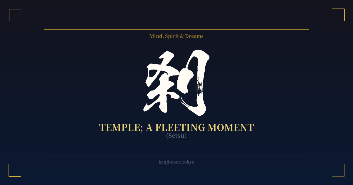
✍️ 刹 (Setsu) — Cultural Context
The kanji 刹 (Setsu) is a character of profound duality, holding two seemingly contradictory meanings that are deeply rooted in Buddhist philosophy. Its journey into the Japanese language begins with two different Sanskrit words: `kṣetra` and `kṣaṇa`.
First, `kṣetra` translates to 'field,' 'land,' or 'country,' and in a Buddhist context, it came to signify a sacred precinct, specifically a temple or monastery. This is where 刹 gets its meaning of 'temple.' It often referred to the central pillar of a pagoda (刹柱, satchū), a vital architectural and spiritual component that connects the heavens and the earth. In this sense, 刹 represents a physical, grounded, and sacred space.
Conversely, the Sanskrit word `kṣaṇa` refers to an immeasurably small unit of time, an 'instant' or 'a moment.' Ancient Buddhist texts defined a kṣaṇa with incredible precision, sometimes as 1/75th of a second. This concept was not just about timekeeping but was central to the Buddhist doctrine of impermanence (無常, mujō). It teaches that reality is a continuous flow of these fleeting moments, arising and passing away in an instant. This is the second, more philosophical meaning of 刹: a fleeting moment.
This duality is the heart of the kanji's power. It is both a place and a non-place; a physical structure and an intangible instant. However, in modern Japanese, 刹 is rarely, if ever, used alone. To convey the idea of 'a fleeting moment,' it is almost exclusively used in the compound word 刹那 (setsuna).
Setsuna is a beautiful and culturally resonant word in Japan. It captures a poignant, bittersweet awareness of the transient nature of life, beauty, and happiness. It’s the feeling of watching a single cherry blossom petal fall, the brief silence after a temple bell rings, or a perfect moment you know can never be replicated. While 刹 is the building block, 刹那 is the complete and universally understood expression of this powerful idea.
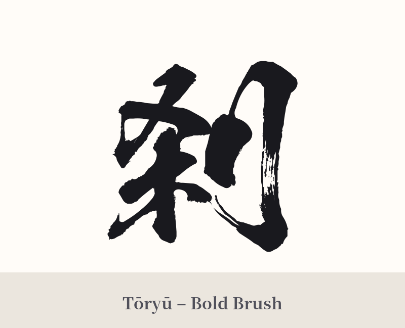
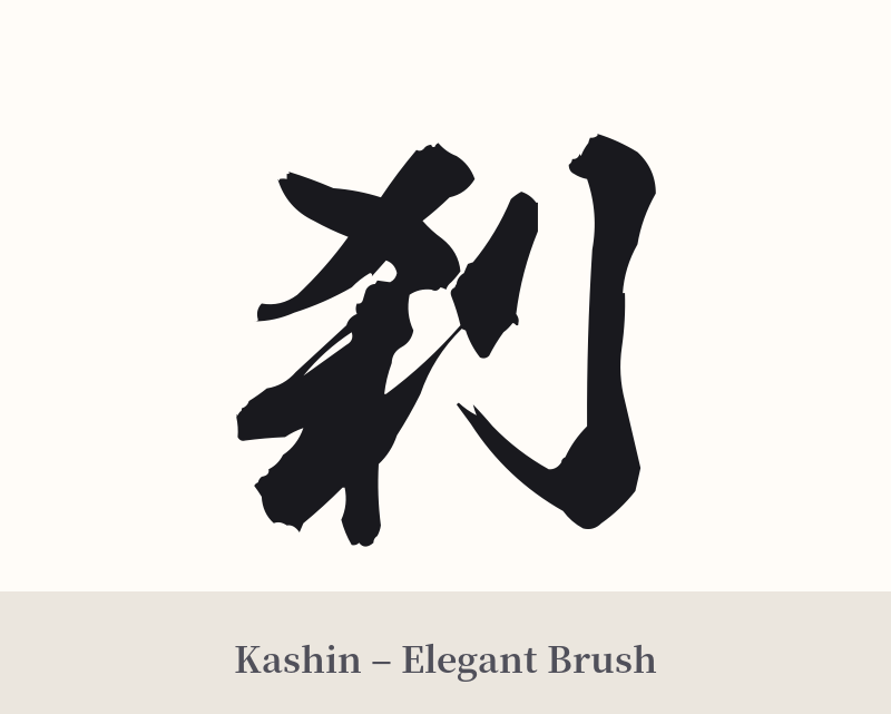
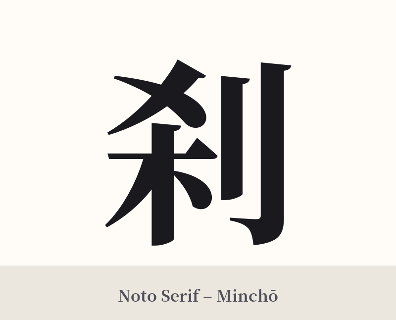
🖌️ Font Styles for 刹
The same kanji can look dramatically different depending on the calligraphy style. Choose a font that matches the mood you want for your tattoo or design.
🎨 Tattoo Suitability
📐 Tattoo Design Guide
Given the cultural context, tattooing 刹 by itself is a nuanced choice that leans towards being ill-advised. The primary recommendation is to use the full, more meaningful word 刹那 (Setsuna) instead.
If you are committed to using the single character 刹 for its minimalist aesthetic or personal symbolism, consider these design approaches to mitigate the risk of it looking incomplete:
– Placement: Choose a personal, subtle location like the inner wrist, behind the ear, on the ribs, or the nape of the neck. This frames the tattoo as a private reflection rather than a public declaration, making its fragmented nature feel more intentional.
– Font Style: A minimalist or ephemeral style works best. A light, airy Mincho (serif) font can look elegant and clean. Alternatively, a flowing, cursive script like Sōsho can visually represent the 'fleeting' nature of the character's meaning.
– Visual Accompaniments: Pair the kanji with imagery that reinforces its meaning. A design incorporating a single falling sakura petal, a wisp of smoke, a dissolving ink wash effect, or a small ripple in water can provide the context that the character lacks on its own.
Comments