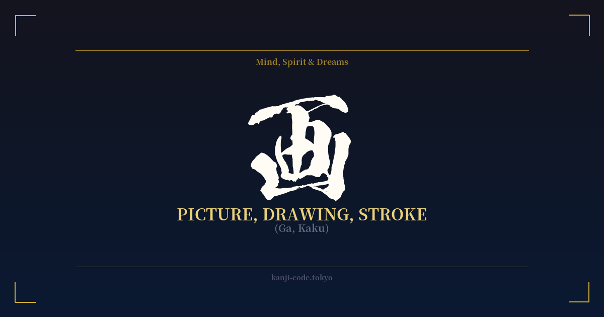
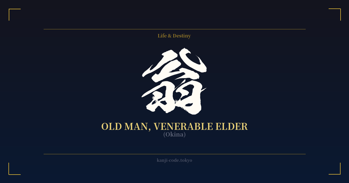
✍️ 画 (Ga, Kaku) — Cultural Context
The kanji 画 (ga, kaku) is the very essence of visual creation in Japanese culture. Its origins paint a vivid picture: a combination of a brush (聿) and a field or plot of land (田). This ancient pictograph represents the act of using a tool to delineate a space, to draw boundaries, and to create an image within them. It is the foundational stroke, the first line on a blank surface.
In its most common sense, 画 means 'picture' or 'drawing.' It forms the backbone of countless words central to Japanese art. Think of 漫画 (manga), the globally beloved comics, where 画 signifies the 'pictures' in the 'whimsical pictures' duo. It’s also in 映画 (eiga), the word for 'movie,' literally 'projected pictures,' showing its seamless transition from traditional media to modern technology.
But 画 is more than just the final product; it is also the process. It carries the meaning of 'stroke,' as in the strokes of a brush in calligraphy (書道, shodō) or painting. The term 画数 (kakusuu) literally means 'stroke count,' a fundamental concept for learning and organizing kanji. This dual meaning connects the static image to the dynamic action required to create it, imbuing the character with a sense of deliberate movement and intention.
This connection to the act of creation elevates 画 beyond a simple noun. It speaks to the philosophy of planning and design. The word 計画 (keikaku), meaning 'plan' or 'project,' uses 画 to signify the act of delineating or mapping out a course of action. It suggests that every great endeavor, whether an artwork or a life plan, begins with a single, intentional 'stroke.'
From the meticulous lines of an ukiyo-e print to the dynamic panels of a manga and the carefully planned strokes of a calligrapher, 画 is the unifying concept. It represents the power of a single line to define a world, tell a story, and capture a moment. It is a symbol not just of art, but of the creative impulse itself.
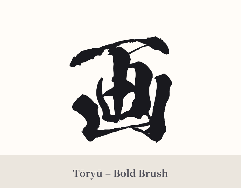
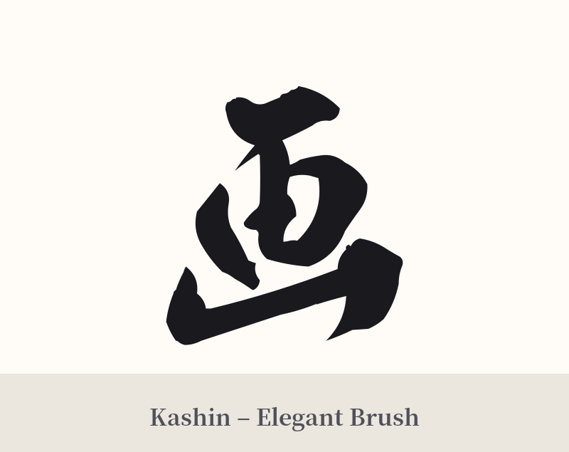
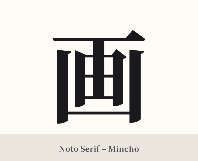
🖌️ Font Styles for 画
The same kanji can look dramatically different depending on the calligraphy style. Choose a font that matches the mood you want for your tattoo or design.
🎨 Tattoo Suitability
📐 Tattoo Design Guide
The simple, balanced structure of 画 allows for great versatility in tattoo design. It speaks to a love for art, creation, and deliberate action.
– Placement: Due to its compact and clean form, this kanji works beautifully in smaller, more intimate locations. Consider the wrist, inner forearm, ankle, or behind the ear. For a larger statement, it could be placed on the shoulder blade or calf, where it has room to breathe.
– Font Style: The choice of script can dramatically alter its meaning. A bold, blocky Kaisho (楷書) style emphasizes its role as a fundamental building block of art and language. A flowing, cursive Sōsho (草書) style would highlight the 'stroke' and 'drawing' aspect, giving it a sense of motion and artistic flair.
– Visual Tips: To address its potential ambiguity as a standalone character, consider integrating it with other elements. A splash of watercolor ink behind the kanji can provide context and a modern artistic feel. Placing it within an Enso circle (a hand-drawn Zen circle) connects it to concepts of creativity and enlightenment. You could also pair it with a simple tool of the trade, like a minimalist brush or pen.
Comments