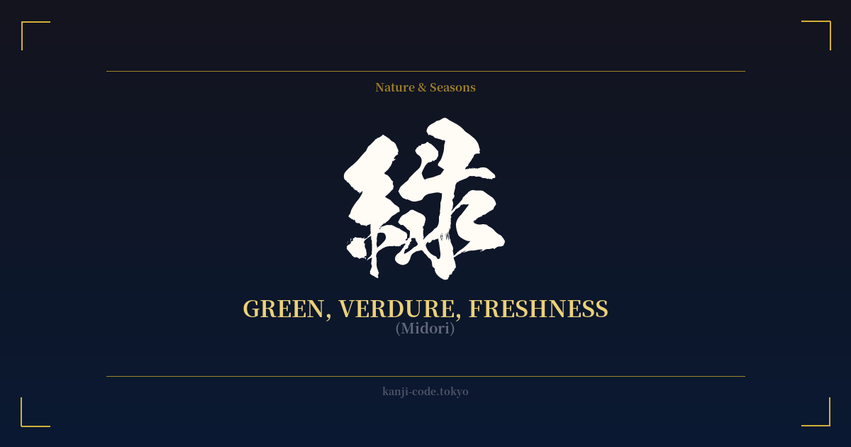
✍️ 緑 (Midori) — Cultural Context
The kanji 緑 (Midori) is more than just the word for a color; it is a profound symbol deeply woven into the fabric of Japanese culture, aesthetics, and connection to the natural world. Its very structure hints at this depth. The character is a combination of 糸 (ito), meaning 'thread' or 'silk,' and a phonetic component. This origin evokes the image of dyeing pristine silk threads a vibrant, shimmering green, capturing a sense of both natural pigment and human artistry.
In Japan, 'midori' conjures vivid imagery of the country's lush landscapes. It is the color of 'shinryoku' (新緑), the breathtakingly fresh green of new leaves in late spring, a sight celebrated in poetry and art. This connection to new growth imbues the kanji with meanings of youth, vitality, freshness, and new beginnings. It is the color of life itself, pulsing through forests of bamboo and mossy temple gardens.
This connection is so fundamental that Japan has a national holiday called 'Midori no Hi' (みどりの日), or Greenery Day. It's a day dedicated to appreciating nature, a testament to the cultural importance of the environment and the color that represents it. This concept is also central to 'shinrin-yoku' (森林浴), or 'forest bathing,' the practice of immersing oneself in nature to improve well-being, where being surrounded by 'midori' is key to the experience.
Historically, the language around color in Japan was different. For centuries, the word 'ao' (青), which now means blue, was used to describe a broader spectrum that included what we call green. You can still see remnants of this in terms like 'aoringo' (blue apple) for a green apple or 'aoshigō' (blue light) for a green traffic light. The introduction and widespread adoption of 緑 (Midori) as the specific term for green was a gradual evolution, making its modern usage clear and distinct.
As a symbol, 緑 represents not just the physical world but also abstract concepts like tranquility, harmony, and eternity, as seen in evergreen trees ('tokiwa-gi'). It can even be used poetically to describe lustrous, healthy black hair ('midori no kurokami'), where 'midori' implies a youthful, vibrant sheen. This rich tapestry of meaning makes 緑 a powerful and evocative character, representing a deep and abiding respect for the natural world.
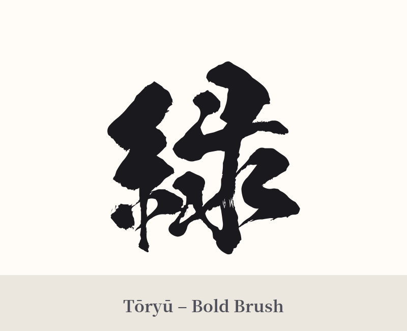
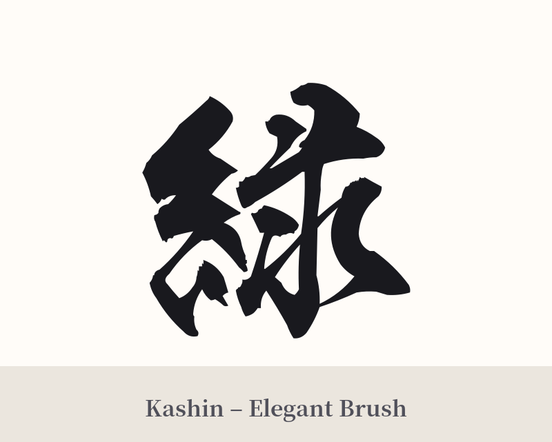
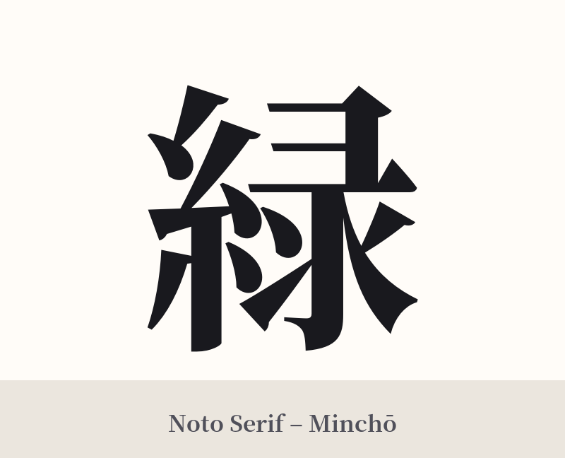
🖌️ Font Styles for 緑
The same kanji can look dramatically different depending on the calligraphy style. Choose a font that matches the mood you want for your tattoo or design.
🎨 Tattoo Suitability
📐 Tattoo Design Guide
The kanji 緑 (Midori) offers wonderful flexibility for a tattoo design due to its balanced structure and positive meaning.
– Placement: This character works well on the forearm, calf, or shoulder blade, where there is enough space to render its 14 strokes clearly. For a more subtle piece, the back of the neck or inner wrist are also good options, provided the artist is skilled with fine lines.
– Style: A traditional shodō (calligraphy) style is highly recommended. A dynamic Gyosho (semi-cursive) script can emphasize the feeling of life and movement, while a strong, clear Kaisho (block) style highlights its balance and stability. A minimalist, clean font can also work for a modern aesthetic.
– Visual Tips: Consider enhancing the design with complementary elements. A subtle watercolor wash of green behind the kanji can create a beautiful effect. Alternatively, incorporating a single maple leaf, a sprig of bamboo, or a delicate moss texture around the character can visually reinforce its connection to nature.
Comments