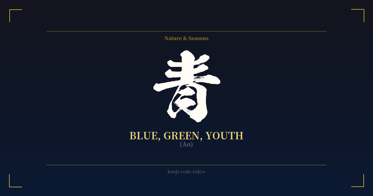
✍️ 青 (Ao) — Cultural Context
The kanji 青 (Ao) is a beautiful and deeply nuanced character, carrying meanings far beyond a simple color. Its story begins with its ancient form, a pictogram representing a plant sprouting from the earth, crowned with lush foliage. This origin ties the character inextricably to the vibrant, life-giving force of nature, which is why it historically encompassed what modern English speakers would distinguish as both blue and green.
In classical Japan, the color spectrum was perceived differently. There were four primary color terms: aka (red), kuro (black), shiro (white), and ao (blue/green). Ao described the color of the vast sea (青い海, aoi umi), the endless sky (青空, aozora), and also the fresh, new leaves of spring (青葉, aoba). This is why even today, a green traffic light is called an 青信号 (aoshingō) and a green apple is an 青りんご (aoringo). The more specific character for green, 緑 (midori), came into common use much later.
This connection to new growth and verdant nature gave rise to Ao's most powerful metaphorical meaning: youth. The word 青春 (seishun), which translates to 'youth' or 'adolescence,' literally means 'blue spring.' It captures the essence of a time in life that is vibrant, fresh, and full of potential, but also sometimes unripe or inexperienced. Someone who is a novice or a 'greenhorn' might be called an 青二才 (aonisai), which humorously translates to something like a 'blue two-year-old.'
This duality—the serene calm of the blue sky and the energetic vitality of green growth—makes 青 a symbol of potential and the beginning stages of life. It represents the uncarved block, the blank canvas, the period of blossoming before full maturity. It is a color of both tranquility and burgeoning energy, a concept cherished in Japanese aesthetics for its representation of the natural cycle of life. Whether seen in the deep indigo dyes of traditional fabrics or the fresh greens of a bamboo forest, Ao speaks to a fundamental and beautiful aspect of the world.
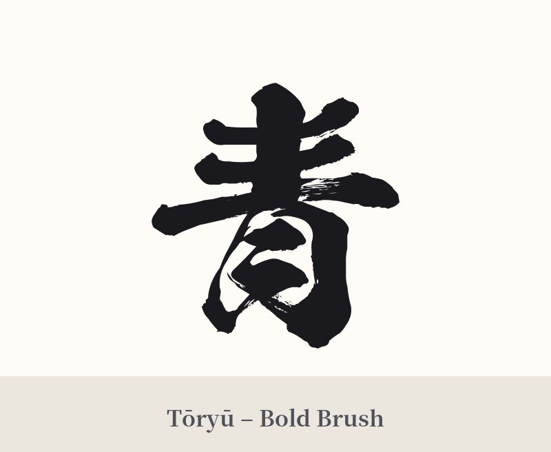
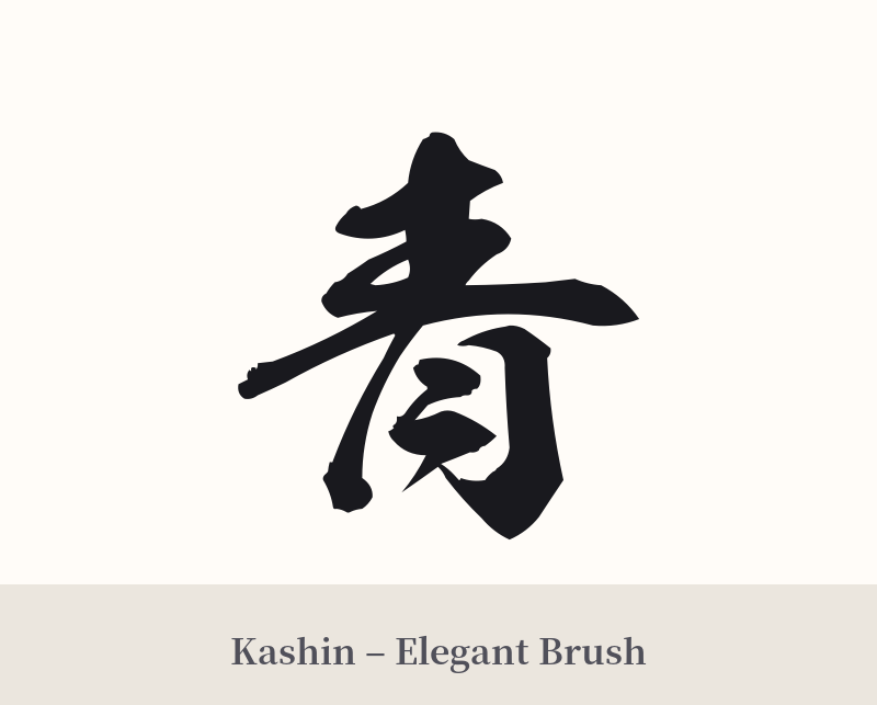
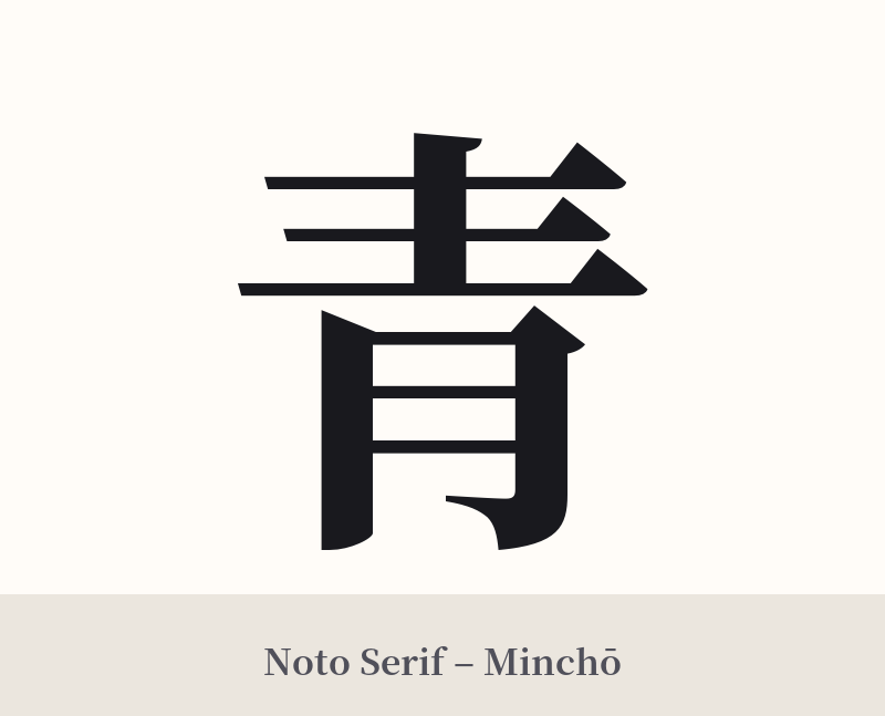
🖌️ Font Styles for 青
The same kanji can look dramatically different depending on the calligraphy style. Choose a font that matches the mood you want for your tattoo or design.
🎨 Tattoo Suitability
📐 Tattoo Design Guide
The simple elegance of 青 (Ao) makes it incredibly versatile for a tattoo design. Its balanced structure looks good at almost any size.
– Placement: For a small, discreet design, consider the wrist, ankle, or behind the ear. For a larger, more prominent piece, the forearm, calf, or shoulder blade provides a great canvas. It can also work well as a central element in a larger composition on the back or chest.
– Style Suggestions: A traditional calligraphy (shodō) style emphasizes its Japanese roots, with expressive brushstrokes conveying energy or tranquility. A minimalist, fine-line approach highlights the character's clean geometry. You could also consider a watercolor style, with washes of blue or green ink bleeding out from the character's edges, visually representing its meaning.
– Visual Tips: Consider integrating the character with imagery that reflects its meaning. Placing 青 within a wave design connects it to the sea (海), while surrounding it with leaves or bamboo links it to nature and youth (青春). Using a blue or deep indigo ink instead of standard black can add another layer of significance.
Comments