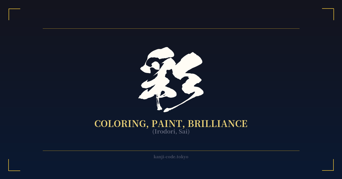
✍️ 彩 (Irodori, Sai) — Cultural Context
The kanji 彩, read as 'irodori' or 'sai', is a character brimming with artistic and life-affirming energy. While its most direct translation might be 'coloring' or 'paint', its true essence captures something far more profound: the vibrancy, brilliance, and richness that color adds to the world.
Historically, the character itself tells a story. It is composed of the radical 彡 (san), representing pattern, stripes, or light rays, and 采, which depicts a hand picking from a tree. This combination evokes the image of gathering beautiful, patterned things from nature—be it vibrant flowers, colorful leaves, or shimmering feathers. It’s a symbol of actively seeking and appreciating the beauty that surrounds us.
In Japanese culture, 'irodori' (彩り) is a concept that extends far beyond a simple palette. It is the artful arrangement of colors in a meal that makes it more appetizing. It is the splash of brilliant red leaves that gives an autumn landscape its breathtaking character. It is the specific combination of hues in a kimono that expresses a season or a mood. 'Irodori' is the nuance and flair that elevates the ordinary into something special and memorable.
This distinguishes it from the more common character for color, 色 (iro). While 色 refers to the static concept of color itself—red, blue, green—彩 speaks to the dynamic application and effect of those colors. It’s the difference between a tube of paint and the finished masterpiece. It implies a conscious act of adornment, of making something more beautiful, more interesting, and more alive.
You'll find 彩 in words like 色彩 (shikisai), meaning 'coloration' or 'hue', and 多彩 (tasai), meaning 'multicolored' or 'diverse'. Its presence signifies variety, richness, and a departure from the monochrome. As such, 彩 embodies a celebration of diversity, creativity, and the vivid tapestry of life itself.
🖌️ Font Styles for 彩
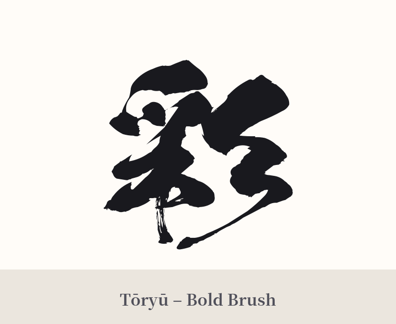
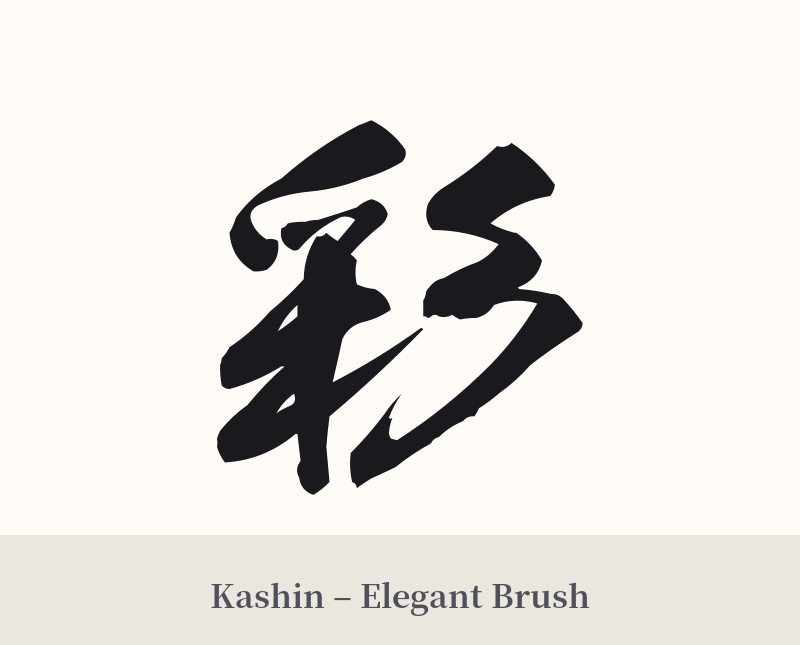
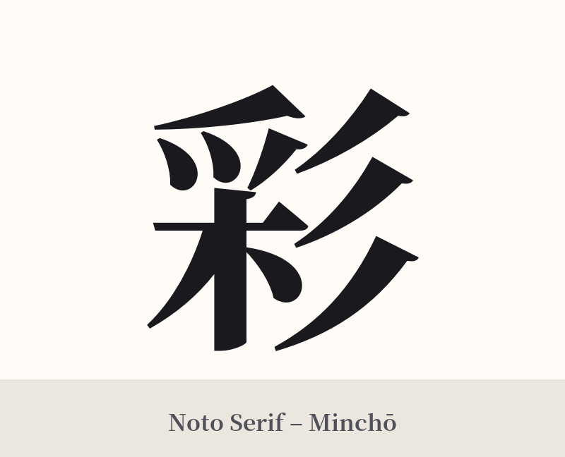
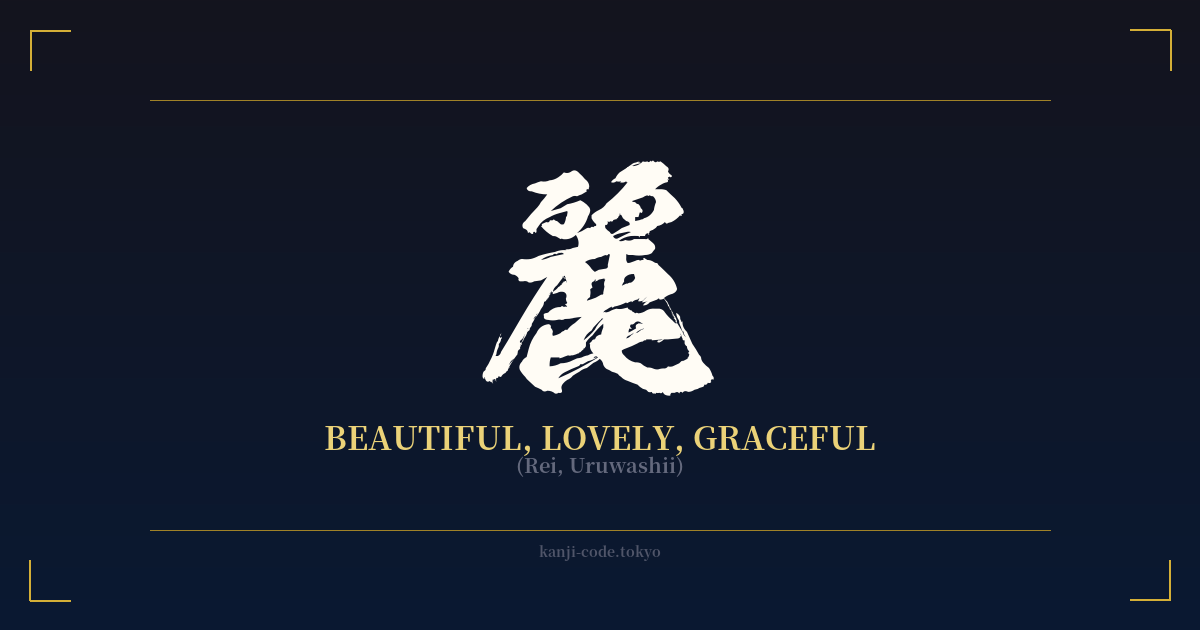
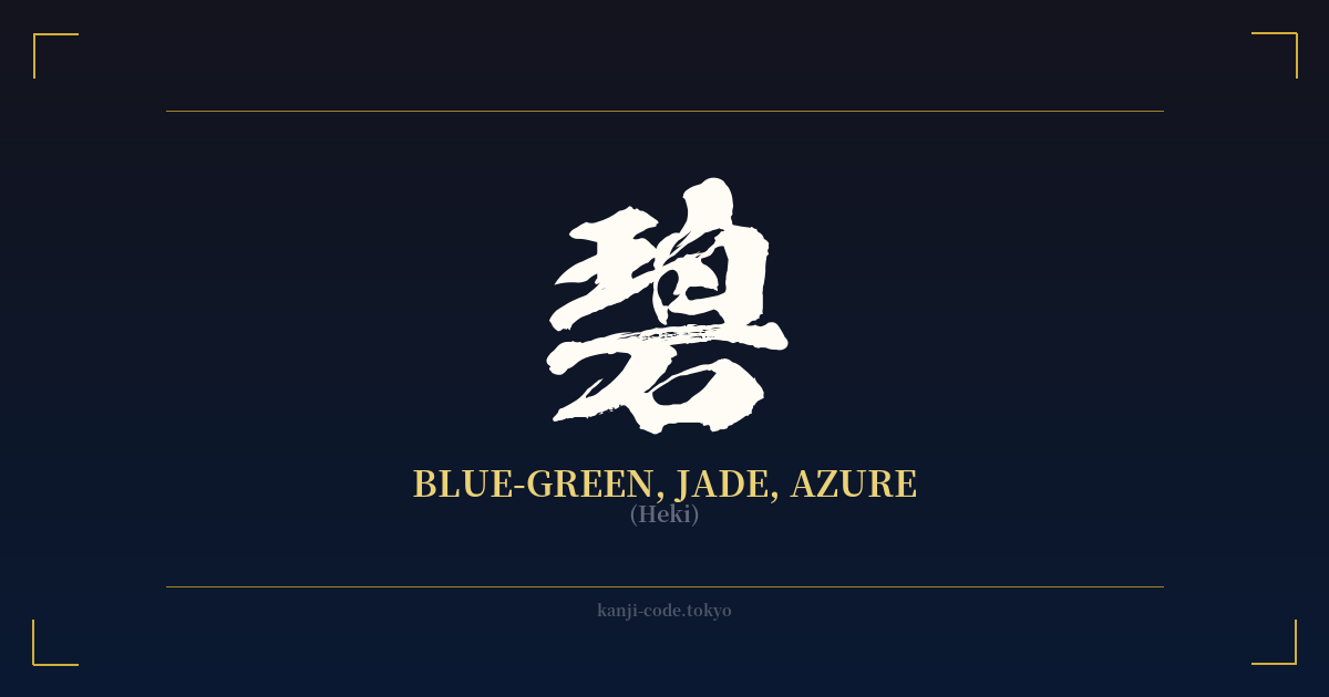
The same kanji can look dramatically different depending on the calligraphy style. Choose a font that matches the mood you want for your tattoo or design.
🎨 Tattoo Suitability
📐 Tattoo Design Guide
The kanji 彩 is a versatile and aesthetically pleasing choice for a tattoo. Its balance of strokes makes it suitable for various styles and placements.
– Placement: Consider areas like the inner forearm, the back of the neck just below the hairline, the calf, or the shoulder blade. These spots provide a clean canvas for a single, elegant character.
– Font Style: A semi-cursive (gyōsho) or cursive (sōsho) script can beautifully capture the artistic and flowing nature of 'irodori'. For a stronger, more declarative statement, a crisp, bold kaisho (block) script works exceptionally well.
– Visual Tips: Enhance the meaning by incorporating visual elements. A watercolor splash behind the kanji can directly reference the 'coloring' theme. A single, elegant brushstroke forming part of the character can highlight its connection to calligraphy and art. You could even have the kanji itself inked in a color other than black to literally embody its meaning.
Comments