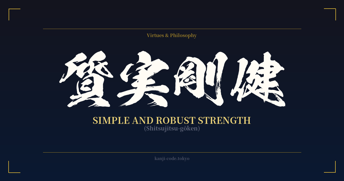
✍️ 質実剛健 (Shitsujitsu-gōken) — Cultural Context
質実剛健 (Shitsujitsu-gōken) is a Japanese four-character idiom, or yojijukugo, that encapsulates a deeply admired set of virtues. It translates to concepts like 'unadorned simplicity and fortitude,' 'simple and robust,' or 'stoic and sturdy.' It champions a character that is sincere, honest, and strong, without any need for superficial decoration or pretense.
The idiom is composed of two distinct parts. The first, 質実 (shitsujitsu), combines 'substance' (質) and 'truth' or 'fruit' (実). Together, they signify being genuine, sincere, and full of substance—grounded in reality, not appearances. It's the quality of being authentic through and through.
The second part, 剛健 (gōken), brings together 'sturdy strength' (剛) and 'health' or 'persistence' (健). This describes a strength that is not just powerful but also healthy, resilient, and enduring. It's the fortitude of both mind and body, a ruggedness that can withstand hardship.
Historically, the concept of Shitsujitsu-gōken gained prominence during the Meiji Period (1868-1912) as Japan rapidly modernized. It was promoted as an ideal for the nation's youth, particularly in educational institutions and the military. It was seen as a way to build a strong, disciplined, and sincere national character, blending traditional samurai ethics with the demands of a new era. The philosophy encouraged valuing substance over style, hard work over easy gains, and inner strength over outward display.
In modern Japan, Shitsujitsu-gōken is still a highly respected compliment. It can be used to describe a person with a strong work ethic and unwavering integrity, a company known for its reliable products and honest business practices, or even a design aesthetic that is functional, durable, and free of unnecessary frills. It stands in direct contrast to a culture of flashiness, celebrating the quiet, dependable strength that forms the bedrock of true character.
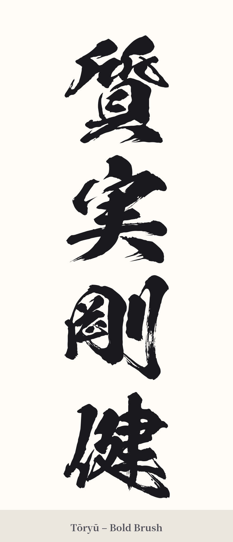
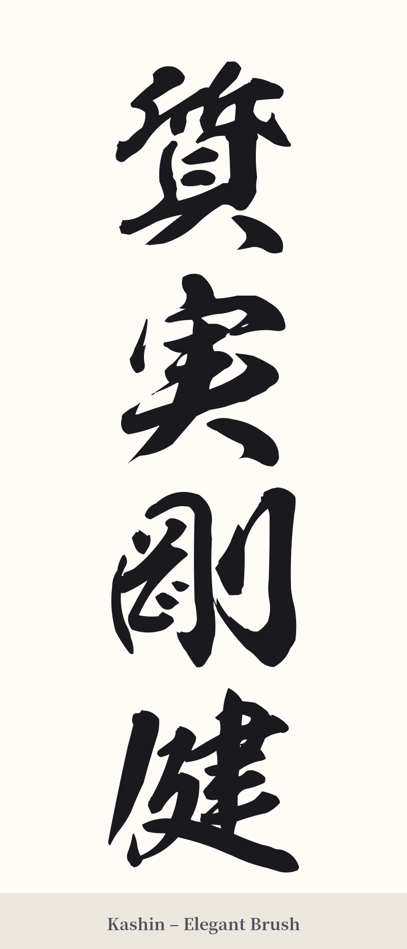
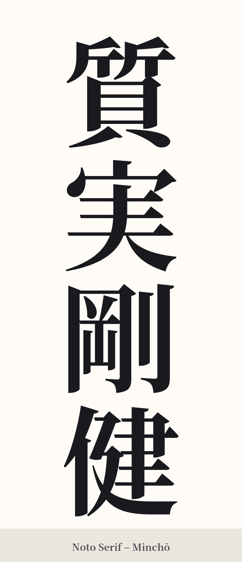
🖌️ Font Styles for 質実剛健
The same kanji can look dramatically different depending on the calligraphy style. Choose a font that matches the mood you want for your tattoo or design.
🎨 Tattoo Suitability
📐 Tattoo Design Guide
As a four-character idiom, 質実剛健 is perfectly suited for a vertical tattoo design. Its inherent balance and visual weight make it a powerful statement piece.
– Placement: The most impactful placements are vertical. Consider the spine, the length of the forearm (either inner or outer), the side of the calf, or along the ribs. These locations allow the four characters to flow downwards, creating a strong visual line.
– Font Style: For a concept like Shitsujitsu-gōken, traditional calligraphy styles work best. A crisp, strong Kaisho (block script) will emphasize the 'robust' and 'sturdy' aspects of the meaning. For a more artistic and slightly less rigid feel, a Gyosho (semi-cursive script) can add a touch of personal flair while maintaining legibility.
– Visual Tips: Given the complexity of the characters, size is crucial. Avoid making it too small. Ensure there is enough negative space between each character so they don't visually merge. This isn't a subtle design; it's meant to be a bold declaration of principle.
Comments