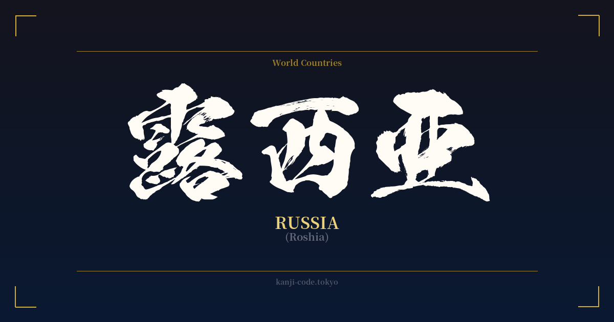
✍️ 露西亜 (Roshia) — Cultural Context
The term 露西亜 (Roshia) is a fascinating window into a specific period of Japanese history, particularly the Meiji Era (1868-1912). During this time, Japan was rapidly opening up to the world and needed ways to write foreign names and concepts. The solution was often ateji, the practice of using kanji characters for their phonetic sounds rather than their meanings.
露西亜 is a classic example of ateji. The characters were chosen to phonetically approximate the sound of "Russia." 露 provides the "Ro" sound, 西 gives the "shi" sound, and 亜 contributes the final "a" sound. While the individual characters mean "dew," "west," and "Asia," respectively, these meanings are completely disregarded in this context. The word functions solely as a sound-based label.
This method was common for naming Western countries. For instance, the United States became 米国 (Beikoku, from "America"), the United Kingdom became 英国 (Eikoku, from "England"), and France became 仏蘭西 (Furansu). These names were official and widely used in documents, literature, and newspapers of the time.
However, as the 20th century progressed, the Japanese writing system evolved. The katakana syllabary became the standard and preferred method for writing foreign words, names, and loanwords due to its simplicity and clarity. It explicitly signals that a word is of foreign origin. Consequently, 露西亜 was replaced by ロシア (Roshia) in everyday use. Today, seeing the kanji version is rare and gives off a historical, formal, or even nationalistic feel, depending on the context.
For someone interested in Japanese, understanding 露西亜 is a lesson in linguistic history. It shows how the language adapted to global interaction before the standardization of katakana. While visually rich and complex, it's a relic of a bygone era, a phonetic placeholder rather than a word with deep symbolic roots.
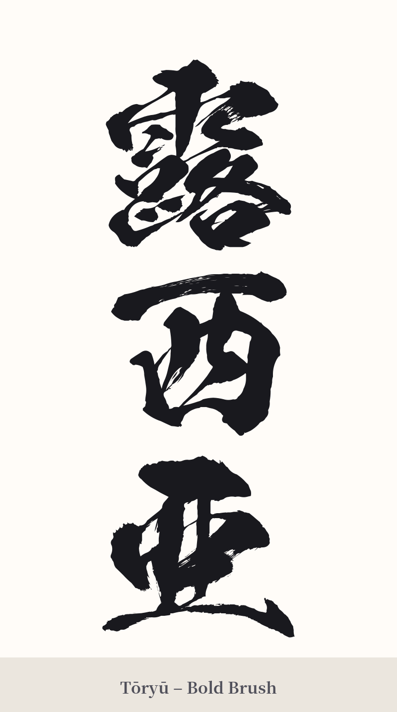
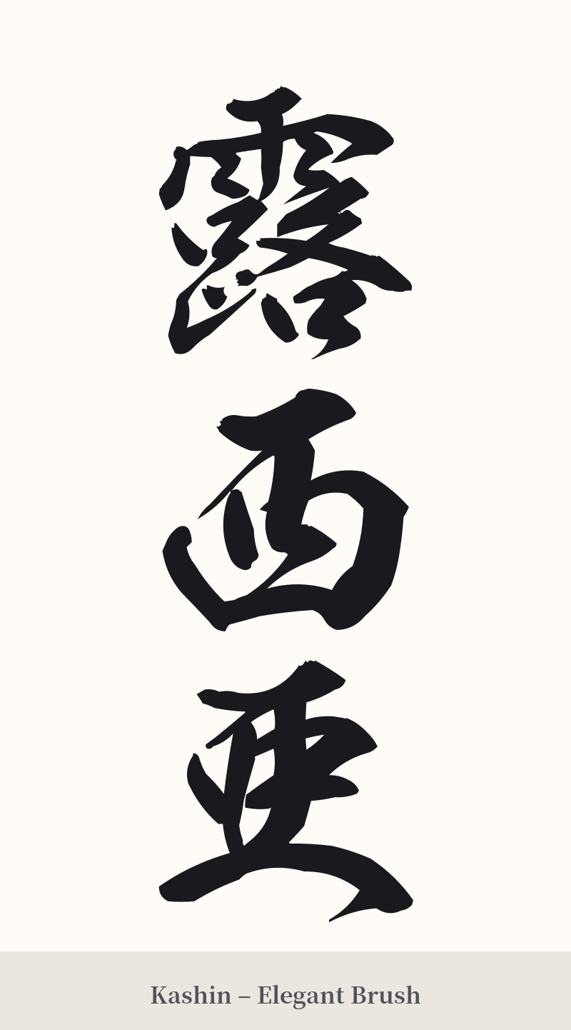
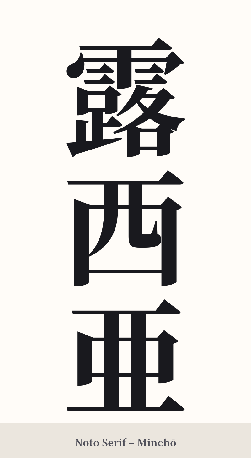
🖌️ Font Styles for 露西亜
The same kanji can look dramatically different depending on the calligraphy style. Choose a font that matches the mood you want for your tattoo or design.
🎨 Tattoo Suitability
📐 Tattoo Design Guide
If you choose to proceed with a 露西亜 tattoo, careful design is crucial to honor its historical nature and visual complexity.
– Placement: This three-character compound requires a larger surface area to be legible. The forearm, calf, or along the spine are excellent choices. Avoid small areas like the wrist or ankle, as the dense strokes of the first character, 露 (21 strokes), will blur over time.
– Orientation: A vertical alignment is highly recommended. This traditional layout enhances the classic, historical feel of the kanji and is how it would have commonly been written in the past.
– Font Style: Opt for traditional, strong calligraphy styles. A bold Kaisho (block script) will give it weight and clarity, while a flowing Gyosho (semi-cursive script) can add an artistic, historical flair. Avoid thin, minimalist, or overly modern fonts that would clash with the word's classic origin.
Comments