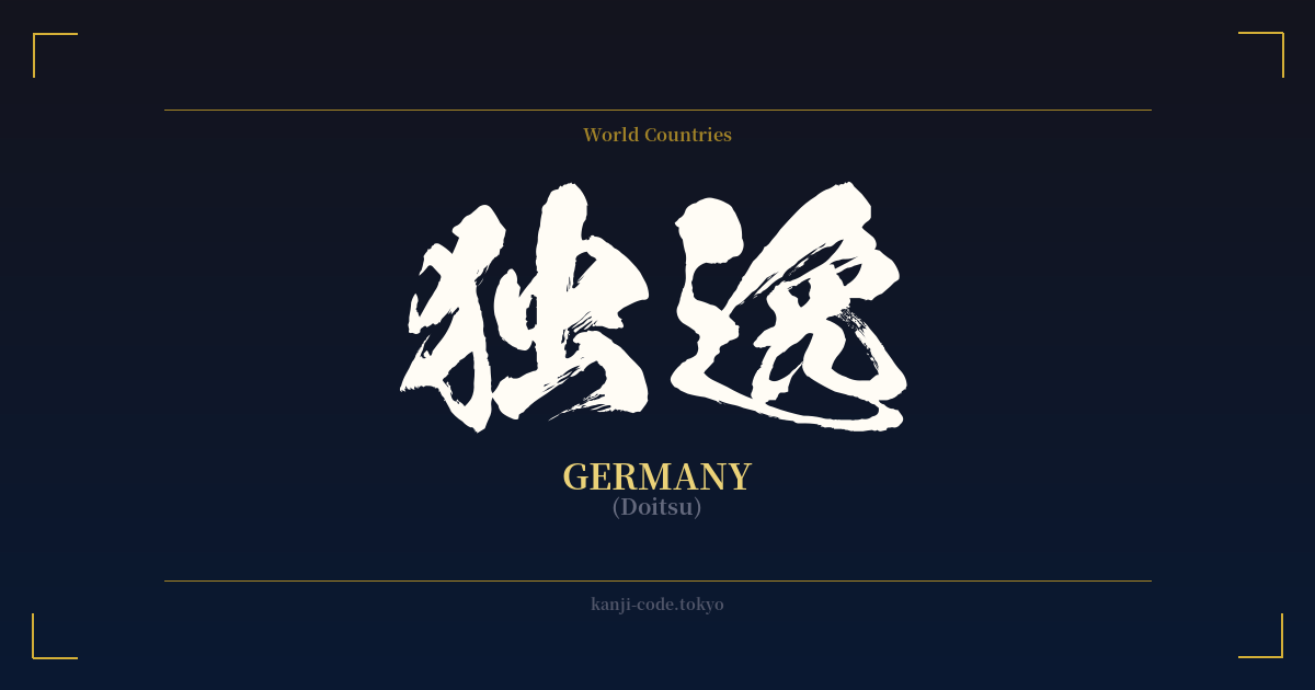
✍️ 独逸 (Doitsu) — Cultural Context
The word 独逸 (Doitsu) is a fascinating window into a specific period of Japanese history. It is an example of 'ateji' (当て字), where kanji characters are used to phonetically represent a foreign word, with little or no regard for their original meanings.
In this case, 独逸 was created to approximate the sound of the German word 'Deutsch'. The character 独 was chosen for the 'Do' sound, and 逸 for the 'itsu' sound, together forming 'Doitsu'. This method of transcription was common during the Meiji Restoration (1868-1912), a time when Japan was rapidly opening up to the West and needed ways to write down new foreign names, concepts, and technologies.
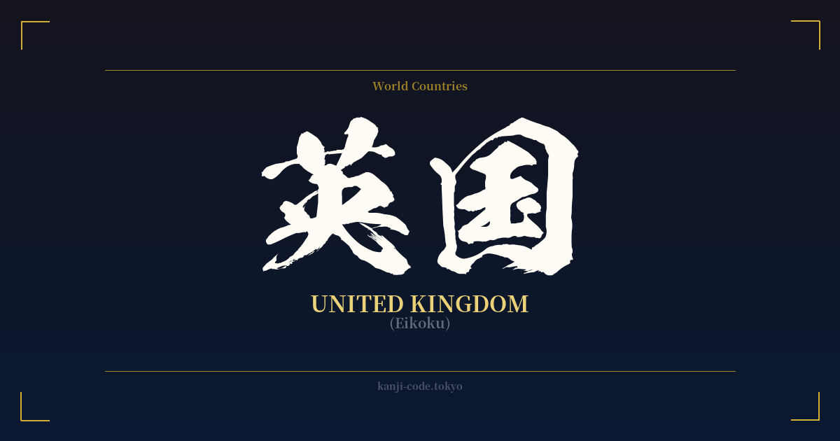
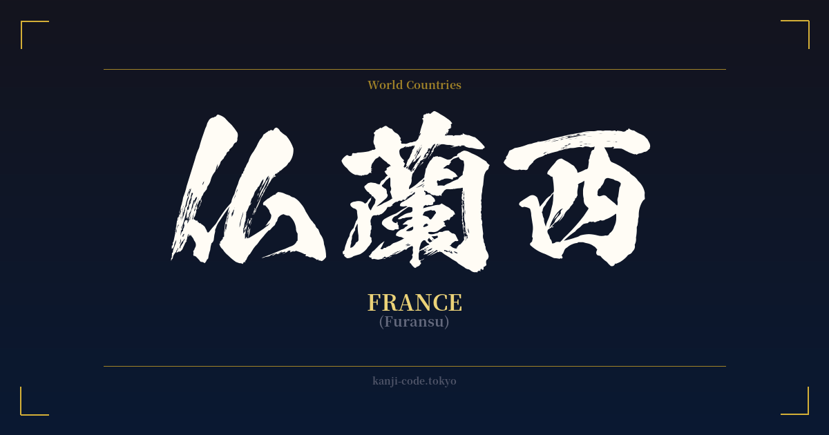
Many country names were given ateji spellings during this era. For instance, the United States became 米国 (Beikoku), France became 仏蘭西 (Furansu), and the United Kingdom became 英国 (Eikoku). These names were constructed by selecting kanji that matched the sounds of the foreign words, often using the first character as a formal abbreviation (e.g., 米 for America, 独 for Germany).
Over time, however, Japan developed and standardized the katakana script specifically for foreign loanwords. Katakana provides a much more flexible and direct way to represent foreign sounds without the baggage of kanji meanings. Consequently, writing 'Germany' as ドイツ (Doitsu) in katakana became the standard in newspapers, on television, and in everyday conversation.
Today, the use of 独逸 is largely confined to historical documents, formal treaties, and academic contexts. You might see it in the official name of a historical pact, like the 日独伊三国同盟 (Nichidokui Sangoku Dōmei), the Tripartite Pact between Japan, Germany, and Italy. For the average Japanese person, seeing 独逸 in a casual context would feel dated and overly formal, much like using an archaic spelling in English.
Therefore, while 独逸 is historically significant and phonetically clever, it does not carry the cultural weight or symbolic meaning of other kanji compounds. Its meaning is purely denotative: it simply means 'Germany'.
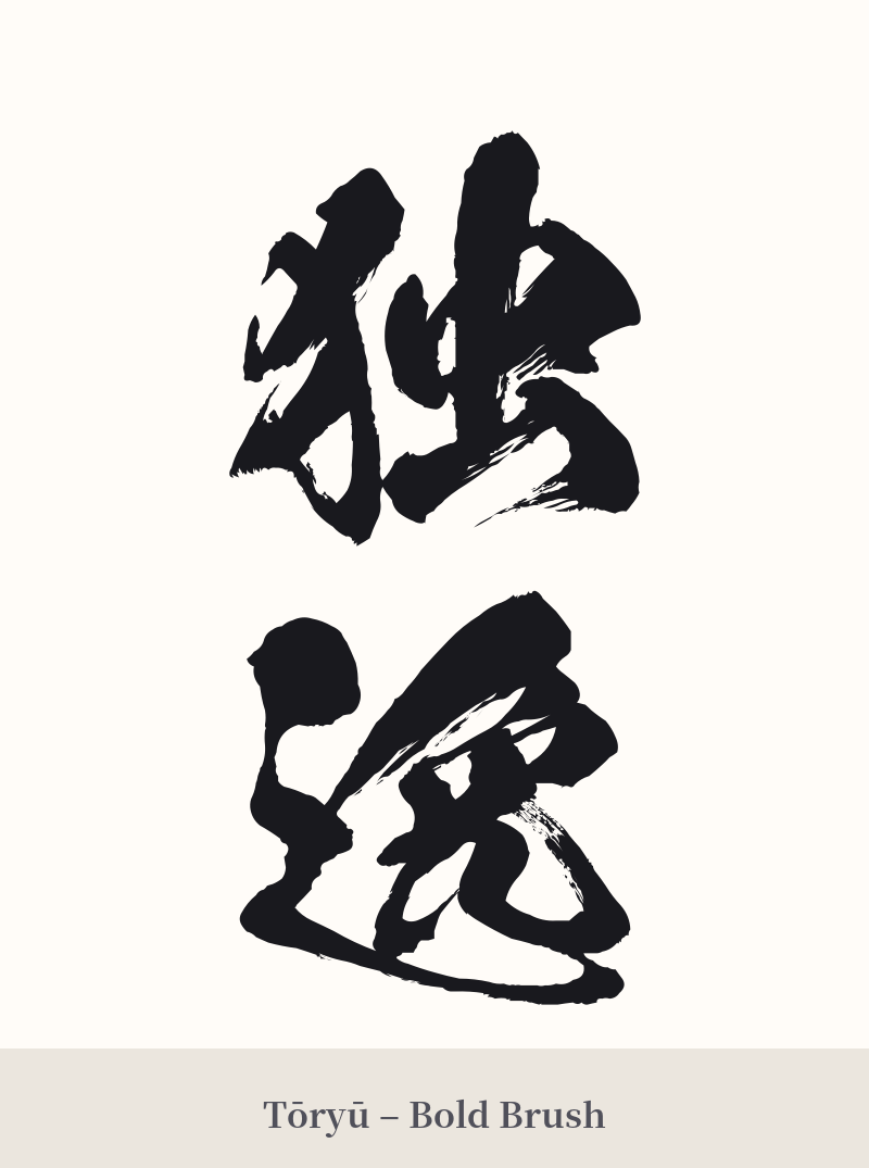
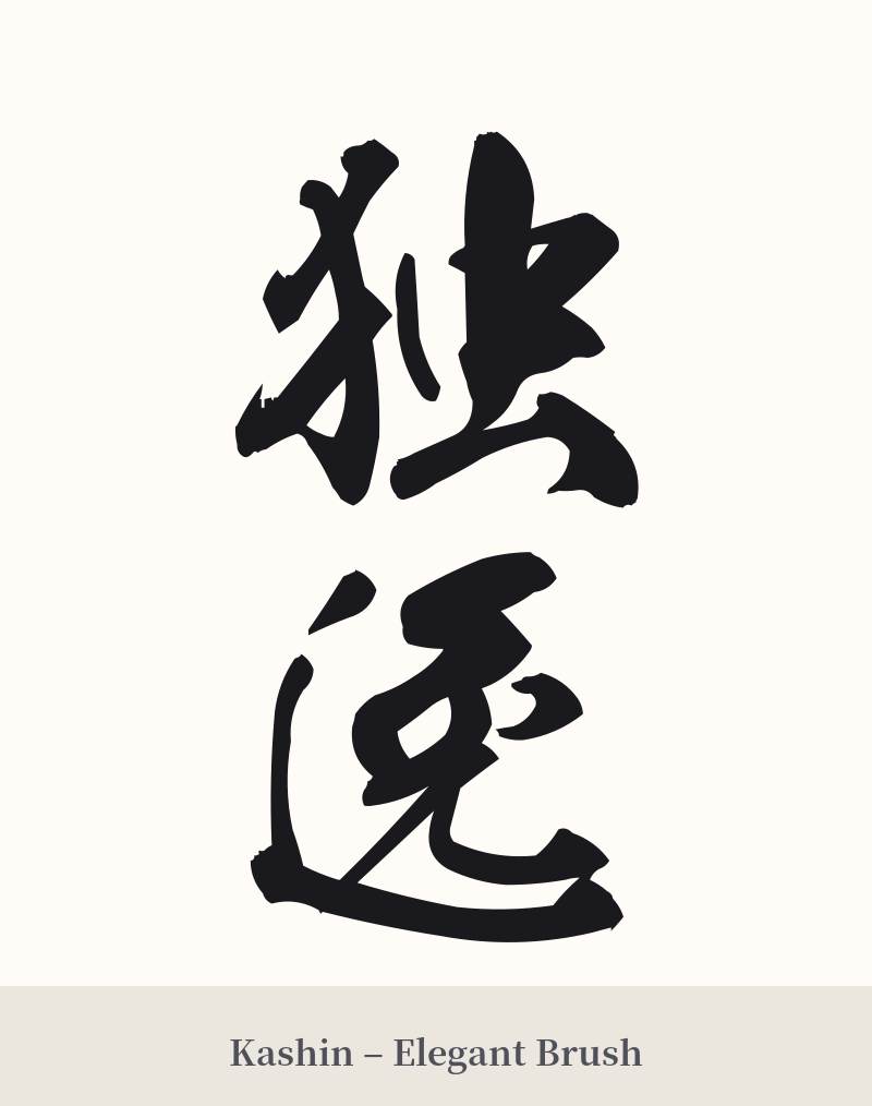
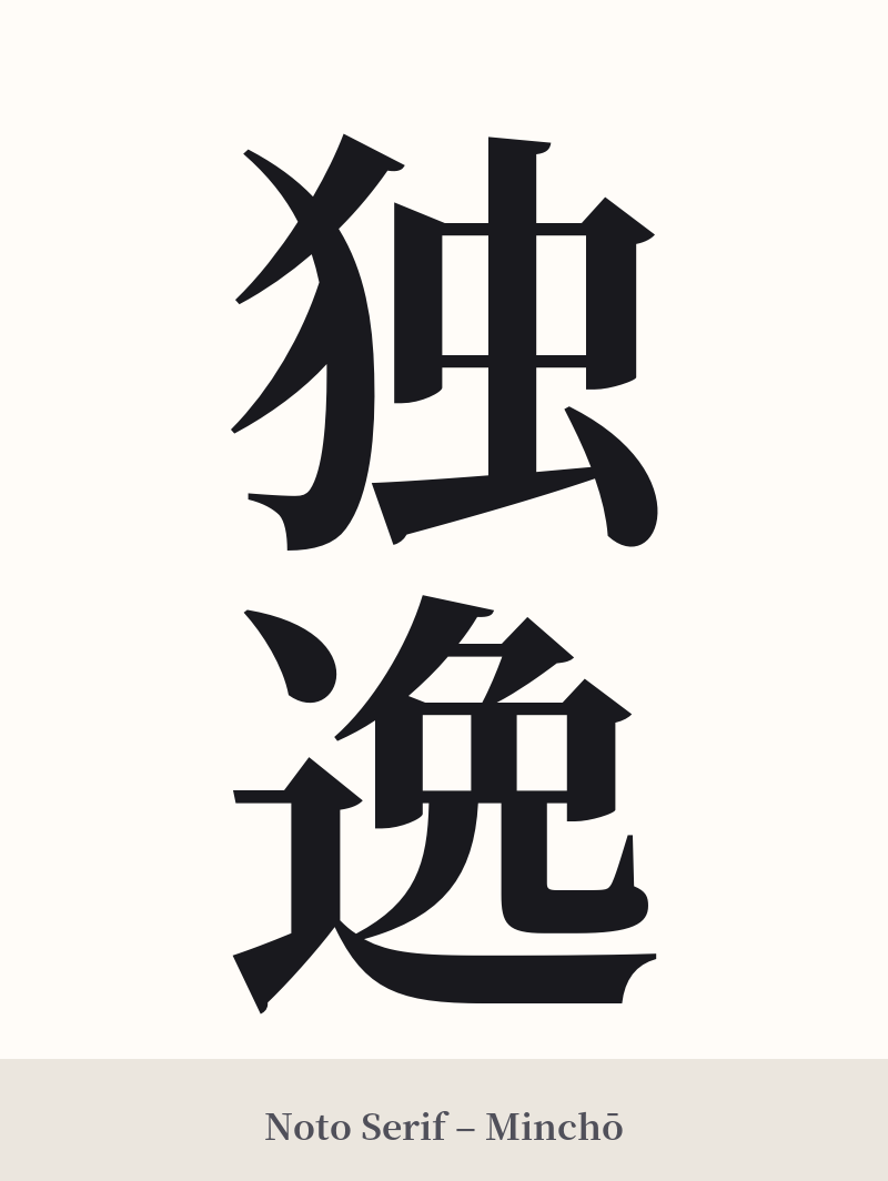
🖌️ Font Styles for 独逸
The same kanji can look dramatically different depending on the calligraphy style. Choose a font that matches the mood you want for your tattoo or design.
🎨 Tattoo Suitability
📐 Tattoo Design Guide
If you choose to get a tattoo of 独逸, embracing its historical and formal nature is key to a successful design.
– Placement: Vertical alignment is the most traditional and visually appealing orientation for this two-character word. Consider placements like the inner forearm, the calf, or running down the spine to emphasize its length.
– Font Style: A classic, crisp Mincho (serif) font would complement its formal origins. For a more artistic and traditional feel, a semi-cursive (Gyosho) or standard script (Kaisho) calligraphy style would be excellent choices. Avoid overly modern or geometric fonts, as they would clash with the word's archaic feel.
– Visual Tips: Since the word itself doesn't have a symbolic visual meaning, the focus should be on the aesthetic quality of the characters. Ensure the artist pays attention to the balance and stroke order. A simple, clean execution without additional imagery is often the most powerful approach for this type of kanji.
Comments