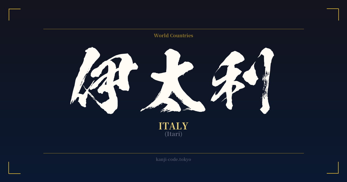
✍️ 伊太利 (Itari) — Cultural Context
伊太利 (Itari) is a fascinating window into a specific moment in Japanese history: the Meiji Restoration (1868-1912). As Japan opened its borders and rapidly modernized, it needed to incorporate a flood of foreign concepts, technologies, and names. For country names, one method was 'ateji' (当て字), where kanji were chosen purely for their phonetic sound to approximate the foreign pronunciation, while their original meanings were disregarded.
This is precisely how 伊太利 was born. The characters 伊 (i), 太 (ta), and 利 (ri) were selected to mimic the sound of 'Italia'. The individual meanings of the characters—'that one,' 'plump/big,' and 'profit'—are completely irrelevant in this context. The word does not mean 'big profitable one' or any other literal combination; it is simply a sound-based transcription.
However, this practice of using ateji for foreign words was often clumsy and led to confusion. Was the reader supposed to interpret the sounds or the meanings? To solve this, the Japanese language increasingly standardized the use of Katakana, a separate syllabary specifically for foreign loanwords, technical terms, and onomatopoeia. Over time, 伊太利 was almost entirely replaced by its modern Katakana equivalent: イタリア (Itaria).
Today, you will almost never see 伊太利 used in daily life. It is considered archaic and historical. Its use is confined to very specific, often nostalgic or academic contexts, such as on the signage of an old restaurant trying to evoke a retro-European feel, in historical texts, or in certain formal abbreviations. For example, the kanji 伊 is still sometimes used as a one-character abbreviation for Italy in contexts like 日伊関係 (Nichi-I kankei), meaning 'Japan-Italy relations'.
For anyone considering this word, it's crucial to understand this history. 伊太利 is not the living, breathing word for Italy in Japan. It is a linguistic fossil, a beautiful but dormant relic of Japan's journey into the international world.
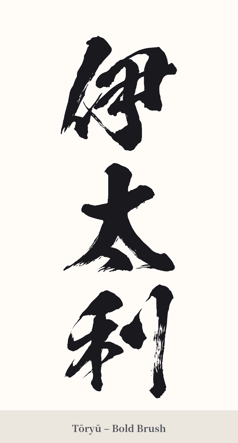
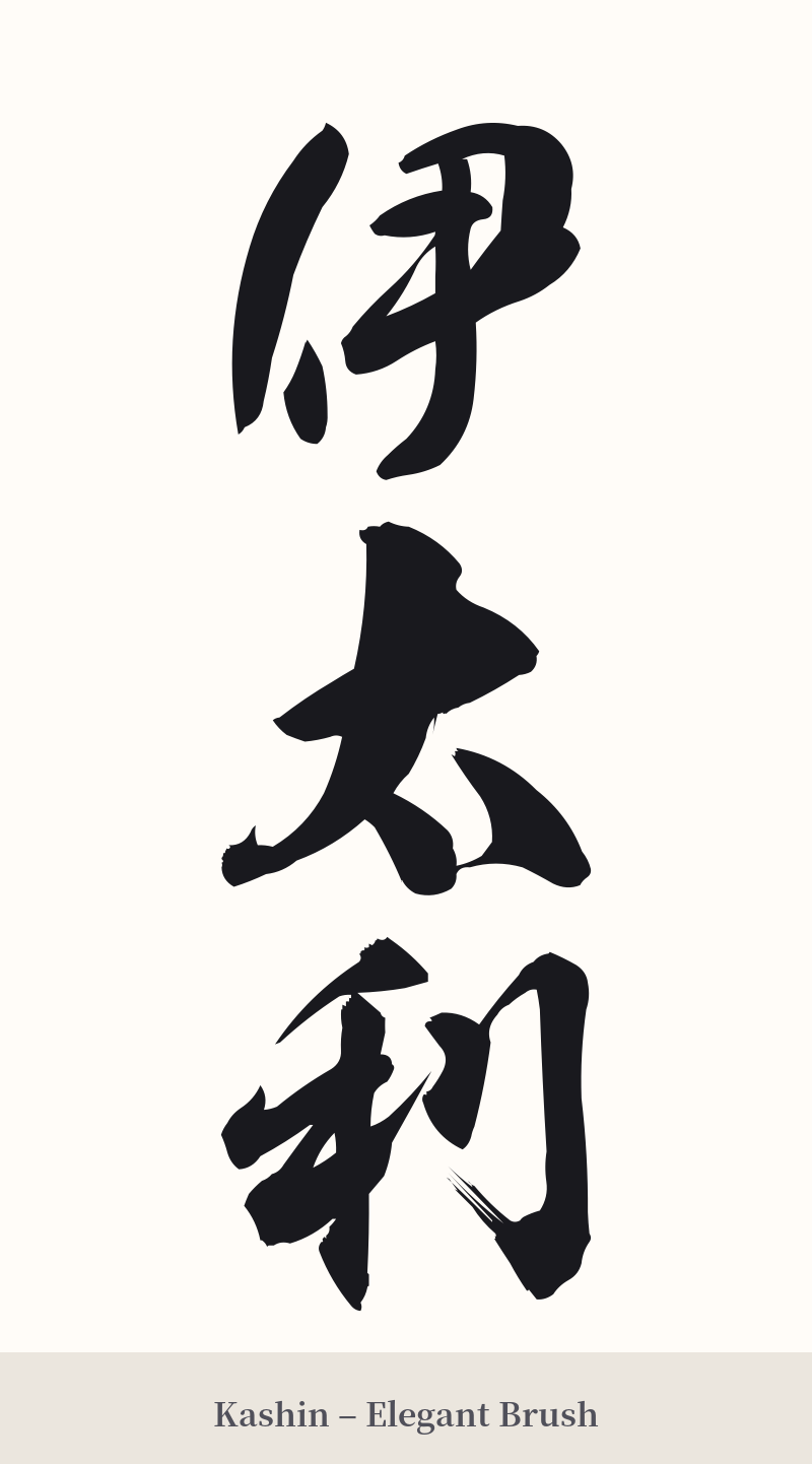
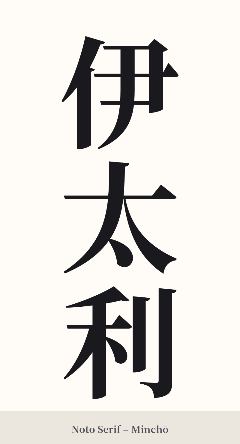
🖌️ Font Styles for 伊太利
The same kanji can look dramatically different depending on the calligraphy style. Choose a font that matches the mood you want for your tattoo or design.
🎨 Tattoo Suitability
📐 Tattoo Design Guide
Given its three-character structure and historical nature, 伊太利 lends itself to traditional and classic tattoo designs.
– Placement: A vertical orientation is highly recommended. This looks elegant running down the spine, along the forearm, or on the calf. A horizontal placement across the upper back or chest also works well.
– Font Style: To honor its archaic feel, choose a traditional brush script. Kaisho (楷書), the standard block script, provides clarity, while Gyosho (行書), a semi-cursive style, can add a more fluid, historical feel. Avoid modern, geometric, or sans-serif fonts, as they would clash with the word's classic origin.
– Visual Tips: Let the characters be the focus. Avoid cluttering the design with other Italian imagery like flags or landmarks. The power of this design lies in its subtle, historical typography. A simple black or dark grey ink is most effective.
Comments