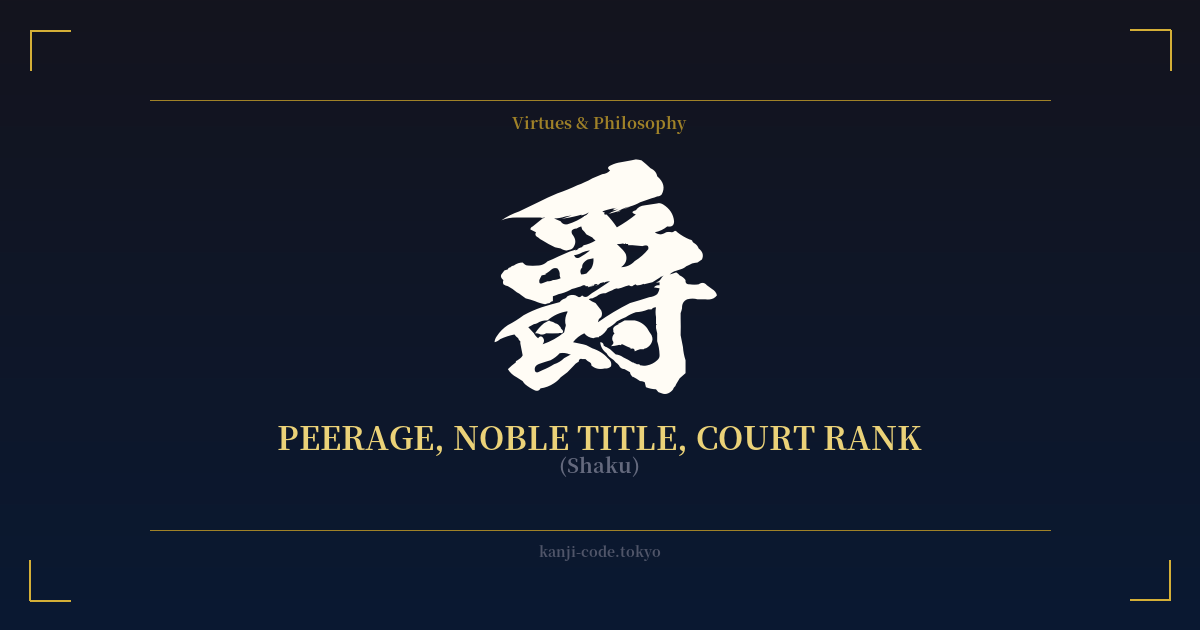
✍️ 爵 (Shaku) — Cultural Context
The kanji 爵 (shaku) carries the weight of ancient hierarchies and the gilded world of nobility. Its story begins not with people, but with an object: a ritual bronze wine vessel used in ancient Chinese ceremonies. The character’s very shape is a pictograph, combining elements that represent a sparrow-like bird (a common decorative motif) and a vessel with legs. In these early courts, the type and intricacy of the ritual items one was permitted to use were directly tied to one’s status. The vessel was a symbol of rank.
Over time, the meaning of 爵 shifted from the object itself to the rank of the person entitled to use it. It became the definitive character for peerage and court titles. This system was famously codified in ancient China as the Goshaku (五爵), the five ranks of nobility: Duke (公), Marquis (侯), Count (伯), Viscount (子), and Baron (男). This entire framework was imported into Japan, shaping its own aristocratic structures for centuries.
In Japan, the most prominent use of this system was during the Meiji Restoration with the establishment of the Kazoku (華族), a new peerage class designed to merge the old court nobility (kuge) and feudal lords (daimyō). Titles like Kōshaku (公爵, Duke) and Danshaku (男爵, Baron) were directly derived from this ancient system. This class held significant social and political power until it was officially abolished by the post-WWII constitution in 1947.
Today, the character 爵 is almost exclusively historical or literary. You won’t hear it in everyday conversation. Its presence is felt most strongly in period dramas, historical texts, and fantasy worlds in manga, anime, and video games, where titles of nobility add a layer of world-building and gravitas. For example, the title of the character Baron Humbert von Gikkingen in the Studio Ghibli film “The Cat Returns” is a direct nod to this European-style peerage system, which uses the same kanji in its Japanese translation.
Unlike kanji like 侍 (Samurai) or 武士 (Bushi), which evoke a warrior ethos and a code of conduct, 爵 is purely about status, lineage, and hierarchical position. It represents a formal, inherited, or bestowed rank within a court, making it feel more static and conceptual than the dynamic identity of a warrior.
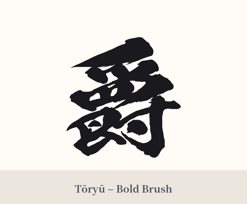
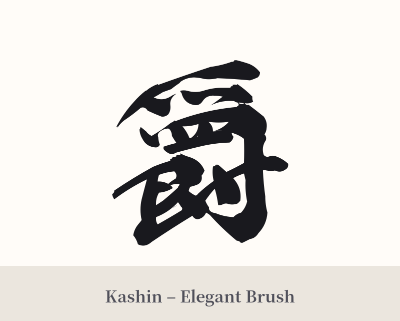
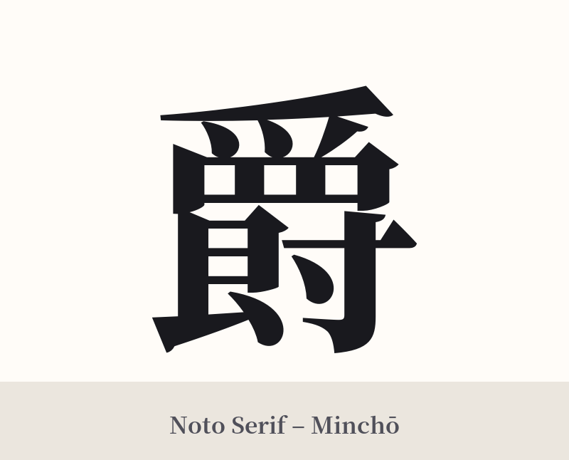
🖌️ Font Styles for 爵
The same kanji can look dramatically different depending on the calligraphy style. Choose a font that matches the mood you want for your tattoo or design.
🎨 Tattoo Suitability
📐 Tattoo Design Guide
Due to its complexity and formal meaning, the kanji 爵 requires careful consideration in a tattoo design.
– Placement: This character has 17 strokes, making it ill-suited for small areas like the wrist or ankle where lines can blur over time. It is better suited for medium-to-large placements like the forearm, calf, shoulder blade, or back, where an artist can render its details clearly.
– Font Style: An elegant, traditional script is the best match. A precise and stately Kaisho (block script) emphasizes its formal, official nature. Alternatively, a flowing Gyōsho (semi-cursive script) can give it a more artistic and historical feel, as if lifted from an ancient scroll.
– Visual Tips: Ensure you work with a tattoo artist skilled in Japanese calligraphy to maintain the character’s balance and stroke order. Because it’s an abstract concept, consider pairing it with imagery that reinforces the theme of nobility, such as a family crest (mon), a stylized crown, or an elegant bird motif that echoes the character’s etymological roots.
Comments