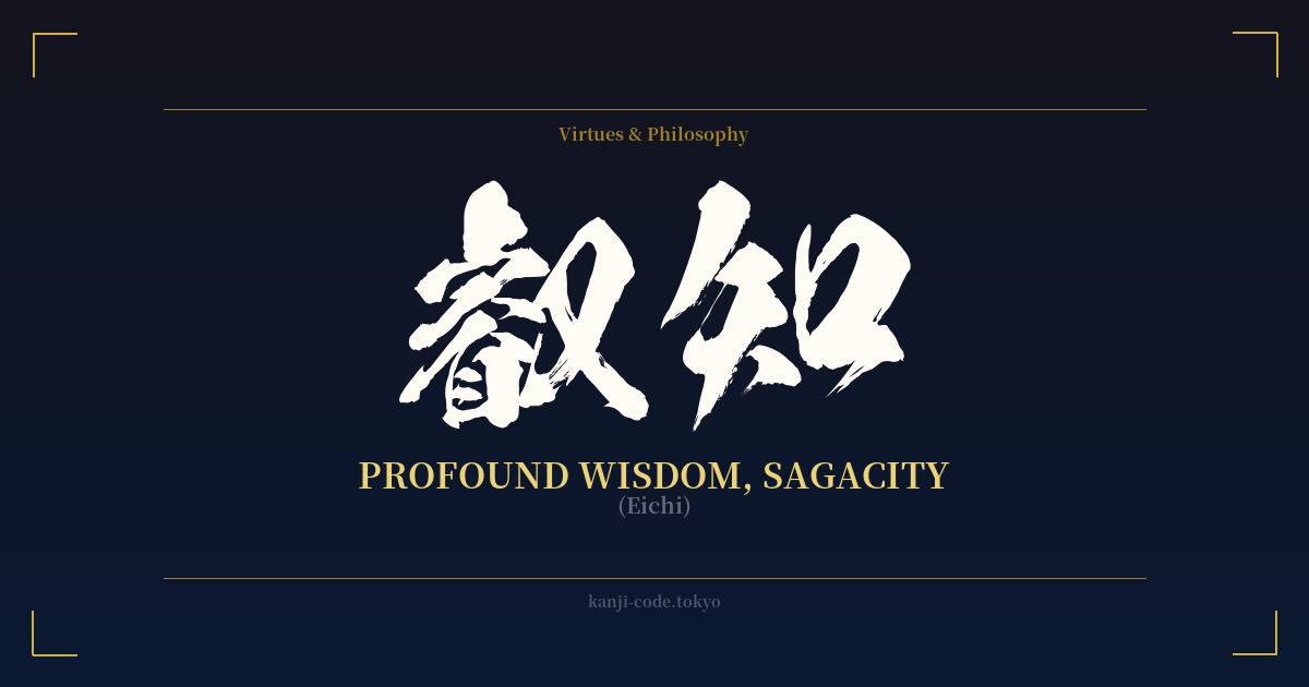
✍️ 叡知 (Eichi) — Cultural Context
叡知 (Eichi) is a Japanese word that transcends the simple English translation of 'wisdom'. It represents a level of understanding that is deep, clear, and all-encompassing. This isn't the practical, everyday wisdom of 知恵 (chie), nor is it the accumulation of facts that is 知識 (chishiki). 叡知 is sagacity—a profound insight into the fundamental nature of things, often with a spiritual or philosophical dimension.
The power of the word comes largely from its first character, 叡 (EI). This kanji is rare and carries a distinct air of reverence. Historically, it was associated with the emperor or with divine intelligence, signifying a perception so keen it seems almost superhuman. It suggests the ability to see through complexity and grasp the essential truth. When this 'penetrating insight' is combined with 知 (CHI), meaning 'to know' or 'wisdom', the result is a term for the highest form of intellectual and spiritual attainment.
In Japanese culture, 叡知 is not something one simply possesses; it is something pursued. It resonates strongly with concepts in Buddhism, where the ultimate goal is enlightenment (悟り, satori), a state of profound wisdom that liberates the mind. Therefore, 叡知 is often linked to spiritual masters, great philosophers, and revered leaders who have demonstrated exceptional judgment and a deep understanding of humanity.
Because of its formal and literary nature, you won't hear 叡知 used in casual conversation. Its use is reserved for texts, speeches, and discussions that touch upon profound subjects. This formality adds to its weight and seriousness. Choosing 叡知 is to align oneself with the pursuit of deep, universal truths, not just cleverness or book smarts. It is a declaration of aspiration towards a more complete and insightful way of being.
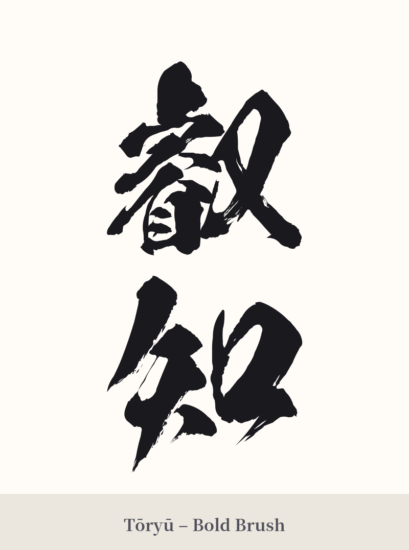
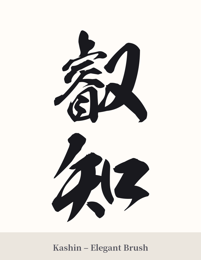
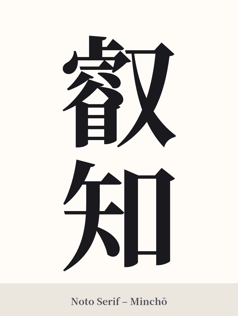
🖌️ Font Styles for 叡知
The same kanji can look dramatically different depending on the calligraphy style. Choose a font that matches the mood you want for your tattoo or design.
🎨 Tattoo Suitability
📐 Tattoo Design Guide
For a tattoo of 叡知, clarity and presence are key. The design needs to respect the complexity and gravitas of the term.
– Placement: A vertical alignment is traditional and highly recommended. Consider places that offer a long, flat canvas, such as the forearm, the side of the calf, or running down the spine. This allows the characters to breathe and be appreciated individually and as a whole.
– Font Style: Traditional calligraphy styles work best. A bold Kaishotai (block script) will provide structure and clarity, especially for the intricate 叡 character. For a more fluid and artistic feel, a Gyosho (semi-cursive) script can be beautiful, but ensure the artist is skilled in Japanese calligraphy to maintain legibility.
– Visual Tips: Do not shrink this design. The 16 strokes in 叡 demand a certain size to look sharp and age well. It functions powerfully as a standalone piece. Adding other elements can risk cluttering the design, but a very subtle enso circle or a faint lotus blossom behind the kanji could work if the kanji remains the clear focus.
Comments