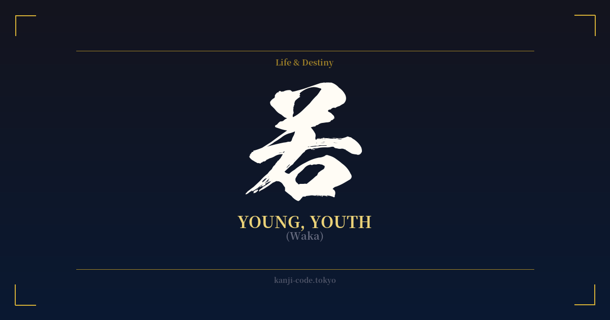
✍️ 若 (Waka) — Cultural Context
The kanji 若 (waka) is a simple yet profound character that encapsulates the essence of youth in Japanese culture. Its meaning extends beyond a mere numerical age, touching upon the qualities of freshness, vitality, potential, and even a touch of immaturity or inexperience. The character itself carries a visual history, with its top radical (艹) representing grass or plants, evoking the image of a new sprout pushing through the earth. This etymology beautifully links the concept of youth with the unstoppable, vibrant energy of new growth in nature.
In the Japanese language, 若 serves as a fundamental building block. It forms the adjective 若い (wakai), meaning 'young,' and the noun 若者 (wakamono), meaning 'young person' or 'the youth.' It can also act as a prefix, as seen in words like 若葉 (wakaba), 'new leaves,' or 若水 (wakamizu), the first water drawn from a well on New Year's Day, believed to have purifying and life-extending properties. This connection to New Year's rituals highlights how youthfulness is associated with purity, renewal, and auspicious beginnings.
Historically, the term 'waka' carried connotations of status. A 'waka-danna' (若旦那) was the young master of a merchant house, and a 'waka-gimi' (若君) was a young lord. In these contexts, 'waka' implied not just youth, but also the heir apparent—someone full of promise and destined for a significant future. This adds a layer of aspiration and potential to the character's meaning.
While 若 represents youth, it's important to distinguish it from the more poetic and romanticized term 青春 (seishun), which translates to 'the springtime of life.' Seishun speaks to the emotional and experiential aspect of youth—the period of dreams, passions, and poignant struggles. In contrast, 若 is more direct and fundamental. It is the raw material of youth itself: the energy, the newness, the state of being not yet fully formed but brimming with life. Choosing 若 is choosing to honor this fundamental, vibrant state of being.
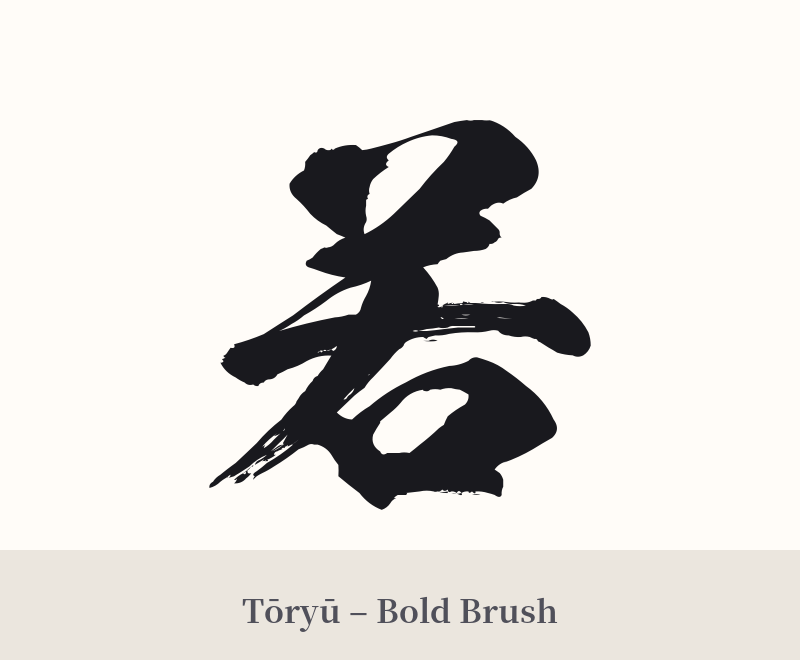
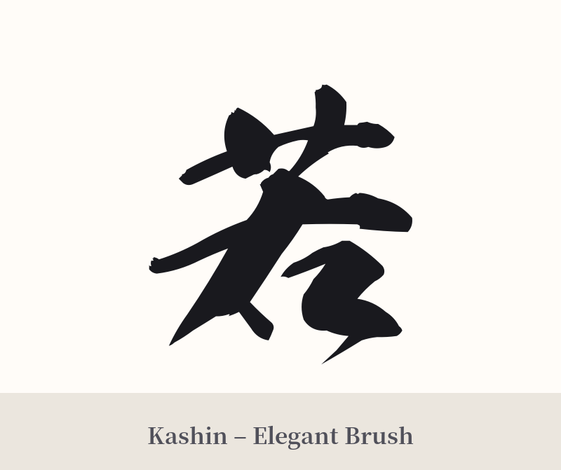
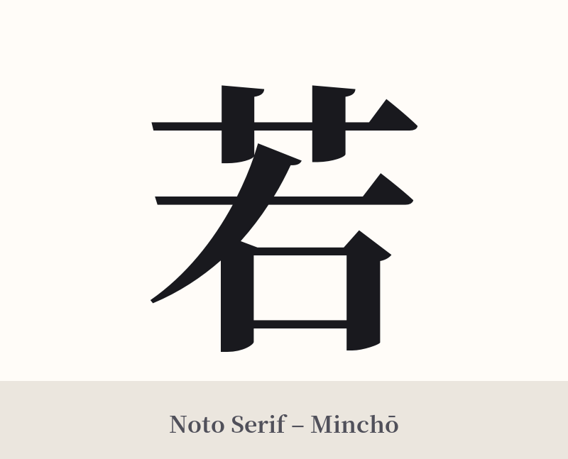
🖌️ Font Styles for 若
The same kanji can look dramatically different depending on the calligraphy style. Choose a font that matches the mood you want for your tattoo or design.
🎨 Tattoo Suitability
📐 Tattoo Design Guide
The kanji 若 is versatile due to its simple and clean form, making it suitable for various tattoo designs and placements.
– Placement: Its modest size and vertical balance make it ideal for areas like the inner wrist, behind the ear, on the ankle, or along the collarbone for a subtle and personal statement. For a slightly larger piece, it works well on the forearm or the back of the neck.
– Font Style: A standard, clean Mincho (serif) or Gothic (sans-serif) font emphasizes its simplicity and clarity. For a more dynamic and energetic feel, a semi-cursive (gyōsho) or brush-stroke style can capture the lively spirit of youth. Avoid overly aggressive or complex styles that might clash with its gentle meaning.
– Visual Pairings: Consider incorporating elements that enhance its meaning. Pairing 若 with a small sprout, a single cherry blossom bud (not a full bloom), or a gentle wave can visually represent new beginnings and growth. These additions can transform the single character into a more complete and narrative design.
Comments