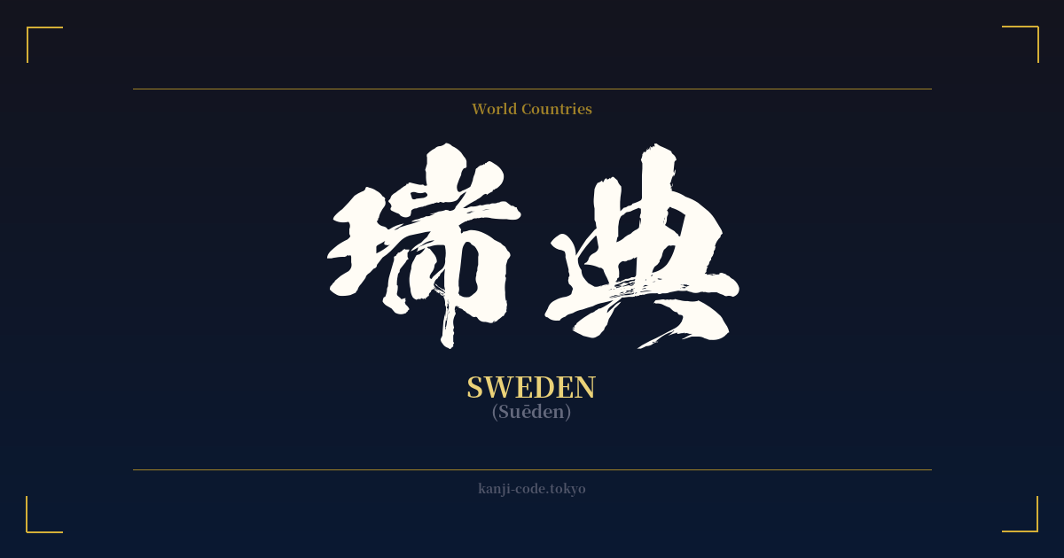
✍️ 瑞典 (Suēden) — Cultural Context
The Japanese name for Sweden, 瑞典 (Suēden), is a fascinating example of 'ateji' (当て字), a practice where kanji are used for their phonetic values to represent foreign words, rather than for their literal meanings. This method was common during the Meiji period (1868-1912) as Japan rapidly modernized and sought to integrate foreign names and concepts into its language.
The choice of characters for Suēden is particularly noteworthy. Instead of selecting random kanji that simply matched the sounds, the scholars of the time often chose characters with positive or fitting connotations. In this case, the result is a name that sounds like 'Sweden' while also carrying a beautifully dignified undertone.
The first character, 瑞 (zui), means 'auspicious sign,' 'congratulations,' or 'blessed.' It evokes imagery of good fortune and positive omens. The second character, 典 (ten/den), signifies 'ceremony,' 'code,' 'law,' or 'classic standard.' Together, 瑞典 phonetically approximates 'Sweden' while semantically suggesting a 'blessed and orderly nation' or an 'auspicious model.' This complimentary naming reflects a deep respect and a positive perception of the country.
In contemporary Japan, the use of 瑞典 is largely confined to formal or official contexts, such as in news headlines, legal documents, and historical texts. For everyday conversation, the katakana script is far more common: スウェーデン (Suwēden). This distinction is important; using the kanji 瑞典 carries a sense of formality and historical weight that the katakana version lacks.
Beyond the name itself, Japan holds a strong appreciation for Swedish culture. Swedish design, known for its minimalism and functionality (epitomized by brands like IKEA and Volvo), resonates deeply with Japanese aesthetics. The concept of 'fika' (a coffee and cake break) is gaining popularity, and there's a general admiration for Sweden's progressive social policies and stunning natural beauty. Therefore, the kanji 瑞典 doesn't just represent a country; it taps into a rich history of cultural exchange and mutual respect.
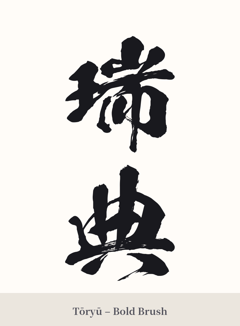
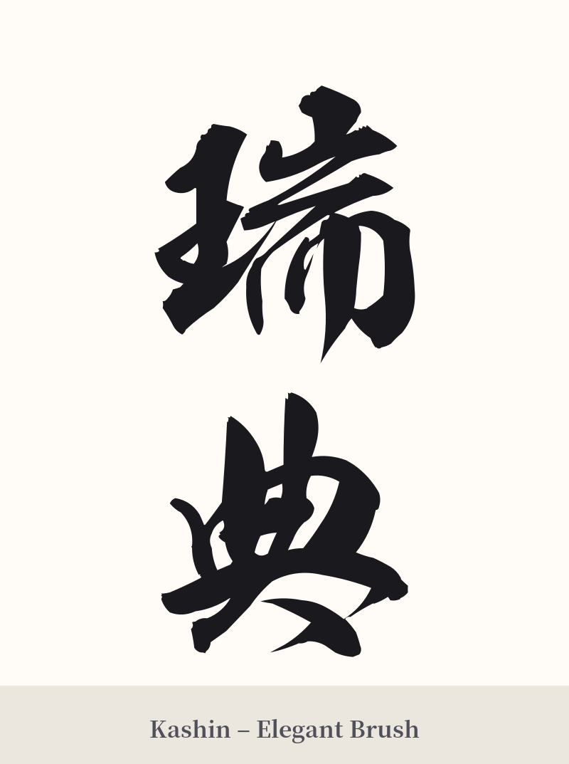
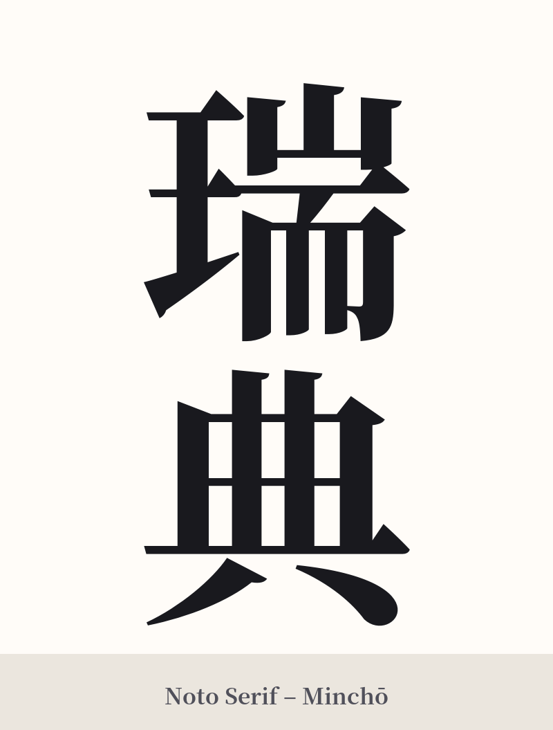
🖌️ Font Styles for 瑞典
The same kanji can look dramatically different depending on the calligraphy style. Choose a font that matches the mood you want for your tattoo or design.
🎨 Tattoo Suitability
📐 Tattoo Design Guide
For a tattoo of 瑞典, the design should emphasize clarity and balance to honor its formal nature.
– Placement: A vertical orientation is highly recommended, as it aligns with traditional Japanese writing. Placements like the forearm, the calf, or along the spine allow the two characters to stack elegantly. For a horizontal design, the inner bicep or across the collarbone works well.
– Font Style: A classic Kaisho (block) script will give the tattoo a formal, stately feel. For something more fluid and artistic, a Gyosho (semi-cursive) style can add a touch of elegance. Avoid overly ornate or aggressive fonts that would clash with the dignified meaning of the characters.
– Visual Tips: To add personal context, consider pairing 瑞典 with imagery related to Sweden, such as a minimalist rendition of the Three Crowns (Tre Kronor), a Dala horse, or even a subtle floral element like the linnaea borealis, the national flower. This helps frame the kanji and tells a more complete story.
Comments