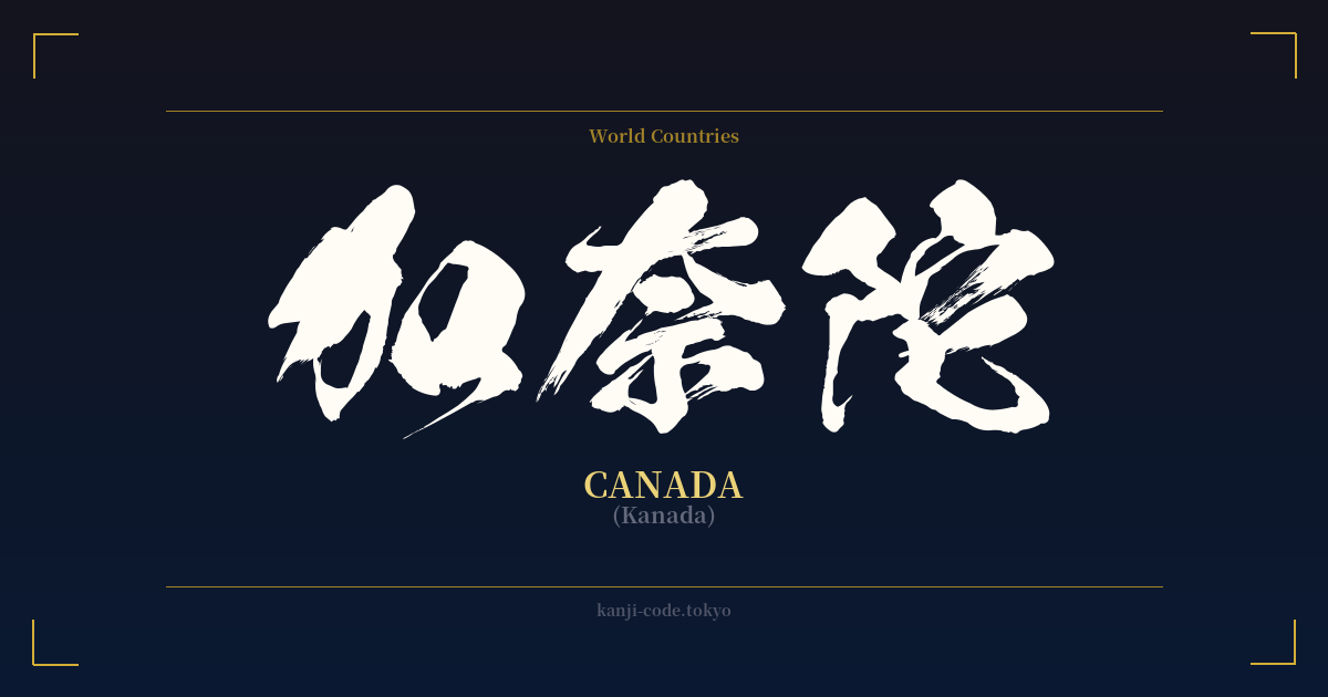
✍️ 加奈陀 (Kanada) — Cultural Context
The word 加奈陀 (Kanada) is a fascinating example of a Japanese linguistic practice called ateji (当て字), where kanji characters are used to phonetically represent foreign words, disregarding their original meanings. This method was particularly widespread during Japan's Meiji period (1868-1912), a time of rapid modernization and intense cultural exchange with the West. As new countries, concepts, and objects were introduced, Japan needed a way to write them down, and ateji was the solution before the Katakana script became the standard for loanwords.
加奈陀 was constructed by selecting three characters whose sounds approximate the syllables in "Ca-na-da." The first, 加 (ka), means "to add" or "join." The second, 奈 (na), is famously used in the name of the ancient capital city, Nara. The third, 陀 (da), often appears in Buddhist terminology and can mean "steep." When combined, their individual meanings are completely set aside; their only purpose is to create the sound "Kanada."
In modern Japan, you will almost exclusively see Canada written in Katakana as カナダ. The kanji version, 加奈陀, is now considered archaic and formal. Its use is largely relegated to historical texts, the names of certain official or traditional organizations (like a Japan-Canada society), or for a specific stylistic, old-world effect. It carries a sense of history and formality that the simple Katakana version lacks.
This contrasts with the ateji for some other countries, like the United States (米国, Beikoku) or the United Kingdom (英国, Eikoku). These are abbreviations of longer phonetic spellings (亜米利加 and 英吉利, respectively) that have remained in common, everyday use in news and formal writing. Canada's kanji name never developed a widely used single-character abbreviation (like 加国), so it has largely faded from public view, making it a more obscure and historical choice.
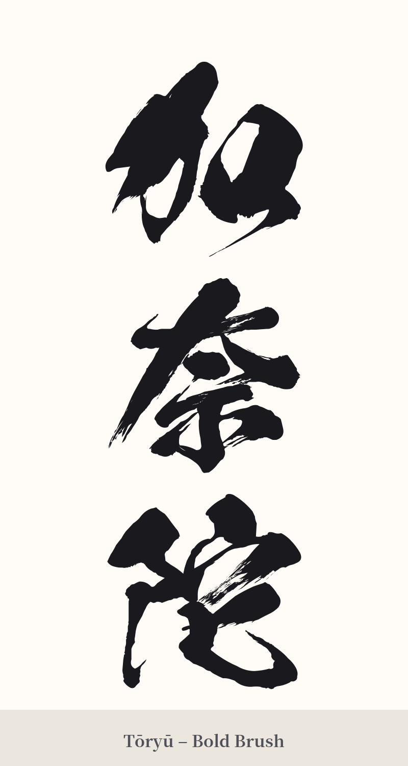
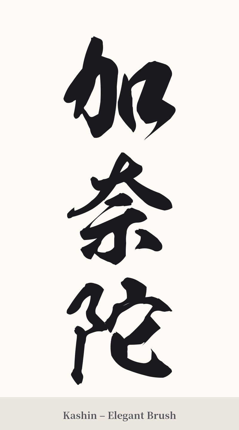
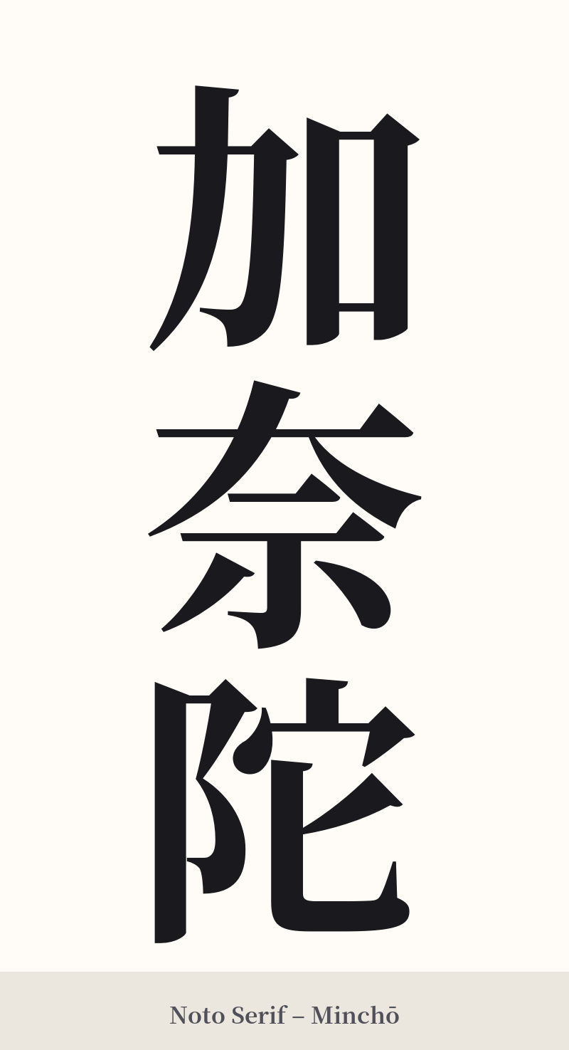
🖌️ Font Styles for 加奈陀
The same kanji can look dramatically different depending on the calligraphy style. Choose a font that matches the mood you want for your tattoo or design.
🎨 Tattoo Suitability
📐 Tattoo Design Guide
For a tattoo of 加奈陀, the design should honor its historical and formal nature. A vertical orientation is highly recommended, as it is the traditional way to write Japanese and creates an elegant flow down an arm, leg, or along the spine.
– Placement: The inner forearm, the calf, or running down the spine are excellent placements that accommodate the three-character length and vertical alignment.
– Font Style: Stick to traditional Japanese calligraphy styles. A clean, crisp Kaisho (block script) emphasizes the structure of each character. For a more fluid and artistic look, a Gyōsho (semi-cursive script) would be beautiful, adding a sense of classic elegance.
– Visual Tips: To add a personal touch without being too literal, consider a subtle background element. A light watercolor wash in red behind the black ink can evoke the Canadian flag. Alternatively, a minimalist maple leaf integrated near the beginning or end of the characters could tie the phonetic word back to its national symbol.
Comments