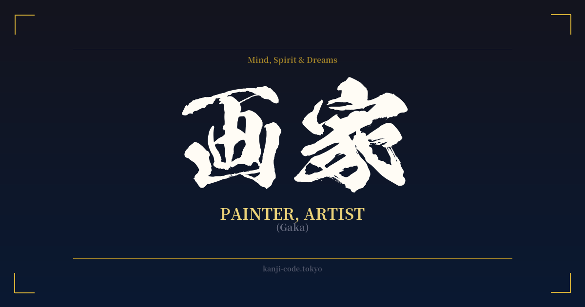
✍️ 画家 (Gaka) — Cultural Context
The Japanese word 画家 (Gaka) translates to 'painter' or 'artist,' but its true meaning is steeped in a rich history of dedication and mastery. To understand its weight, we must look at its components: 画 (ga), meaning 'picture' or 'brush-stroke,' and 家 (ka), a suffix denoting an expert or professional in a specific field.
This isn't just someone who paints; a Gaka is a person whose life and identity are intertwined with their art. The '-ka' suffix is powerful in Japanese. It's the same one found in words like 書道家 (shodōka, 'calligrapher'), 音楽家 (ongakuka, 'musician'), and 漫画家 (mangaka, 'manga artist'). It elevates a practice from a mere hobby to a dedicated profession or a way of life, implying a lineage of knowledge and a high level of skill.
Historically, Japan has revered its painters. From the serene ink wash landscapes of Sesshū Tōyō in the Muromachi period to the vibrant, dynamic ukiyo-e prints of Katsushika Hokusai and Utagawa Hiroshige during the Edo period, the Gaka has been a pivotal figure in capturing and defining Japanese aesthetics. These artists were not just decorators; they were storytellers, social commentators, and conduits of philosophical and religious ideas, such as the Zen Buddhist concepts that influenced sumi-e (ink wash painting).
The Gaka's role was to see beyond the surface, to capture the 'mono no aware'—the gentle sadness of transient things—or the powerful energy of a crashing wave. Hokusai, perhaps the most famous Gaka internationally, even referred to himself as 'Gakyō Rōjin Manji,' which translates to 'The Old Man Mad About Painting.' This name perfectly encapsulates the passionate obsession and lifelong dedication inherent in the concept of Gaka.
In modern Japan, the term Gaka still holds this sense of professionalism. While the English loanword アーティスト (ātisuto) is used for a more general, contemporary 'artist,' Gaka retains a classic, more focused connotation tied to the canvas and brush. Choosing the word Gaka is to align oneself with this long and honorable tradition of mastery, discipline, and the profound, transformative power of the visual image.
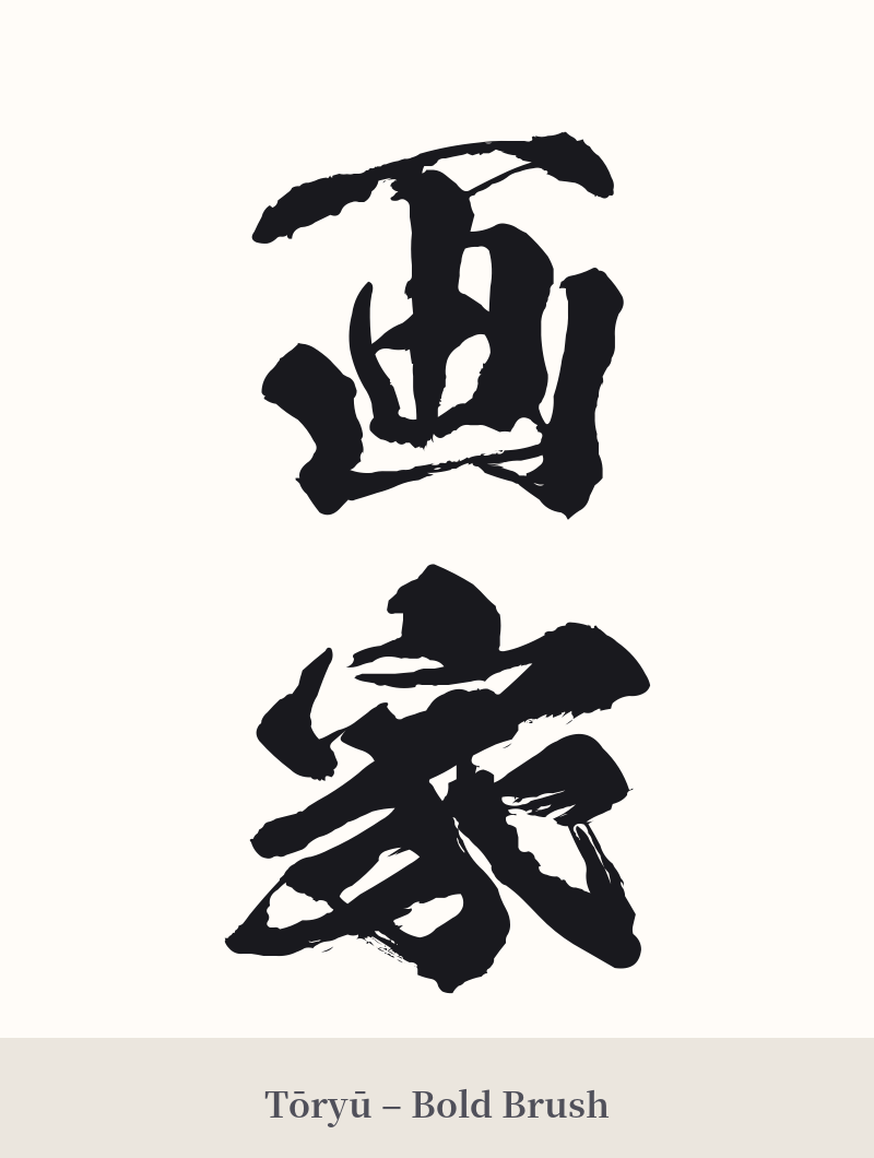
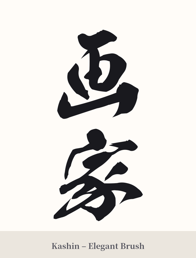
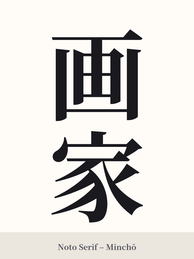
🖌️ Font Styles for 画家
The same kanji can look dramatically different depending on the calligraphy style. Choose a font that matches the mood you want for your tattoo or design.
🎨 Tattoo Suitability
📐 Tattoo Design Guide
For a tattoo of 画家 (Gaka), the design should reflect the artistic and professional nature of the word itself.
– Placement: A vertical orientation on the forearm, calf, or along the spine can create a classic, elegant look. A horizontal placement works well across the chest, upper back, or inner bicep. These areas provide a flat canvas for the characters to be read clearly.
– Font Style: Consider a semi-cursive script like 'Gyosho' to give the tattoo a fluid, artistic feel, as if drawn by a brush. For a more formal and solid impression, a classic 'Mincho' (serif) style provides a sense of authority and tradition. Avoid overly stylized or thin fonts that might blur over time.
– Visual Tips: To personalize the design, consider incorporating a small, stylized red seal (like a hanko stamp) near the kanji, a common practice for artists signing their work in East Asia. Another idea is to have the characters themselves look as if they were painted with a single, expressive brushstroke, adding a meta-layer to the design.
Comments