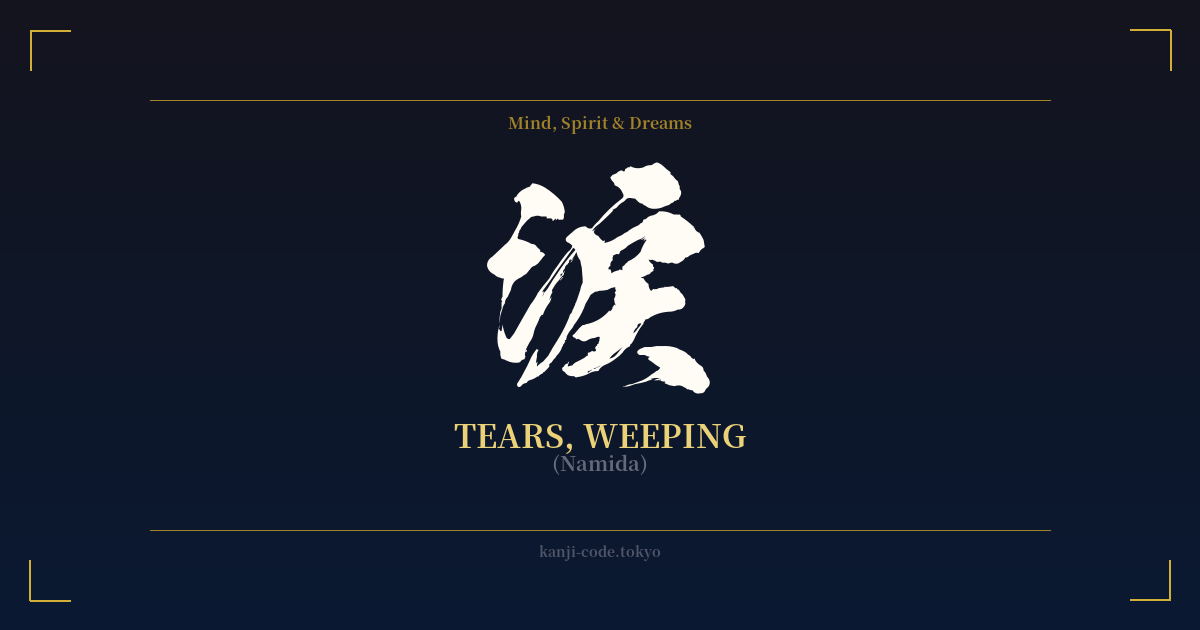
✍️ 涙 (Namida) — Cultural Context
The Japanese kanji 涙 (namida) translates to 'tears,' but its cultural significance flows far deeper than a simple biological function. In Japan, tears are not just a reaction but a powerful symbol woven into the fabric of art, literature, and social understanding. They represent the full, complex spectrum of human emotion, from the sharpest grief to the most profound joy.
The character's construction offers a glimpse into its poetic origins. It is composed of two parts: on the left, the radical 氵 (sanzui), which represents water. On the right is 戾, a character that can mean 'to return.' Together, they create a beautifully evocative image: the 'water that returns' from the eyes. This isn't just a physical description; it hints at an emotional outpouring, a return to a fundamental state of feeling.
In Japanese culture, there is a deep appreciation for transient, poignant beauty, a concept known as 'mono no aware' (物の哀れ), or 'the pathos of things.' Tears are central to this worldview. They are seen as a sincere expression of a heart moved by beauty, by loss, or by the fleeting nature of life itself. Crying over the brief bloom of cherry blossoms is not a sign of weakness, but of a deep, aesthetic sensitivity.
This nuance is captured in the language itself. There are specific words for different kinds of tears. 'Ureshi-namida' (嬉し涙) are tears of happiness, shed at weddings or moments of triumph. 'Kuyashi-namida' (悔し涙) are tears of frustration, cried after a narrow defeat. This linguistic precision shows how deeply the culture has considered the various origins of this single human expression.
One of the most telling proverbs is 'Oni no me ni mo namida' (鬼の目にも涙), which means 'tears in the eyes of a demon.' This suggests that even the most hardened or monstrous being is capable of compassion and sorrow, highlighting tears as the ultimate symbol of shared humanity. While stoicism ('gaman' or endurance) is also a valued trait, the ability to be moved to tears is seen as a sign of a true, feeling heart. From classic kabuki plays to modern anime, a character's tears are often a pivotal moment, revealing their true nature and deepest vulnerabilities or strengths.
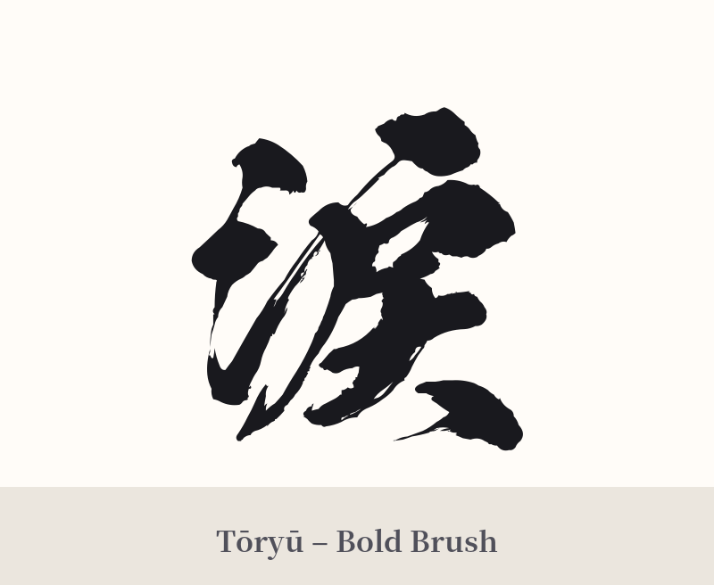
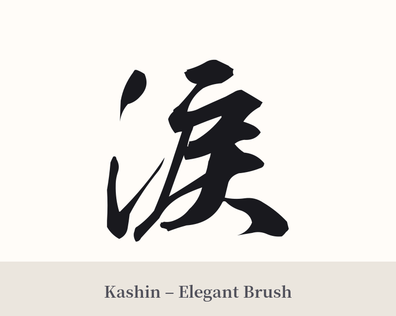
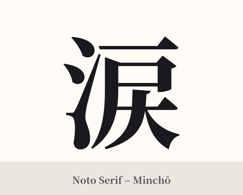
🖌️ Font Styles for 涙
The same kanji can look dramatically different depending on the calligraphy style. Choose a font that matches the mood you want for your tattoo or design.
🎨 Tattoo Suitability
📐 Tattoo Design Guide
A tattoo of 涙 (namida) is a deeply personal statement, and the design should reflect its emotional weight. Its simple elegance allows for a variety of stylistic interpretations.
– Placement: For a subtle, personal reminder, consider small placements like the inner wrist, behind the ear, or on the collarbone. For a more prominent piece, it works well vertically on the forearm, ribs, or along the spine.
– Font Style: The character's form lends itself to expressive calligraphy. A fluid, semi-cursive 'gyōsho' style can emphasize the watery, emotional quality. A classic, serifed 'mincho' font can give it a more literary and poignant feel, as if taken from a page of a novel.
– Visual Tips: Consider integrating the character with other imagery. It could be placed alongside a single falling cherry blossom petal to represent 'mono no aware,' or paired with a lotus flower to symbolize purity and emotional resilience rising from hardship. Some designs even stylize the final strokes of the kanji to look like a dripping tear, directly merging the symbol with its meaning.
Comments