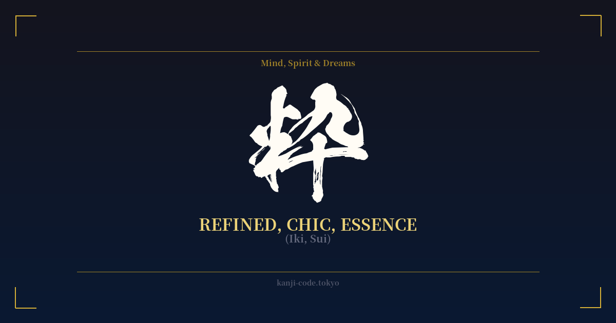
✍️ 粋 (Iki, Sui) — Cultural Context
粋, pronounced 'Iki', is one of Japan's most celebrated and elusive aesthetic concepts. While often translated as 'chic,' 'refined,' or 'stylish,' these English words fail to capture its true depth. Iki is not just about appearance; it's a complete philosophy of conduct, an effortless sophistication that is felt more than it is seen.
Born in the bustling urban culture of the Edo period (1603-1868), Iki was the calling card of the chōnin, the merchant class of cities like Edo (modern-day Tokyo). Subject to strict sumptuary laws imposed by the ruling samurai class, merchants were forbidden from openly displaying their wealth. Ostentatious silks and flashy gold were out of the question.
In response, the chōnin cultivated Iki as a form of quiet rebellion and cultural expression. It was a style defined by subtlety and suggestion. Instead of a bold pattern on the outside of a kimono, an exquisite, hand-painted design would be hidden on the inner lining—a private luxury known only to the wearer and perhaps a chosen few. This is the essence of Iki: an understated confidence that doesn't need to shout for attention.
The philosopher Kuki Shūzō, in his seminal 1930 work 'The Structure of Iki,' identified three core components. The first is 'bitai' (媚態), a subtle, alluring coquetry or sensuality. The second is 'ikiji' (意気地), a gallant, brave, and unwavering spirit. The final component is 'akarame' (諦め), a resigned, almost melancholic understanding of fate and the fleeting nature of pleasure. Together, they form an ideal that is worldly, sophisticated, and deeply human.
Iki is distinct from other Japanese aesthetics. It is not 'wabi-sabi,' which finds beauty in rustic imperfection and impermanence. Nor is it 'miyabi,' the courtly, aristocratic elegance of a much earlier era. Iki is urban, dynamic, and sensual—the aesthetic of the city, the theater, and the pleasure quarters. It's the sharp wit of a geisha, the confident posture of a kabuki actor, and the discerning taste of someone who understands quality without needing a brand name to prove it.
The kanji 粋 itself is composed of 米 (rice) and 十 (ten), originally referring to the process of hulling rice to get to the pure, essential grain. This beautifully mirrors the concept of Iki as the distilled essence of style, stripped of all that is unnecessary or vulgar.
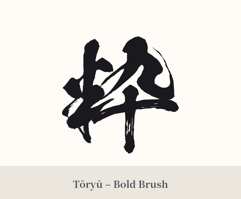
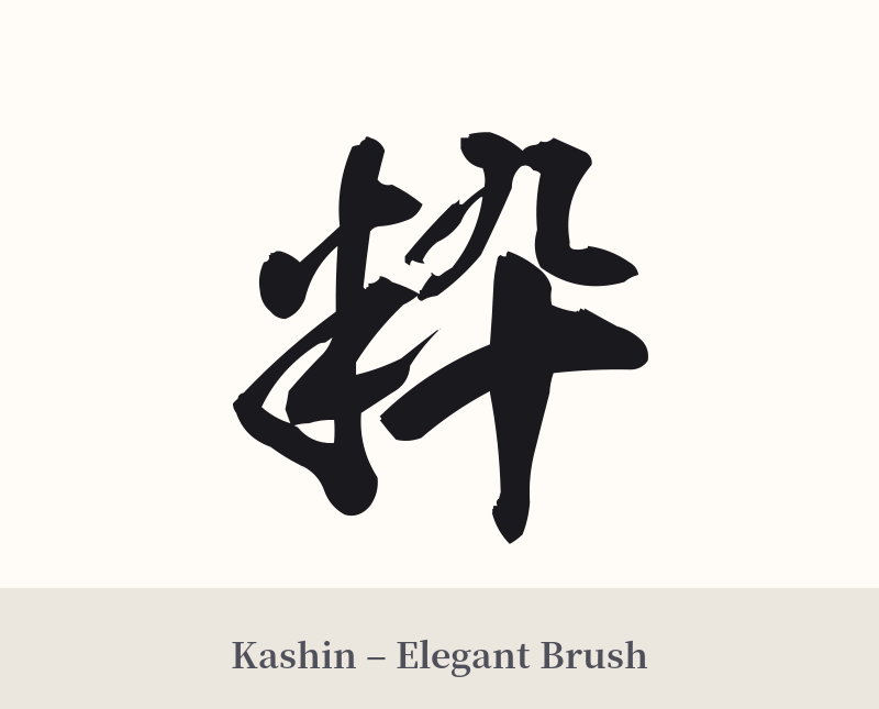
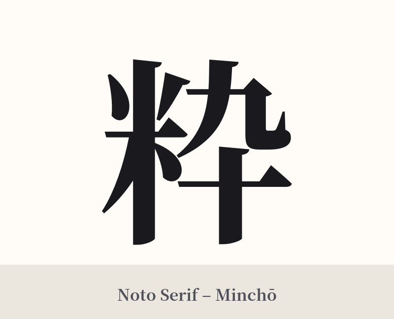
🖌️ Font Styles for 粋
The same kanji can look dramatically different depending on the calligraphy style. Choose a font that matches the mood you want for your tattoo or design.
🎨 Tattoo Suitability
📐 Tattoo Design Guide
A tattoo of 粋 should reflect the concept itself: subtle, confident, and refined.
– Placement: Consider placements that allow for a subtle reveal, honoring the spirit of Iki. The inner forearm, the nape of the neck, behind the ear, or along the ribcage are excellent choices. These spots are not always on display, making the tattoo a more personal statement.
– Font Style: The font should be elegant and clean. A standard Kaisho (block script) offers clarity and timelessness. For a more fluid feel, a Gyosho (semi-cursive) style can capture the effortless grace of Iki. Avoid overly aggressive or decorative fonts, as they would contradict the kanji's meaning.
– Visual Tips: In most cases, the single character 粋 is powerful enough on its own. Over-designing the tattoo would be the antithesis of Iki. If you wish to add an element, it should be minimal—a single, thin enso circle, a subtle brush stroke, or a tiny, falling cherry blossom petal. The goal is to complement, not compete with, the kanji.
Comments