✍️ 硯 (Suzuri) — Cultural Context
The kanji 硯 (suzuri) refers to an inkstone, a deceptively simple tool that is the bedrock of Japanese and East Asian calligraphy. It is far more than a mere slab of stone; it is a vessel for transformation, a symbol of scholarship, and a quiet testament to the beauty of preparation and patience.
Historically, the inkstone is one of the “Four Treasures of the Study” (文房四宝, Bunbō Shihō), alongside the brush (筆, fude), the ink stick (墨, sumi), and paper (紙, kami). These four items were the essential tools for scholars, monks, poets, and even samurai for centuries. The suzuri serves as the grinding surface where the solid ink stick is mixed with a few drops of water, a meditative process that creates the liquid ink used for writing.
This act of grinding ink is a ritual in itself. It is a moment of calm and focus before the brush ever touches the paper. It requires patience and a delicate touch to achieve the desired consistency and shade of black. In this way, the suzuri embodies the principle that true creation begins not with a frantic burst of energy, but with quiet, deliberate preparation. It represents the foundation upon which expression is built.
Crafted from specific types of slate, high-quality inkstones are works of art. Famous production areas in Japan, like Akama in Yamaguchi Prefecture, produce suzuri that are prized for their fine grain and ability to produce superior ink. These stones can be passed down through generations, absorbing the history of all the words and artworks they helped create. They carry the weight of tradition and the spirit of the artisans who carved them.
Choosing the kanji 硯 is to embrace a symbol of the intellectual and artistic life. It speaks to a love for tradition, a respect for the creative process, and an understanding that great things are born from a quiet, stable foundation. It is the silent partner to the expressive brush, representing the contemplative soul of the artist and the scholar.
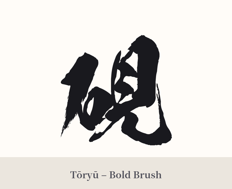
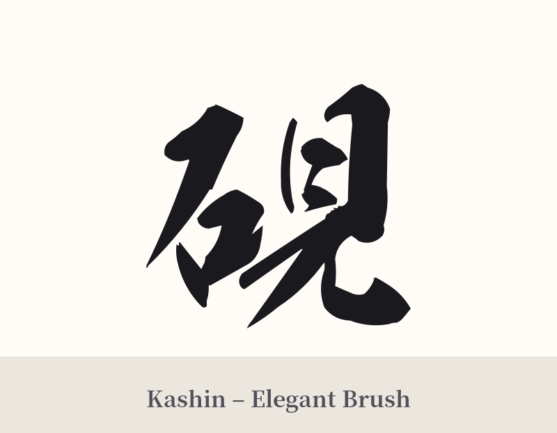
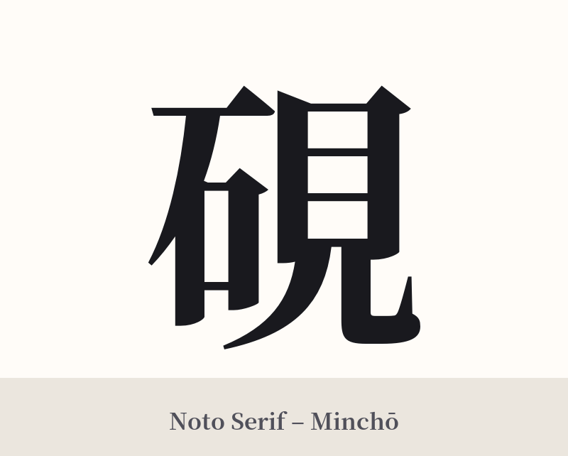
🖌️ Font Styles for 硯
The same kanji can look dramatically different depending on the calligraphy style. Choose a font that matches the mood you want for your tattoo or design.
🎨 Tattoo Suitability
📐 Tattoo Design Guide
The kanji 硯 has a solid, stable structure that works well in various tattoo designs. Its connection to art and tradition offers rich stylistic possibilities.
– Placement: This character suits flat planes of the body where its balanced form can be appreciated. Consider the inner forearm, the calf, or the back of the shoulder. For a more subtle placement, the wrist or behind the ear could work if tattooed with fine lines.
– Style: A traditional calligraphy style like Kaisho (block script) emphasizes its structure and scholarly feel. For a more fluid and artistic look, a Gyōsho (semi-cursive) or Sōsho (cursive) script would be beautiful, mimicking the very art form the inkstone enables.
– Visual Elements: To add context, consider incorporating a subtle brush stroke (like an ensō circle) or a small, stylized splash of ink near the character. It could also be the centerpiece of a larger design featuring the other “Four Treasures of the Study”: a brush, paper, and an ink stick.
Comments