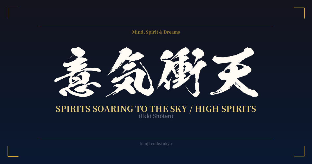
✍️ 意気衝天 (Ikki Shōten) — Cultural Context
意気衝天 (Ikki Shōten) is a powerful four-character idiom, known in Japanese as a 'yojijukugo'. These idioms are concise, often poetic phrases that convey complex ideas, and they are a hallmark of literary and formal Japanese. Ikki Shōten paints a vivid picture of a spirit so vigorous and full of life that it seems to burst forth and pierce the heavens themselves.
The literal translation breaks down into 'spirit' (意気) 'thrusting' (衝) the 'heavens' (天). The first two characters, 意気 (ikki), combine to mean morale, spirit, or disposition. It's not just a fleeting mood but a deep-seated willpower and enthusiasm. The second part, 衝天 (shōten), describes the action of soaring or rocketing upwards to the sky. Together, they create a metaphor for a state of peak motivation, confidence, and unstoppable ambition.
In Japanese culture, this phrase is often used to describe a person or a group filled with an almost overwhelming sense of purpose and energy. Imagine a sports team heading into a championship game, their morale at an all-time high—their state could be described as Ikki Shōten. It could also apply to an artist in a moment of pure creative breakthrough, or an entrepreneur whose ambition and drive seem limitless. It captures that electrifying feeling of being on top of the world, ready to take on any challenge.
Historically, this kind of vigorous spirit was highly valued in samurai culture, where maintaining high morale was crucial for battle. While it's not exclusively a martial term, it carries that same intensity and vigor. Today, it’s found more in literature, motivational speeches, and formal contexts rather than everyday conversation. It’s a word used to describe a powerful, almost transcendent state of being, making it a profound choice for anyone wishing to embody a spirit of boundless aspiration and unshakeable confidence.
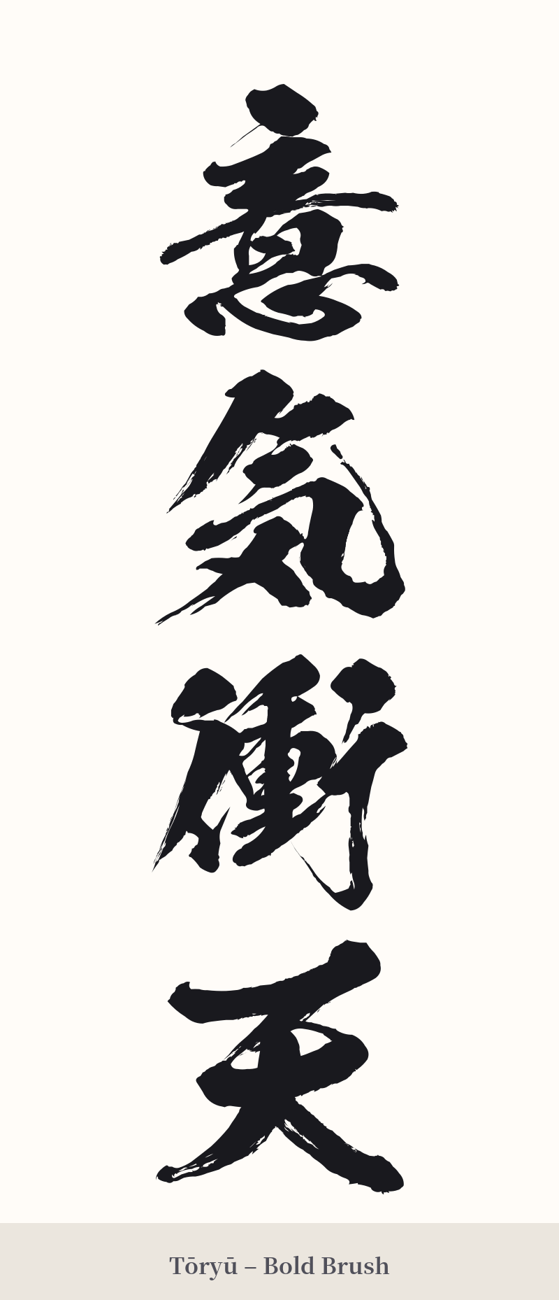
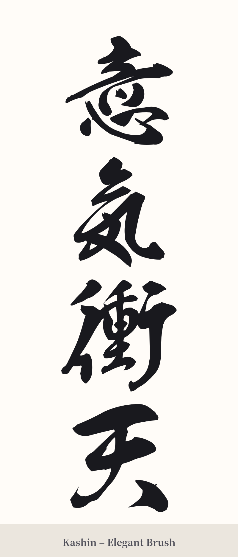
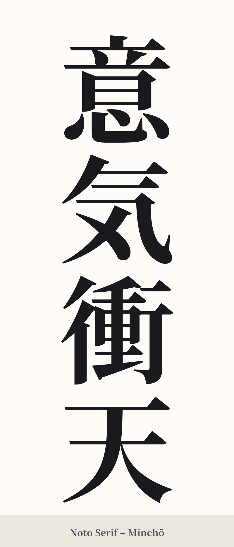
🖌️ Font Styles for 意気衝天
The same kanji can look dramatically different depending on the calligraphy style. Choose a font that matches the mood you want for your tattoo or design.
🎨 Tattoo Suitability
📐 Tattoo Design Guide
The vertical nature of this four-character compound makes it ideal for certain placements that emphasize its 'soaring' meaning.
– Placement: A vertical column down the spine, along the forearm, or down the calf can look particularly striking. This orientation visually reinforces the idea of energy rising upwards.
– Font Style: For a dynamic and energetic feel, a semi-cursive (gyosho) or full-cursive (sosho) calligraphy style is perfect. The flowing, connected brushstrokes can capture the sense of movement. For a more solid and powerful statement, a bold, angular block script (kaisho) works beautifully, emphasizing strength and stability.
– Visual Tips: Due to the complexity of 意 and 衝, avoid making the tattoo too small. Give the artist enough space to ensure each stroke is clean and legible, preserving the integrity and beauty of the characters for years to come.
Comments