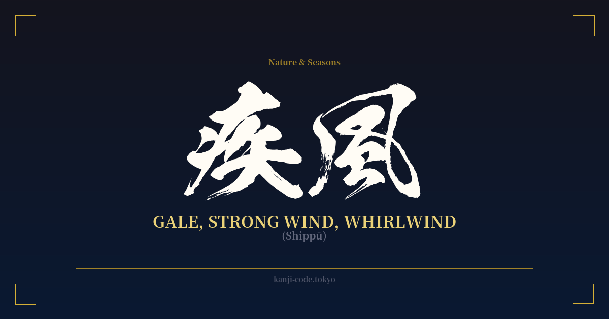
✍️ 疾風 (Shippū) — Cultural Context
疾風 (Shippū) literally translates to 'gale' or 'whirlwind,' but its essence in Japanese culture goes far beyond a simple weather report. It captures the very idea of incredible, almost supernatural speed and unstoppable momentum. It is a word that evokes power, decisiveness, and the raw, untamed forces of nature.
Historically and culturally, the concept of Shippū is deeply intertwined with the warrior ethos. A samurai's ideal movement was often described as being 'like a gale'—swift, unpredictable, and overwhelming. To strike like a Shippū was to be so fast that the opponent had no time to react. This imagery is prevalent in classic literature, martial arts philosophy, and historical accounts of famous battles.
This connection to speed and power has made Shippū a popular term in modern pop culture, especially in anime, manga, and video games. It's frequently used in the names of special attacks, character titles, or series subtitles (like the famous 'Naruto: Shippuden') to instantly convey a sense of heightened speed and action. It signals a dramatic escalation in power and ability.
Furthermore, Shippū is a key component of a well-known Japanese proverb: 「疾風に勁草を知る」(shippū ni keisō o shiru). This translates to, 'In a strong wind, one knows the sturdy grass.' The profound meaning is that true strength and character are only revealed when tested by adversity. The 'gale' here is a metaphor for hardship, and only those with true resilience (the 'sturdy grass') can withstand it. This adds a layer of philosophical depth to the word, associating it not just with physical speed, but with inner fortitude and the strength to endure life's storms.
Thus, Shippū is more than just wind. It is a symbol of nature's formidable power, a martial ideal of swift action, and a philosophical reminder that adversity reveals our true nature. It embodies a dynamic force that can be both destructive and clarifying.
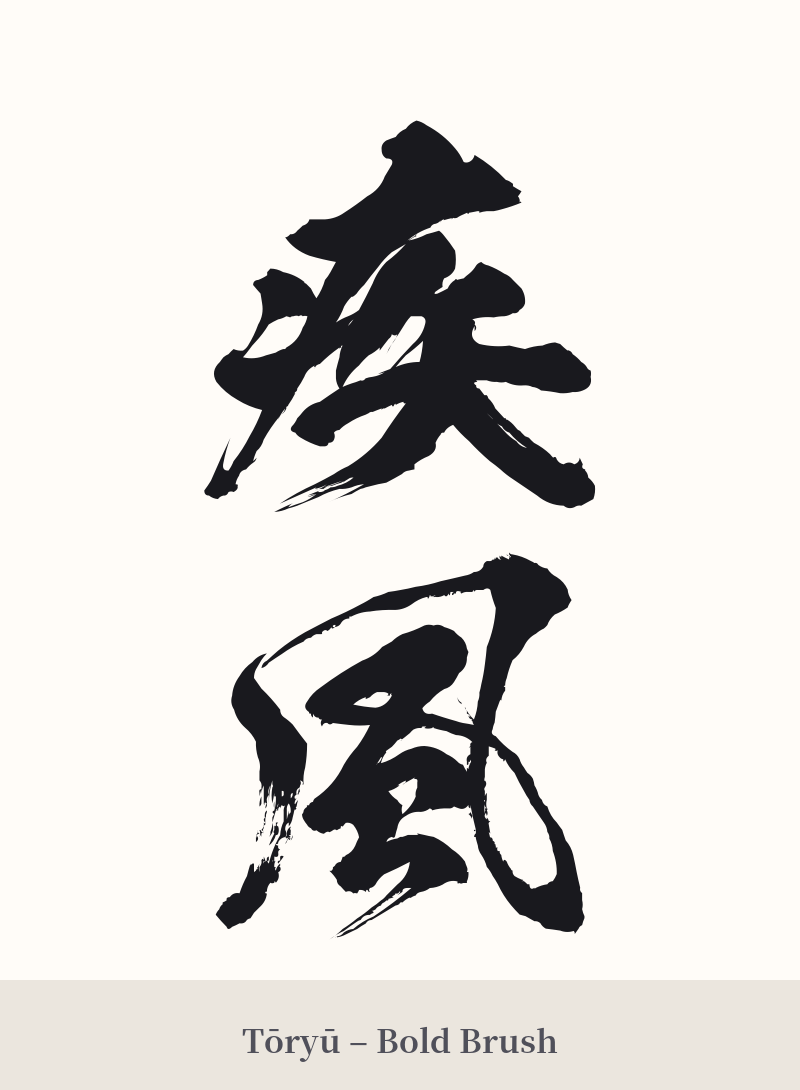
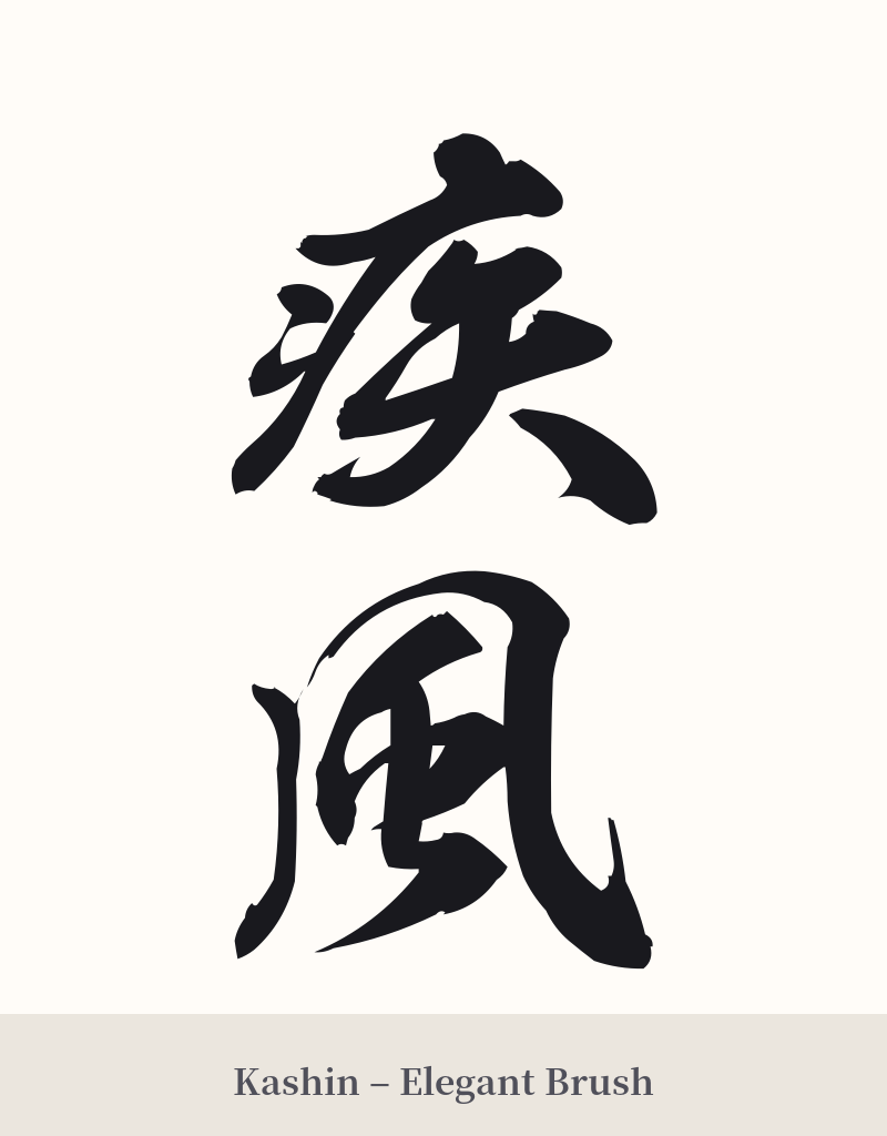
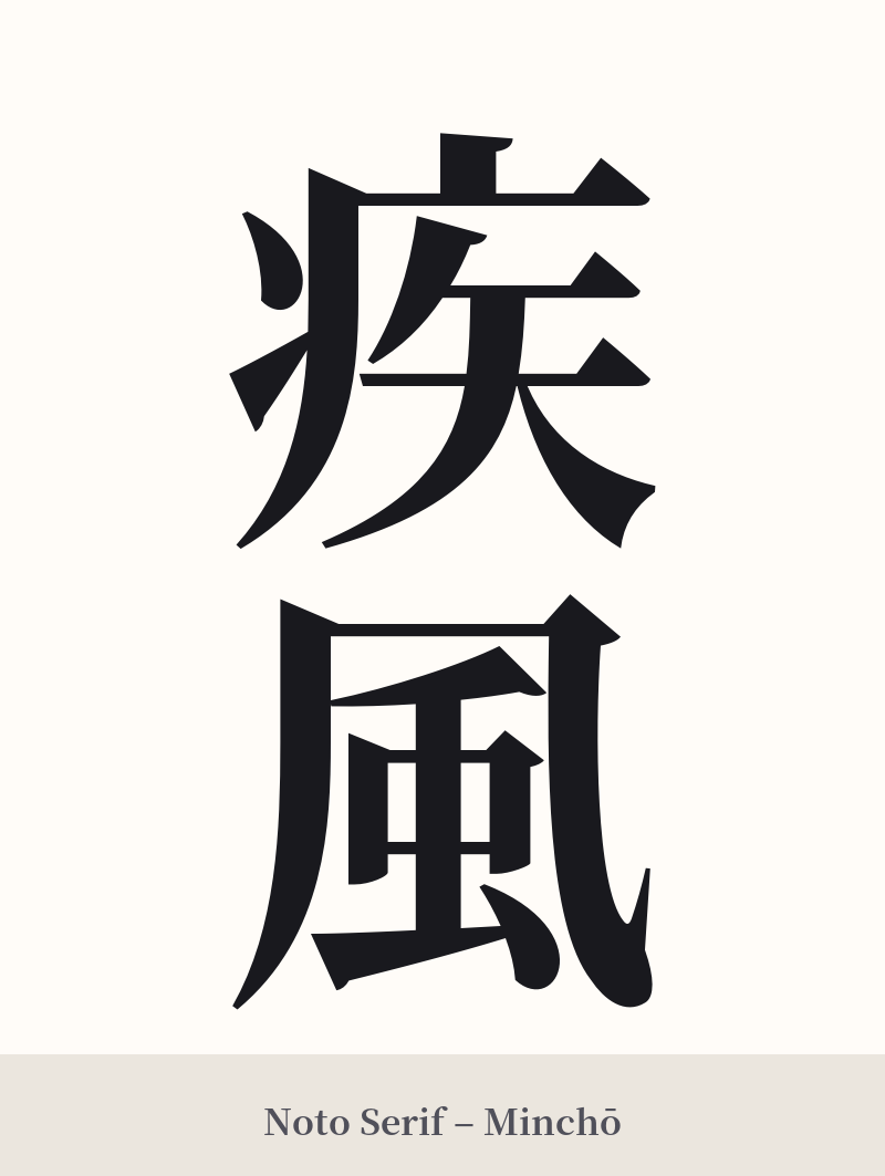
🖌️ Font Styles for 疾風
The same kanji can look dramatically different depending on the calligraphy style. Choose a font that matches the mood you want for your tattoo or design.
🎨 Tattoo Suitability
📐 Tattoo Design Guide
For a 疾風 (Shippū) tattoo, the design should emphasize speed and movement. It's a dynamic word that looks best when it feels like it's in motion.
– Placement: Consider areas of the body that suggest flow and length. The forearm, calf, or running down the ribs or spine are excellent choices. These placements allow the characters to align with the body's natural lines, enhancing the sense of velocity.
– Font Style: Energetic, semi-cursive (gyōsho) or cursive (sōsho) calligraphy styles are perfect for capturing the essence of wind. The flowing, connected strokes can visually mimic a gust of wind. For a more solid, impactful statement, a bold, sharp block script (kaisho) can also work, conveying raw power rather than just speed.
– Visual Elements: Complement the kanji with visual motifs that reinforce the theme. Abstract wind bars, swirling lines, or a few scattered leaves caught in the gust can frame the characters beautifully. Avoid static or rigid elements; everything about the design should feel fluid and fast.
Comments