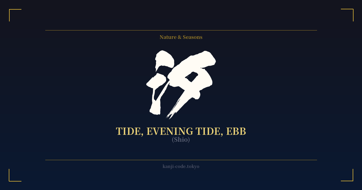
✍️ 汐 (Shio) — Cultural Context
The kanji 汐 (shio) is a beautiful and evocative character that captures a specific moment in nature's rhythm: the evening tide. Its very structure tells a story. It is composed of two radicals: 氵 (sanzui) on the left, which is the symbol for water, and 夕 (yū) on the right, the character for evening or dusk. Together, they literally paint a picture of 'water in the evening,' a direct and poetic representation of its meaning.
In the Japanese language, there is another, more common kanji for tide: 潮. This character is also pronounced 'shio' (or 'chō') and refers to the tide in a general sense, as well as currents or even social trends. The distinction is key. While 潮 is broad and dynamic, 汐 is specific, quiet, and introspective. It doesn't just mean tide; it means the gentle ebb and flow as daylight fades, the quiet retreat of the sea under the twilight sky.
This specific imagery has made 汐 a favorite in Japanese literature and poetry, particularly in haiku and waka. It evokes a sense of tranquility, the passage of time, and a gentle melancholy. This feeling is closely aligned with the Japanese aesthetic of 'mono no aware,' an empathy toward the transient nature of things. The evening tide is a perfect symbol of this concept—a beautiful, fleeting moment that happens every day, marking an end but promising a new beginning with the morning's high tide.
Beyond poetry, 汐 is deeply connected to Japan's island geography and the Shinto reverence for nature. The sea is not just a resource but a living entity, and its cycles are observed with respect. The evening tide is part of this sacred rhythm, a quiet counterpart to the powerful storms and waves also represented in the language. It is the sea at rest.
In a modern context, 汐 is often found in personal names, almost exclusively for women. Names like Shio (汐) or Shiori (汐里, 'tidal village') carry a sense of gentleness, poetic beauty, and a connection to nature. This usage further softens the character's image, associating it with personal identity and quiet strength.
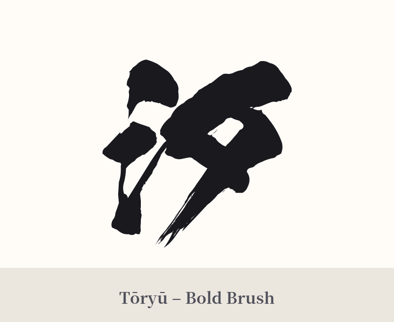
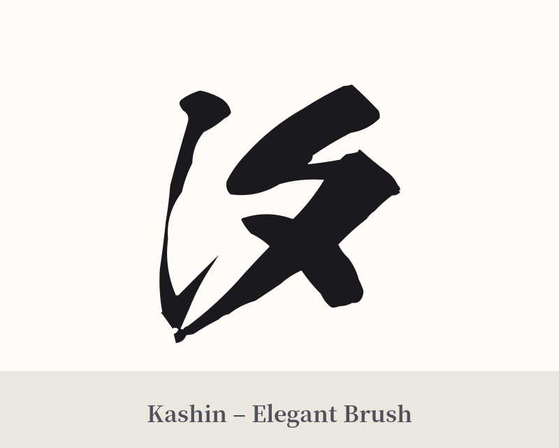
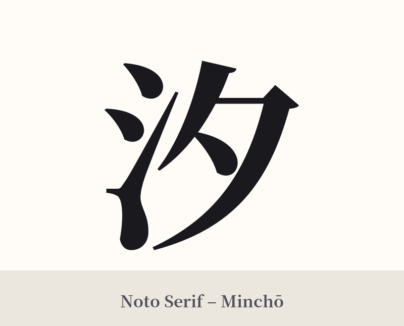
🖌️ Font Styles for 汐
The same kanji can look dramatically different depending on the calligraphy style. Choose a font that matches the mood you want for your tattoo or design.
🎨 Tattoo Suitability
📐 Tattoo Design Guide
The kanji 汐 is visually simple and elegant, making it versatile for tattoo design. Its meaning—the gentle evening tide—lends itself to fluid and thoughtful compositions.
– Placement: Consider placements that follow the body's natural lines, enhancing the feeling of flow. The inner forearm, along the calf muscle, down the ribs, or on the back of the neck are excellent choices. For a more subtle tattoo, the wrist or behind the ear works well due to the character's simplicity.
– Font Style: To emphasize its connection to nature and poetry, a calligraphic style is highly recommended. A semi-cursive (gyōsho) or cursive (sōsho) script will give it a fluid, hand-brushed look. For a more classic and refined feel, a clean Mincho (serif) font highlights its literary heritage.
– Visual Tips: While 汐 is beautiful on its own, it can be paired with other elements to deepen its meaning. Consider incorporating gentle, minimalist waves, a crescent moon (月) to signify evening, or a flock of plovers (chidori), which are often associated with Japanese coastlines. The simplicity of the kanji allows it to be the focal point even within a larger, more intricate design.

Comments