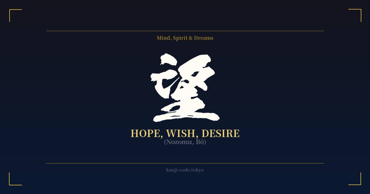
✍️ 望 (Nozomu, Bō) — Cultural Context
The kanji 望 (nozomu) is a beautiful and evocative character that encapsulates the very human act of looking toward the future with a sense of hope, wish, or desire. It is a character filled with quiet longing and aspiration, representing the gap between where one is and where one wants to be.
Its ancient form provides a poetic origin story. The character is a combination of radicals that depict a person standing on tiptoe to get a better view of the full moon (月). This imagery perfectly captures the feeling of yearning for something distant and beautiful, something just out of reach but still visible. It’s not a demanding or aggressive desire, but a contemplative, hopeful gaze towards a goal or a dream.
In the Japanese language, 望 is incredibly versatile. As the verb `nozomu` (望む), it means 'to wish for', 'to desire', or 'to hope for'. It's often used for personal aspirations, like `heiwa o nozomu` (平和を望む), 'to wish for peace'. The noun form, `nozomi`, is a common female given name in Japan, famously associated with the 'Nozomi' Shinkansen (bullet train), which was named to evoke a sense of speed and fulfilling the hope of a fast journey.
The character is also a key component in other important words. The most common word for 'hope' in modern Japanese is `kibō` (希望). Here, 望 is combined with 希 (ki), which also means hope or rare. `Kibō` often refers to a more general, abstract, and forward-looking hope, while `nozomu` can feel more like a personal, immediate wish. The opposite concept is expressed in `shitsubō` (失望), which means 'disappointment' or 'despair'—literally, to 'lose hope'.
Culturally, 望 connects to the Japanese aesthetic appreciation for the moon (`tsukimi`, or moon-viewing). This tradition involves quietly observing the moon, reflecting on its beauty and the passage of time. The kanji 望 taps into this same introspective and slightly melancholic feeling of observing something beautiful from afar, making it a character rich with poetic and philosophical weight.
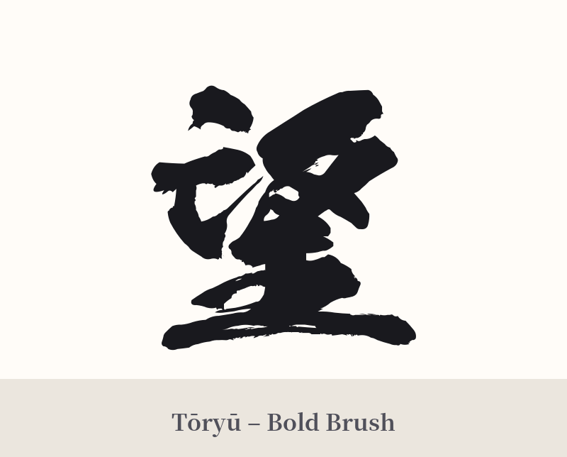
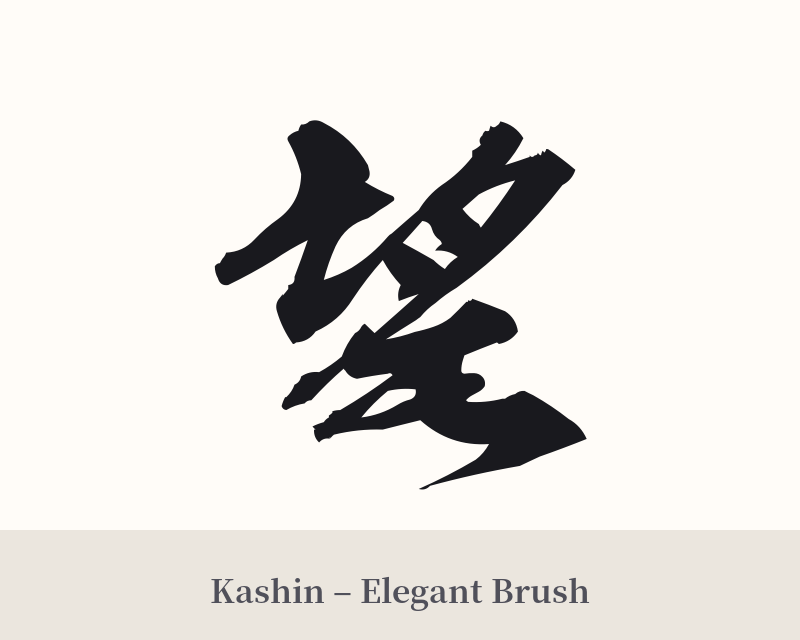
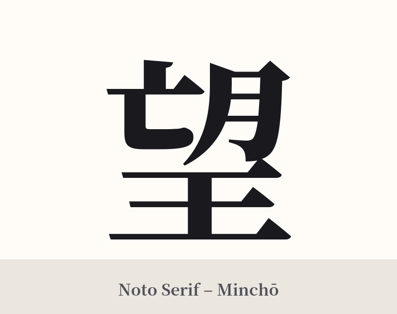
🖌️ Font Styles for 望
The same kanji can look dramatically different depending on the calligraphy style. Choose a font that matches the mood you want for your tattoo or design.
🎨 Tattoo Suitability
📐 Tattoo Design Guide
The kanji 望 offers a balanced and elegant form that works well for various tattoo designs. Its meaning is personal yet universal, making it suitable for many placements.
– Placement Suggestions: For a single character, consider the inner forearm, the back of the neck just below the hairline, the ribs, or the calf. These areas provide a clean canvas that allows the character to stand on its own.
– Font Style Recommendations: The style can dramatically change the feel. A strong, clear `Kaisho` (block script) emphasizes the determination within hope. A more fluid `Gyōsho` (semi-cursive script) can capture the personal, flowing nature of a wish. For a classic, refined look, a `Mincho` style with its serif-like details is an excellent choice.
– Visual Tips: While 望 is powerful enough to stand alone, a subtle design element can enhance its meaning. A delicate crescent or full moon nearby, or a simple horizon line below the character, can pay homage to its etymological roots of gazing at the moon. However, be careful not to overcrowd the design; the kanji itself should remain the focal point.
Comments