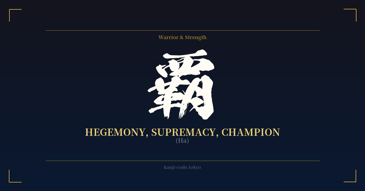
✍️ 覇 (Ha) — Cultural Context
The kanji 覇 (Ha) is one of the most potent symbols of power in the Japanese language. It doesn't just mean 'strength' or 'victory'; it signifies absolute supremacy, the kind of overwhelming dominance that defines a champion or establishes a hegemon. This is not the quiet strength of resilience, but the roaring power of a conqueror who stands uncontested at the top.
Historically, this character is deeply tied to the concept of the 覇王 (Haō), or 'Supreme Ruler.' This title was often used for powerful warlords who ruled by force and ambition, most famously in the context of China's historical 'Five Hegemons.' In Japan, it evokes figures like Oda Nobunaga, whose ambition was to unify the nation under his absolute rule. The Haō is a figure who carves their own destiny and imposes their will upon the world, for better or worse.
The character's visual construction hints at its profound meaning. While its ancient origins are complex, the modern form contains radicals that can be interpreted to support its meaning. The top part, 西, is often associated with the west, but in this context, it's part of a larger structure that implies covering or overwhelming. The bottom components, 月 (moon) and 革 (leather, revolution), contribute to a sense of dramatic change and power that eclipses all others.
In modern Japan, 覇 is frequently used in the context of competition. A sports team that achieves 連覇 (renpa) has won consecutive championships, utterly dominating their league. The word 制覇 (seiha) means 'conquest' or 'to conquer,' used for everything from winning a video game tournament to a company dominating a market. This demonstrates the kanji's core idea: not just to participate, but to overwhelm and reign supreme.
However, this unyielding ambition comes with a darker side. The word 覇権 (haken), meaning 'hegemony,' carries political and military connotations of a nation imposing its power on others. Therefore, 覇 embodies a duality: it is the symbol of the celebrated champion, but also of the feared dictator. It represents a power that is not given but taken, making it a statement of immense ambition and self-belief.
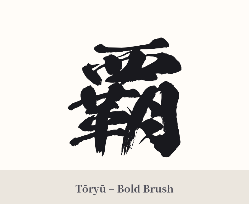
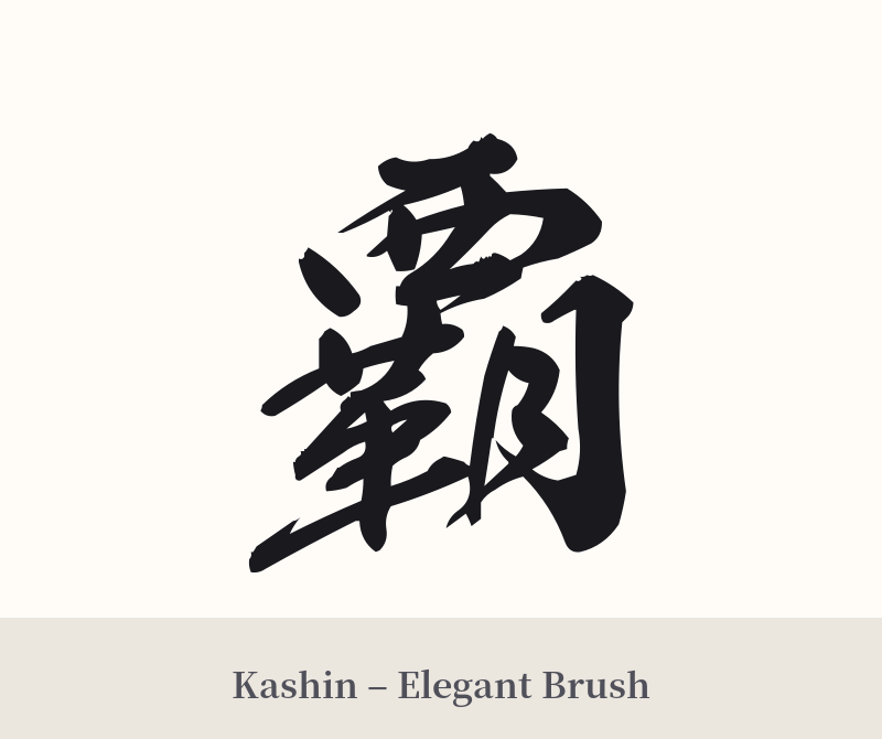
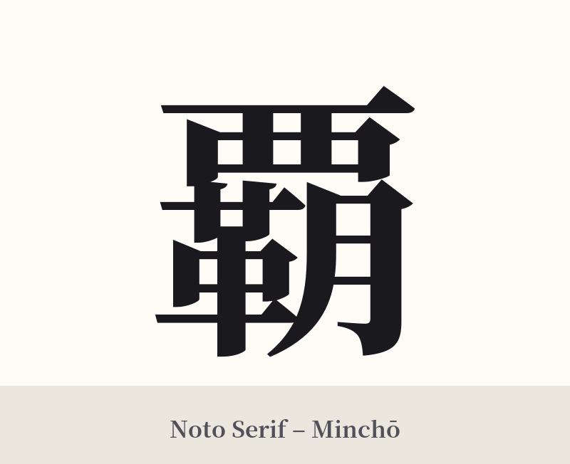
🖌️ Font Styles for 覇
The same kanji can look dramatically different depending on the calligraphy style. Choose a font that matches the mood you want for your tattoo or design.
🎨 Tattoo Suitability
📐 Tattoo Design Guide
Due to its complexity and powerful message, the design and placement for 覇 are crucial.
– Placement: This kanji demands space. Its 19 intricate strokes can become a blur if tattooed too small. Opt for larger, flatter areas of the body like the back, chest, or a full forearm or calf. This allows the artist to render each stroke with clarity and impact.
– Style: A bold, semi-cursive calligraphy style (Gyōsho) is an excellent choice, as it conveys a sense of dynamic, unstoppable energy. For a more rigid and authoritative feel, a sharp, well-defined block script (Kaisho) works well. Avoid overly thin or delicate styles, as they would contradict the kanji's inherent power.
– Visuals: 覇 is a statement piece that stands strongly on its own. Adding other elements can risk cluttering the design and diluting its message. If you do pair it with something, consider minimalist concepts like a single, bold brushstroke (ensō) behind it or a subtle background texture that doesn't compete for attention.
Comments