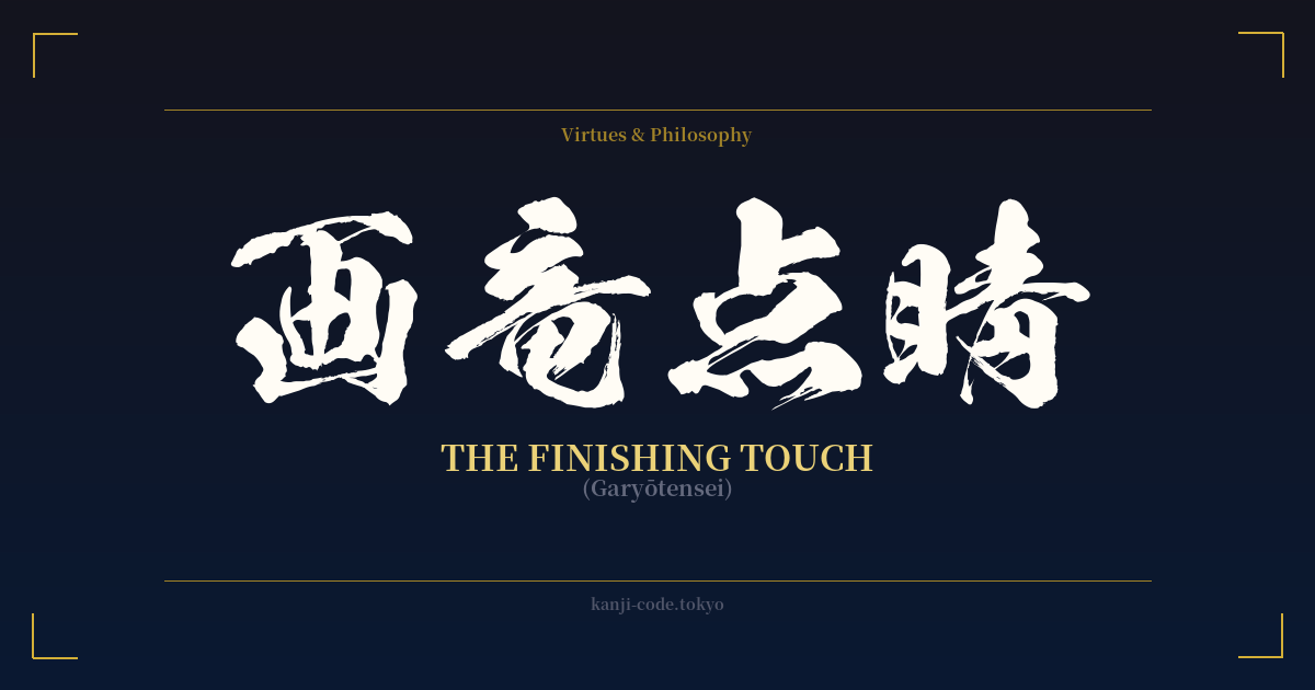
✍️ 画竜点睛 (Garyōtensei) — Cultural Context
画竜点睛 (Garyōtensei) is a four-character Japanese idiom, known as a Yojijukugo, that translates literally to "painting a dragon, dotting the pupil." While the literal meaning is clear, its true power lies in the ancient Chinese legend from which it originates, a story that elevates it to a profound metaphor for the importance of the finishing touch.
The tale centers on a renowned painter named Zhang Sengyou who lived in China during the Liang Dynasty. He was commissioned to paint four large dragons on the walls of a temple. Upon completion, the dragons were magnificent and lifelike in every detail, yet Zhang had conspicuously left their eyes blank.
When onlookers and the temple's patrons asked why he hadn't finished the paintings, Zhang calmly explained, "If I paint the eyes, the dragons will come to life and fly away." The crowd, skeptical and amused, dismissed his words as the boast of an arrogant artist. They urged him to complete the work, insistent on seeing the final product.
Bowing to the pressure, Zhang picked up his brush. He dipped it in ink and, with a precise motion, dotted the pupils into the eyes of two of the four dragons. In an instant, the air filled with the sound of thunder and the flash of lightning. The two dragons with eyes now painted writhed on the wall, broke free from the plaster, and soared into the stormy sky, disappearing from sight. The other two dragons, their eyes still blank, remained as inert paintings on the wall.
From this powerful legend, 画竜点睛 came to mean much more than just painting a dragon's eye. It signifies the final, crucial element that completes a work, giving it life, soul, and value. It's the masterstroke, the tiny detail that makes all the difference between something that is merely good and something that is truly great.
In modern Japan, the expression is used in various contexts, from art and literature to business and even cuisine. A chef might add a single sprig of garnish that perfects a dish—that is their garyōtensei. A writer might find the one perfect word to end a poem, bringing the entire piece into focus. It’s a celebration of the idea that sometimes, the smallest action has the greatest impact, transforming the whole.
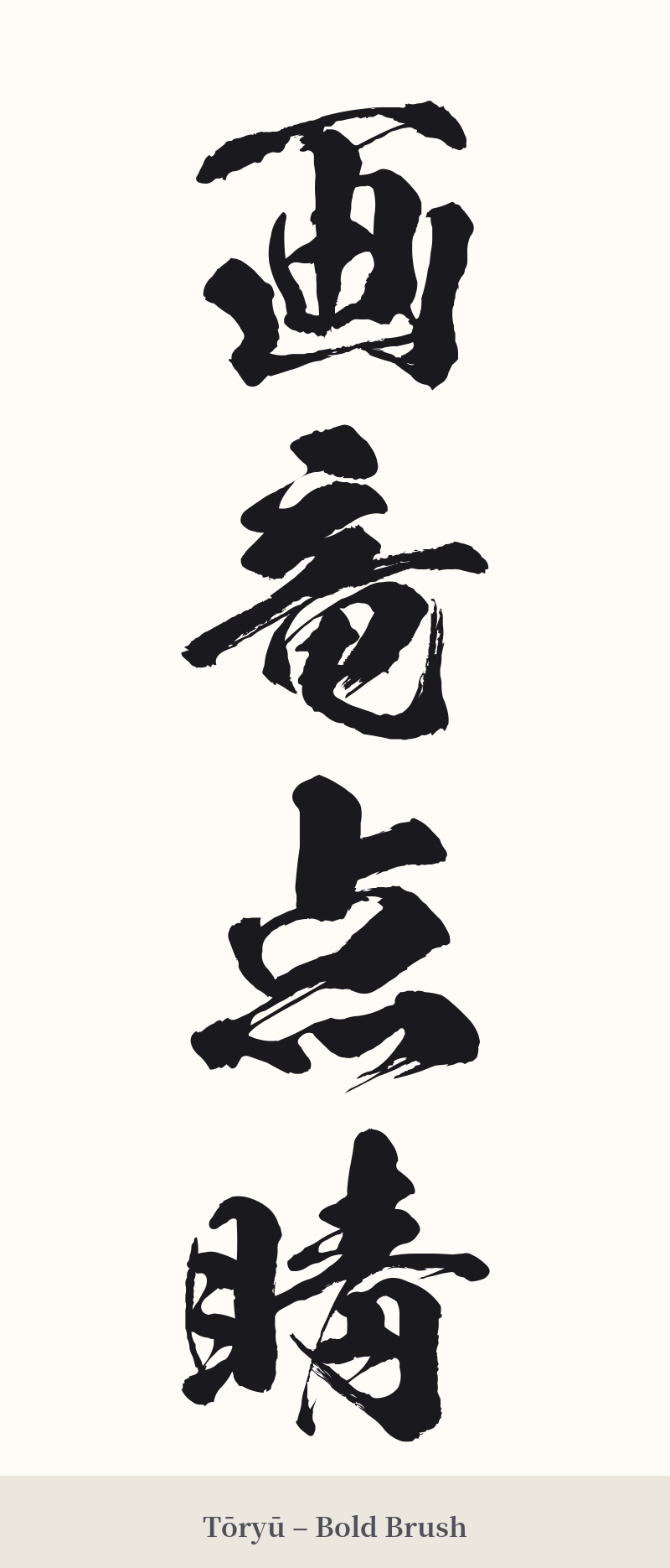
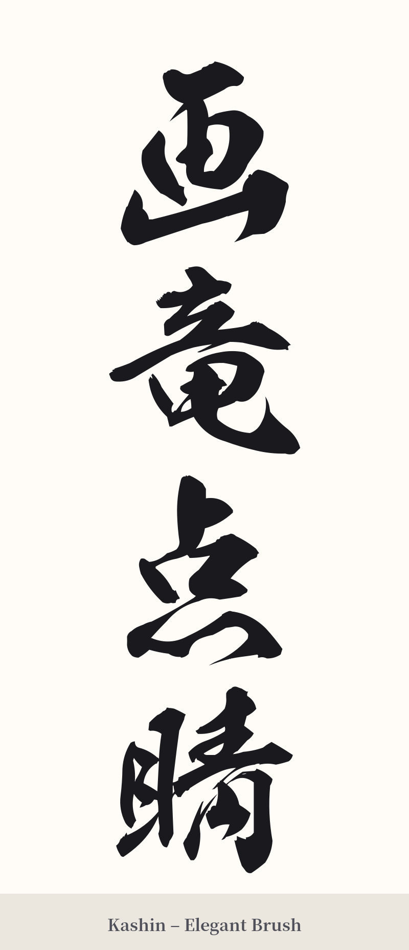
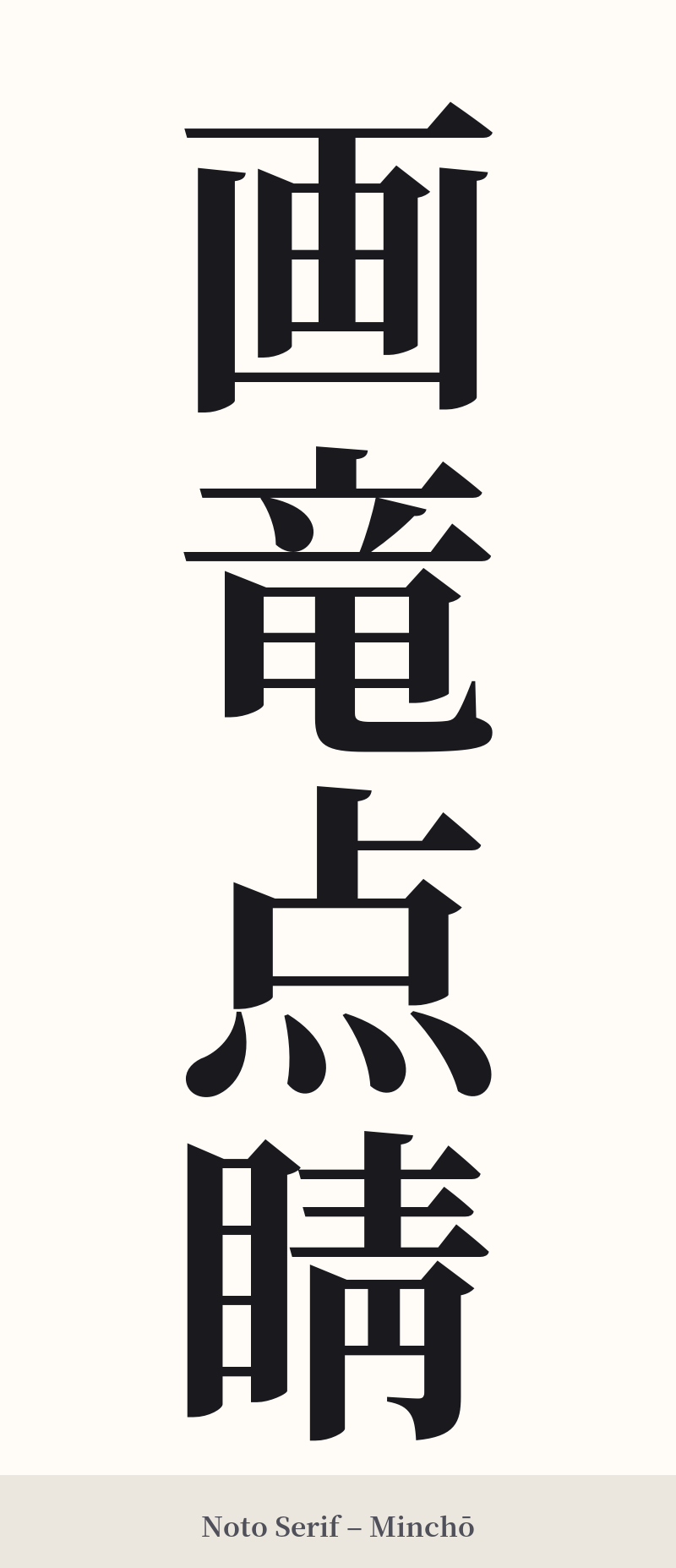
🖌️ Font Styles for 画竜点睛
The same kanji can look dramatically different depending on the calligraphy style. Choose a font that matches the mood you want for your tattoo or design.
🎨 Tattoo Suitability
📐 Tattoo Design Guide
The four-character nature of 画竜点睛 lends itself to strong, balanced compositions.
– Placement: Vertical alignment is the most traditional and visually striking way to present a Yojijukugo. This looks powerful running down the forearm, the calf, or along the spine. A horizontal arrangement can also work well across the upper back, chest, or collarbone.
– Style: A standard block script (Kaishotai) will emphasize the detail and complexity of each character, offering clarity and a sense of authority. For a more fluid and artistic feel that mirrors the idiom's meaning, a semi-cursive style (Gyōshotai) is an excellent choice. A full cursive script (Sōsho) may be too abstract and risk obscuring the individual characters.
– Visuals: The kanji themselves are the art. Avoid cluttering the design with too many external elements. If you wish to add a visual cue, consider a single, stylized brushstroke near the calligraphy, or a subtle, abstract representation of a dragon's eye, to honor the story without overwhelming the characters.
Comments