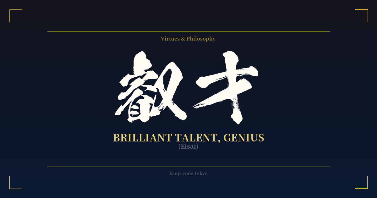
✍️ 叡才 (Eisai) — Cultural Context
While many are familiar with 天才 (tensai) as the go-to Japanese word for 'genius,' 叡才 (Eisai) offers a deeper, more nuanced alternative. It speaks not just of innate ability, but of a profound, insightful, and almost sagely intelligence. This is the genius of perception and wisdom, not just raw talent.
The key to understanding 叡才 lies in its first character, 叡 (EI). This is a rare and powerful kanji, historically associated with imperial wisdom. Its intricate form is a combination of radicals meaning 'eye,' 'ear,' and 'heart,' painting a picture of an intelligence that is all-encompassing. It's the ability to see things clearly, listen deeply, and understand with empathy and clarity. This is not the flashy genius of a prodigy, but the deep-seated wisdom of a philosopher or a visionary leader.
The second character, 才 (SAI), is much simpler and more common, meaning 'talent' or 'ability.' When paired with 叡, it elevates the concept from mere skill to something truly exceptional. 叡才 is the talent that is guided by profound insight. It suggests a person who doesn't just solve problems, but perceives the true nature of things.
In modern Japan, 叡才 is a literary and somewhat archaic term. You won't hear it in everyday conversation, which is part of its appeal for those seeking a unique and thoughtful expression of intellect. While 天才 might describe a brilliant mathematician, 叡才 could be used to describe a strategist who sees patterns no one else does, or a poet who captures the human condition with breathtaking clarity.
Choosing 叡才 over 天才 is a deliberate statement. It signals an appreciation for a quieter, more profound form of brilliance—one that is less about being 'heaven-gifted' (the literal meaning of 天才) and more about cultivated, deep-seeing wisdom. It represents an aspiration not just to be smart, but to be wise.
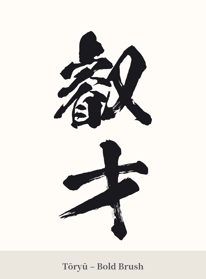
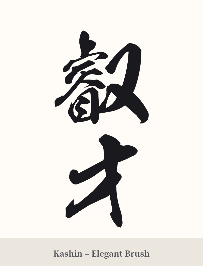
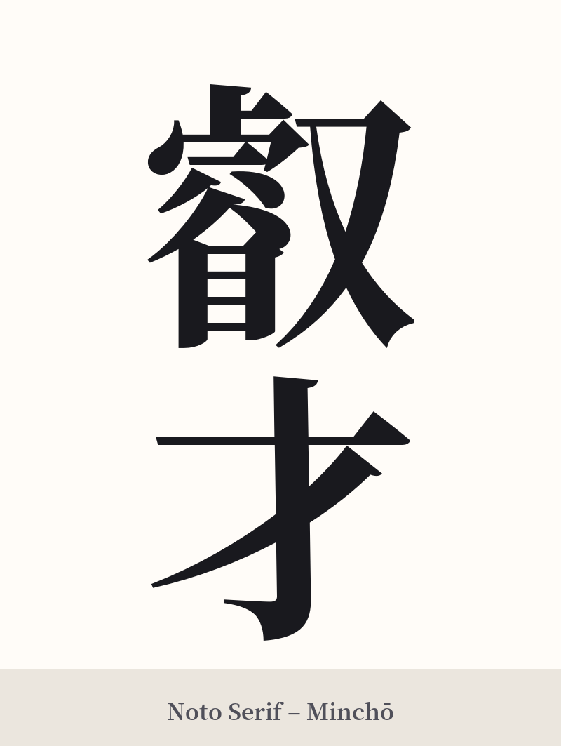
🖌️ Font Styles for 叡才
The same kanji can look dramatically different depending on the calligraphy style. Choose a font that matches the mood you want for your tattoo or design.
🎨 Tattoo Suitability
📐 Tattoo Design Guide
The primary challenge and opportunity in designing a tattoo for 叡才 is the stark contrast between its two characters. The first, 叡, is a dense 16-stroke character, while the second, 才, is a simple 3-stroke character. This visual imbalance is part of its beauty.
– Placement: Choose a flat, spacious area of the body to ensure the details of 叡 can be rendered clearly. The inner forearm, calf, back, or chest are excellent choices. Avoid small or highly curved areas like the wrist or ankle.
– Size: This is not a word for a small, subtle tattoo. The character 叡 requires significant size to prevent its strokes from blurring together into an ink blot over time. Discuss the minimum viable size with your artist.
– Font Style: A crisp, traditional script is highly recommended. A Kaisho (block) or Mincho (serif) style will provide the clarity needed for legibility. Highly cursive Sōsho or Gyōsho styles are not advised, as they would likely render the 叡 character unrecognizable.
– Orientation: A vertical alignment is classic and works well to highlight the flow from the complex top character to the simple bottom one. This arrangement is common in traditional Japanese calligraphy and will lend your tattoo an authentic feel.
Comments