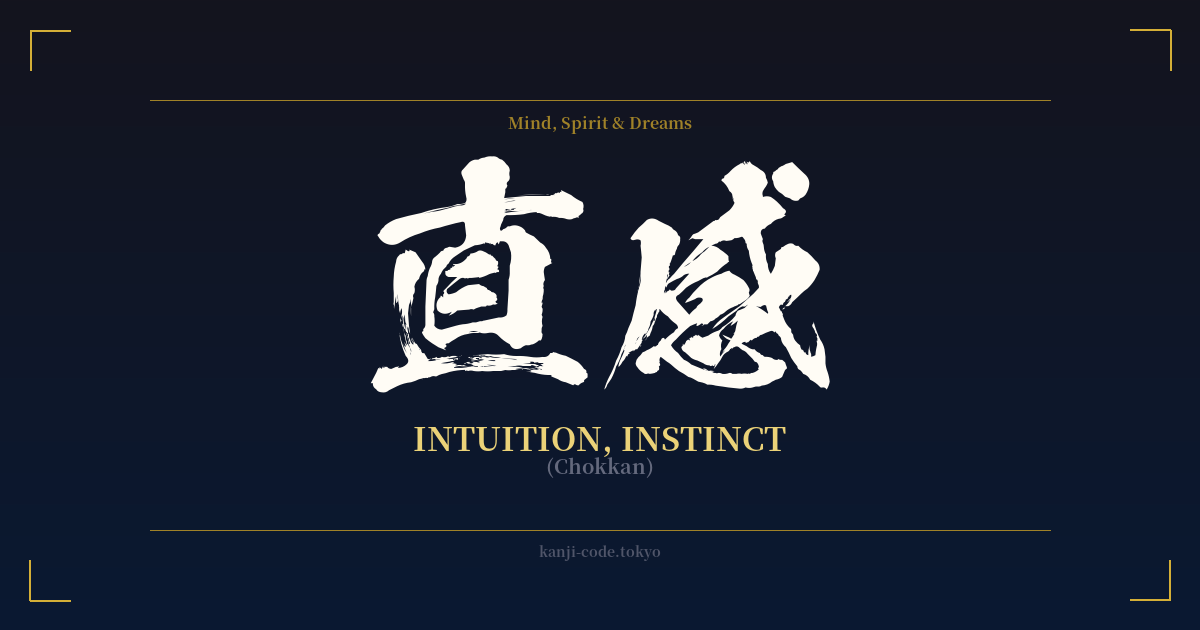
✍️ 直感 (Chokkan) — Cultural Context
直感 (Chokkan) is the Japanese word for intuition, but its essence is captured more precisely in its literal breakdown: 'direct feeling.' This isn't about psychic premonitions or a mystical sixth sense; rather, it refers to the immediate, unfiltered understanding of a situation, person, or problem without the need for conscious, logical reasoning. It’s the gut feeling that guides you, the hunch you can't quite explain but know you should follow.
In Japanese culture, while logic and careful analysis are highly valued, so is the power of Chokkan. It's seen as a vital skill honed through experience. A seasoned business leader might make a crucial decision based on Chokkan, or a master artisan might rely on it to make a perfect cut. The common phrase 「直感が働く」(chokkan ga hataraku) translates to 'my intuition is working,' highlighting its role as an active, useful faculty.
This concept has deep roots in philosophies like Zen Buddhism. The state of 'mushin' (無心), or 'no-mind,' in martial arts and meditation is closely related. It's a state where the practitioner moves and reacts with perfect, instinctual clarity, free from the hesitation of conscious thought. This is Chokkan in its purest form—action and awareness becoming one.
Unlike the English word 'instinct,' which often refers to primal, biological drives, Chokkan operates on a higher, more cognitive level. It's the synthesis of all your past experiences, knowledge, and subtle observations, processed in an instant by your subconscious. It’s the quiet voice that emerges not from a lack of information, but from a wealth of it that you aren't consciously aware of processing.
Therefore, to embrace the idea of Chokkan is to value a different kind of intelligence. It’s an acknowledgment that some truths are felt directly before they are understood intellectually. It represents a trust in one's inner self and the subtle currents of awareness that guide us through life's complexities.
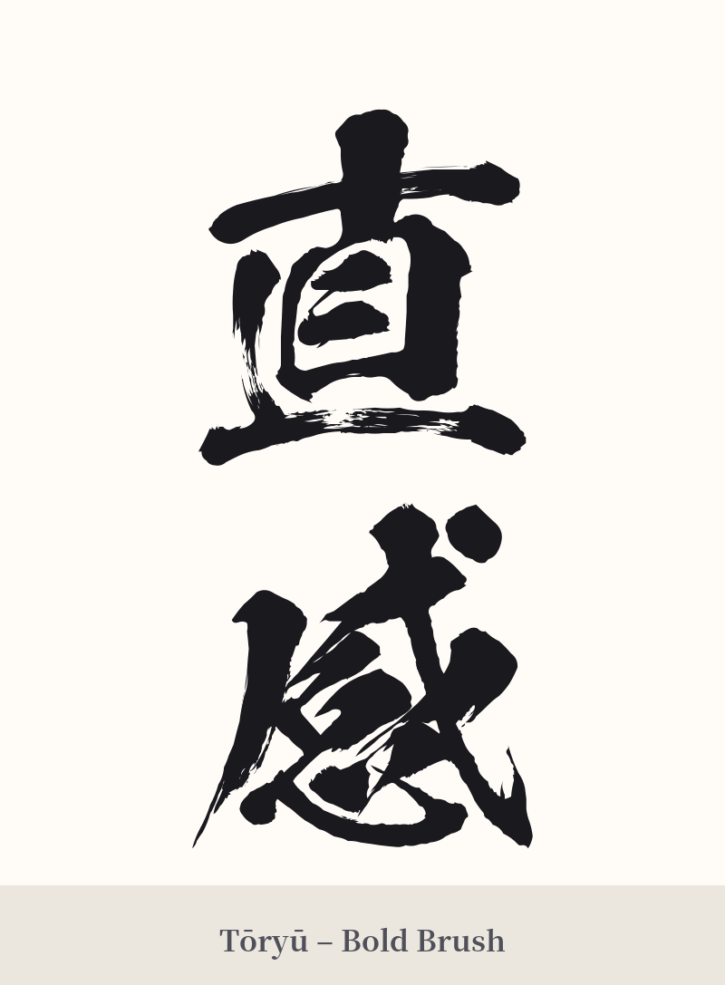
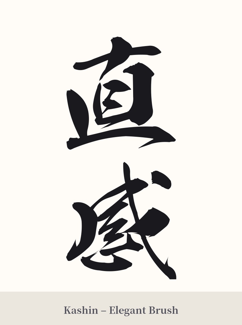
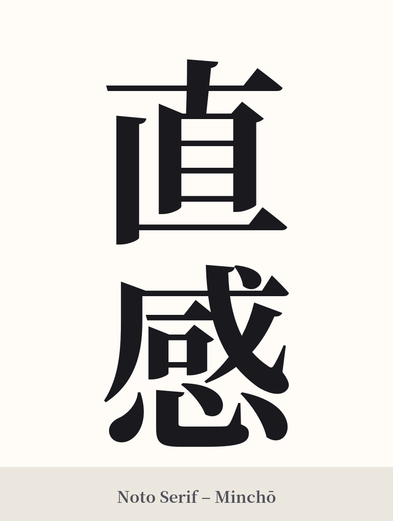
🖌️ Font Styles for 直感
The same kanji can look dramatically different depending on the calligraphy style. Choose a font that matches the mood you want for your tattoo or design.
🎨 Tattoo Suitability
📐 Tattoo Design Guide
直感 offers a beautifully balanced and meaningful design for a tattoo. Its two-character structure allows for versatile placement and styling.
– Placement: A vertical alignment is traditional and works exceptionally well along the spine, forearm, or calf, emphasizing the flow of 'direct feeling.' For a more subtle approach, a horizontal placement on the collarbone, inner bicep, or across the ribs is also very effective.
– Font Style: The choice of script can dramatically alter the feel. A bold, angular Kaisho (block) script can highlight the 'directness' of 直, while a fluid, semi-cursive Gyosho script can emphasize the 'feeling' of 感. Combining these ideas with a skilled artist can create a truly personal piece.
– Visual Tips: Play with the inherent contrast between the two characters. 直 is simple and geometric, while 感 is more detailed and complex. This visual tension is a core part of the word's aesthetic. You could also consider integrating the kanji within an enso circle to symbolize the immediate, complete nature of intuition, or use a watercolor splash effect to evoke the sense of a 'feeling' washing over you.
Comments