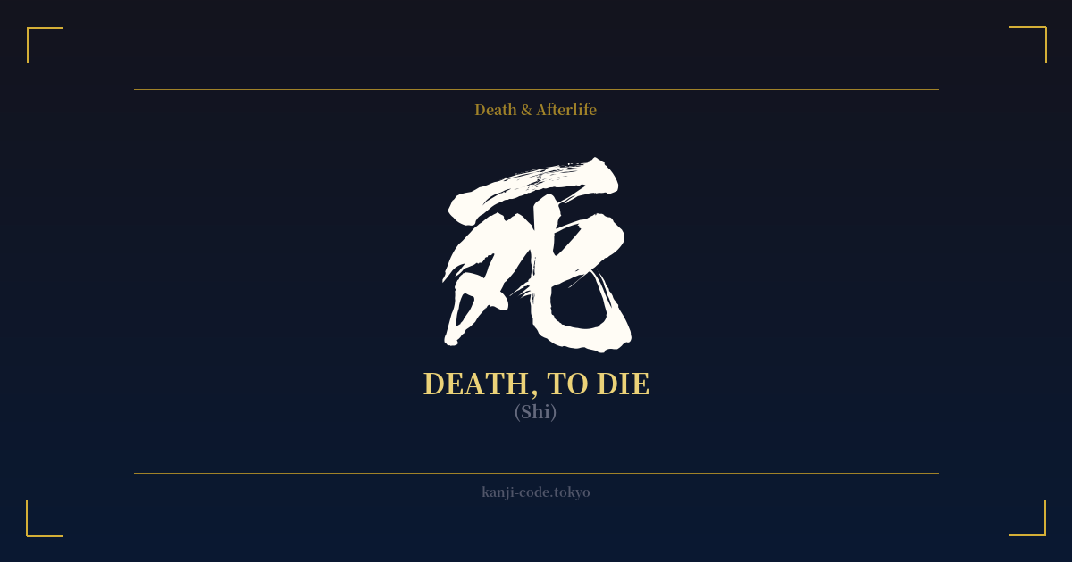
✍️ 死 (Shi) — Cultural Context
The kanji 死 (shi) is one of the most direct and powerful characters in the Japanese language, representing the concept of death. Its origins are graphically illustrative, believed to be a pictograph combining a character for 'bones' or 'decay' (歹) with a depiction of a person kneeling (匕), symbolizing a person next to mortal remains. This stark origin sets the tone for its role in the culture: direct, final, and somber.
In Japan, death is deeply intertwined with concepts of purity and impurity, largely influenced by Shinto beliefs. Death is considered a source of 'kegare' (穢れ), or defilement, which requires purification rituals. This cultural underpinning makes the public or casual display of the character for death highly unusual and unsettling. It is not a symbol to be taken lightly.
This aversion is so strong that it has created a widespread superstition known as tetraphobia. The number four (四) is also pronounced 'shi,' making it a homophone for death. Consequently, the number four is avoided throughout society. Hospitals and hotels often skip the fourth floor, and products are not sold in sets of four. The kanji 死 itself is rarely used for decoration or in any context that isn't strictly necessary and clinical, like on a death certificate (死亡届, shibō todoke).
However, this cultural taboo does not mean that Japanese culture ignores death. On the contrary, it is explored with great depth and sensitivity in art, literature, and philosophy. The Buddhist concept of 'mono no aware' (物の哀れ), the gentle sadness and pathos of ephemeral things, finds its ultimate expression in the acceptance of mortality, often symbolized by the fleeting beauty of cherry blossoms (sakura). The samurai code of Bushido emphasized a readiness to face death at any moment as a way to live a life free of fear.
Yet, these philosophical explorations are distinct from using the raw character 死 as a standalone statement. While a Westerner might see it as a 'memento mori'—a reminder to live life to the fullest—this interpretation does not readily translate. In its native context, 死 is less a philosophical prompt and more a stark, literal, and ominous signifier of the end. It lacks the poetry of 'sakura' or the stoicism of 'Bushido'; it is simply, and powerfully, death.
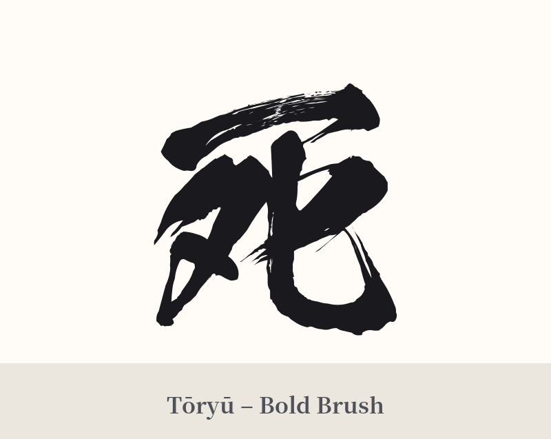
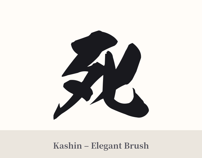
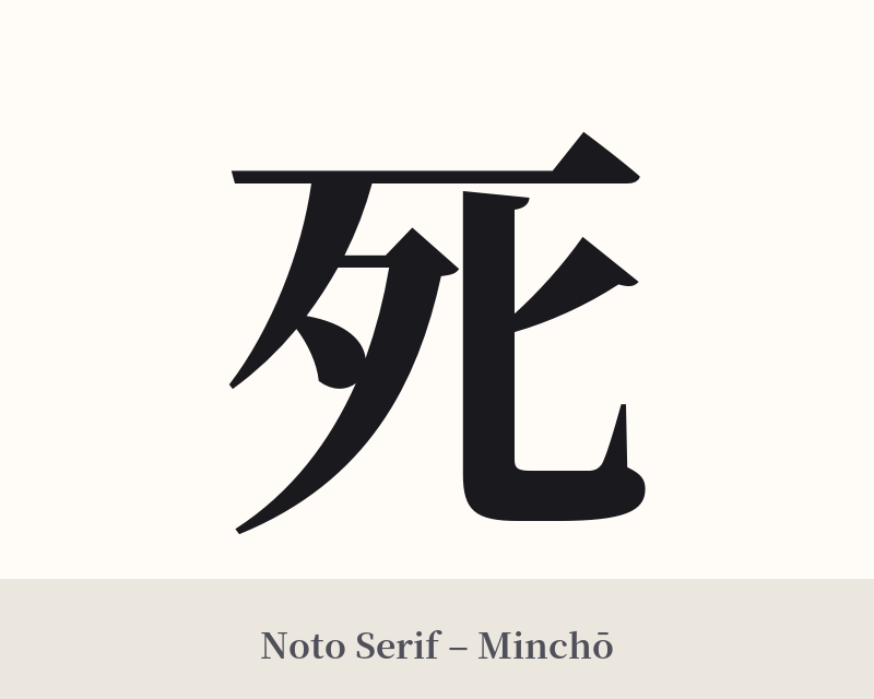
🖌️ Font Styles for 死
The same kanji can look dramatically different depending on the calligraphy style. Choose a font that matches the mood you want for your tattoo or design.
🎨 Tattoo Suitability
📐 Tattoo Design Guide
If you are set on this powerful and controversial character, the design should match its gravity. Its simplicity allows for a variety of stylistic interpretations, but the core message remains intense.
– Placement: This is not a subtle tattoo. Common placements that lean into its boldness include the forearm, the back of the neck, or a large piece on the back or chest. For a more personal statement, the ribs or inner bicep keep it more concealed.
– Font Style: A dynamic, semi-cursive or 'scratchy' calligraphy (shodo) style can emphasize the raw, emotional nature of the concept. Conversely, a clean, sharp, geometric font like Mincho or a blocky Gothic style can give it a cold, modern, and final feel.
– Visual Tips: This kanji is almost always done in solid black ink to maintain its starkness. Adding color is very unusual and may detract from its power. Some people choose to pair it with a contrasting symbol to create a narrative, such as a lotus flower (rebirth), a koi fish (perseverance), or cherry blossoms (impermanence). Be aware that while this adds layers of meaning for the wearer, it does not erase the primary, negative connotation of the character itself in Japanese culture.
Comments