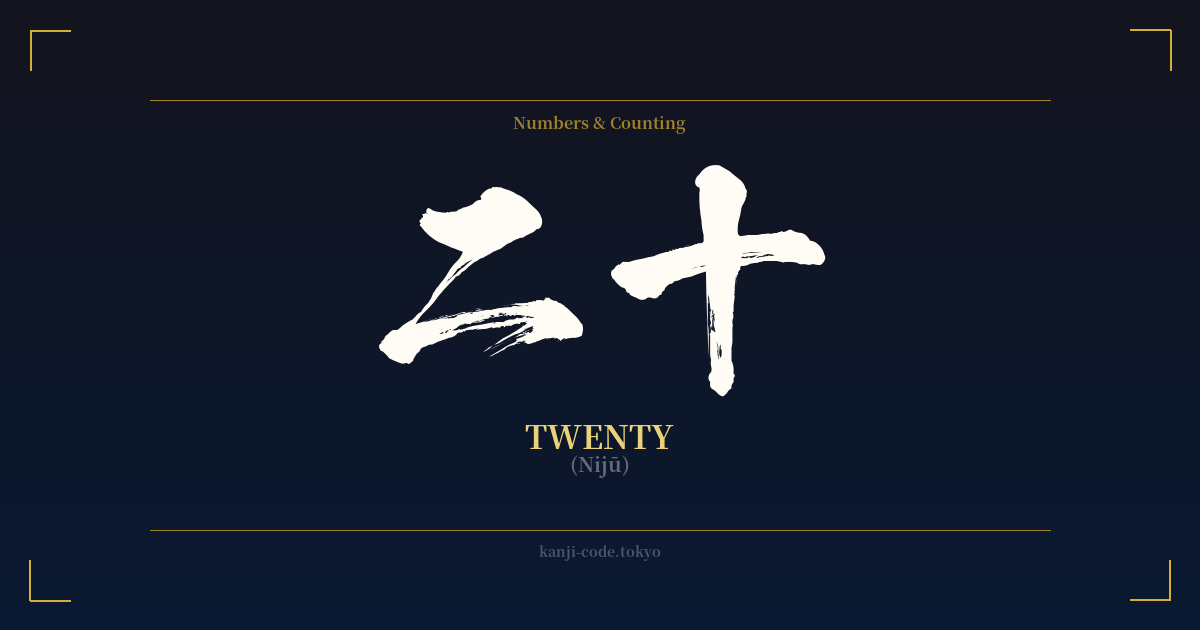
✍️ 二十 (Nijū) — Cultural Context
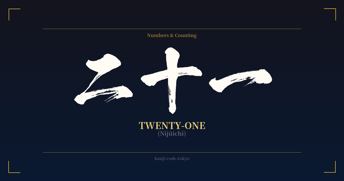
The kanji 二十 (Nijū) is the Japanese word for the number twenty. Its construction is a perfect example of the logical and systematic nature of Japanese numerals. It combines the character for 'two', 二 (ni), with the character for 'ten', 十 (jū). This structure literally means 'two tens', a straightforward multiplication that forms the basis for counting in larger numbers across East Asian languages.
While the number itself is simple, its cultural significance in Japan is immense, primarily tied to the age of twenty. In Japan, turning twenty years old, known as 二十歳 (hatachi), marks the official transition into adulthood. This milestone is celebrated nationally on the second Monday of January during a public holiday called 成人の日 (Seijin no Hi), or Coming of Age Day.
On this day, new adults participate in local ceremonies, often held at city offices or community centers. Young women traditionally dress in elaborate, long-sleeved kimonos called furisode, while men typically wear formal Western suits or traditional hakama. The ceremonies involve speeches from local dignitaries reminding the new adults of their civic duties, rights, and responsibilities, which now include the right to vote, drink alcohol, and smoke tobacco.
Beyond this major rite of passage, the number twenty appears in other cultural contexts. For example, the 二十四節気 (Nijūshi Sekki) are the 24 solar terms of the traditional East Asian lunisolar calendar. These terms, such as 'Start of Spring' (立春, Risshun) and 'Winter Solstice' (冬至, Tōji), divide the year into 24 distinct periods, guiding agriculture, festivals, and daily life for centuries. This shows how numbers are woven into the very fabric of nature and time in Japanese tradition.
There is also an older, single-character version of twenty, 廿. While still recognized, it is now considered archaic for general use and is mostly seen in historical texts, artistic contexts, or as a stylistic choice. In modern Japanese, 二十 is the standard and universally understood way to write 'twenty'.
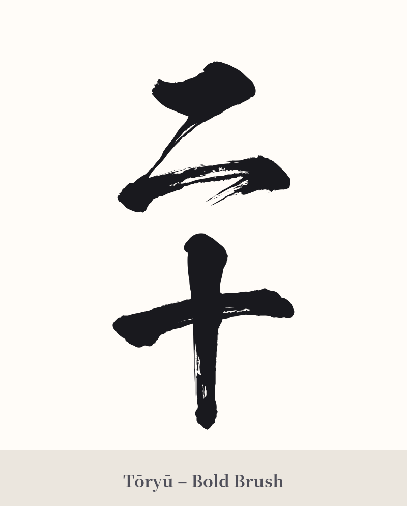
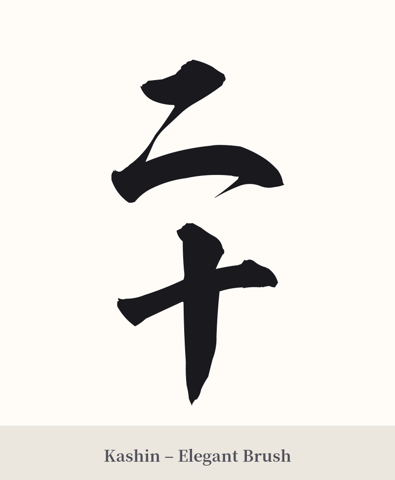
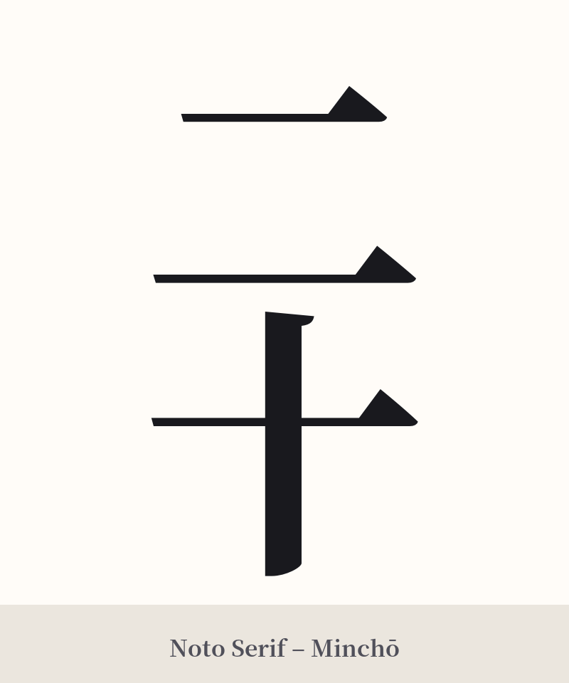
🖌️ Font Styles for 二十
The same kanji can look dramatically different depending on the calligraphy style. Choose a font that matches the mood you want for your tattoo or design.
🎨 Tattoo Suitability
📐 Tattoo Design Guide
The beauty of 二十 lies in its stark simplicity. Its clean, geometric forms lend themselves well to a minimalist aesthetic.
– Placement: Due to its small size, it works exceptionally well in discreet locations. Consider the inner wrist, behind the ear, on an ankle, or vertically along a finger. It can also be integrated into a larger piece as part of a significant date or number sequence.
– Font Style: A crisp, modern block font like Mincho or Gothic will emphasize its straightforward nature. For a more artistic and traditional feel, a flowing calligraphy style (shodō) like Gyosho (semi-cursive) can add a touch of elegance to the simple strokes.
– Visual Tips: A vertical orientation is common and aesthetically pleasing in Japanese writing. The two characters stack neatly on top of each other, creating a balanced and compact design. Avoid overly ornate styles that could obscure the characters' simple forms.
Comments