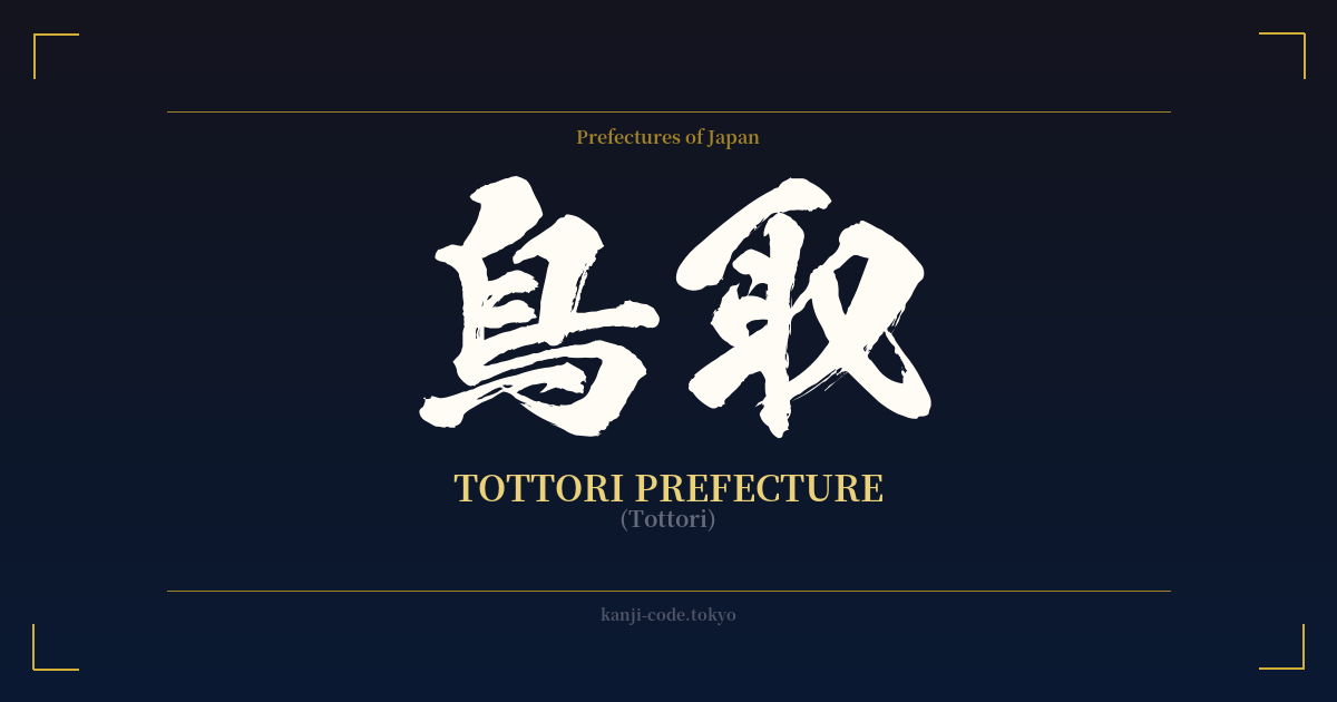
✍️ 鳥取 (Tottori) — Cultural Context
The name 鳥取 (Tottori) paints a vivid picture rooted in ancient Japanese history, literally translating to 'bird-catching' or 'to take a bird.' This name isn't just a poetic descriptor; it's a direct reference to the region's historical role. The characters are 鳥 (tori), meaning 'bird,' and 取 (tori), meaning 'to take' or 'to fetch.'
Historically, the name is believed to originate from the 'Totoribe,' a clan or guild of people living in the area during the Kofun and Asuka periods (roughly 300-710 AD). Their specialized occupation, assigned by the Yamato imperial court, was to capture and supply waterfowl from the region's many ponds and lakes for food and falconry. The name of their profession became synonymous with the land itself, a testament to the deep connection between people, their labor, and their environment.
Today, Tottori Prefecture honors this natural heritage, though in a different way. It is Japan's least populous prefecture, a fact that contributes to its image as a tranquil, unspoiled corner of the country. Its most famous landmark is the Tottori Sand Dunes (鳥取砂丘, Tottori Sakyū), a vast, desert-like landscape stretching along the coast of the Sea of Japan. This unique geological feature creates a sense of profound scale and solitude, a far cry from the bustling metropolises of Tokyo or Osaka. The name 鳥取, therefore, evokes not just its ancient past but also this modern identity of vast, open nature and quiet serenity.
Beyond its natural landscapes, Tottori has a unique place in modern pop culture. It is the home prefecture of manga artist Shigeru Mizuki, the creator of the beloved series 'GeGeGe no Kitarō.' His hometown of Sakaiminato is now a living tribute to his work, with streets lined with over 170 bronze statues of the yōkai (supernatural spirits) from his stories. This blend of ancient folklore, natural beauty, and modern creativity gives the word 'Tottori' a layered significance for those familiar with its culture.
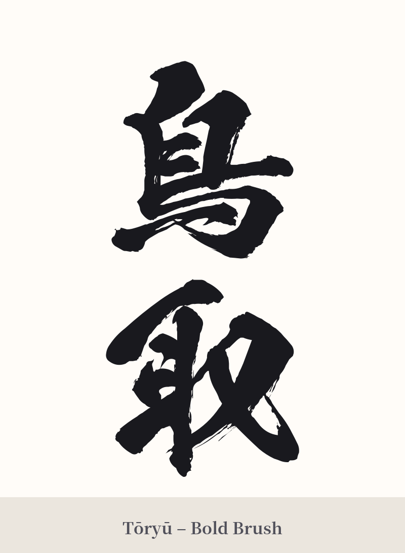
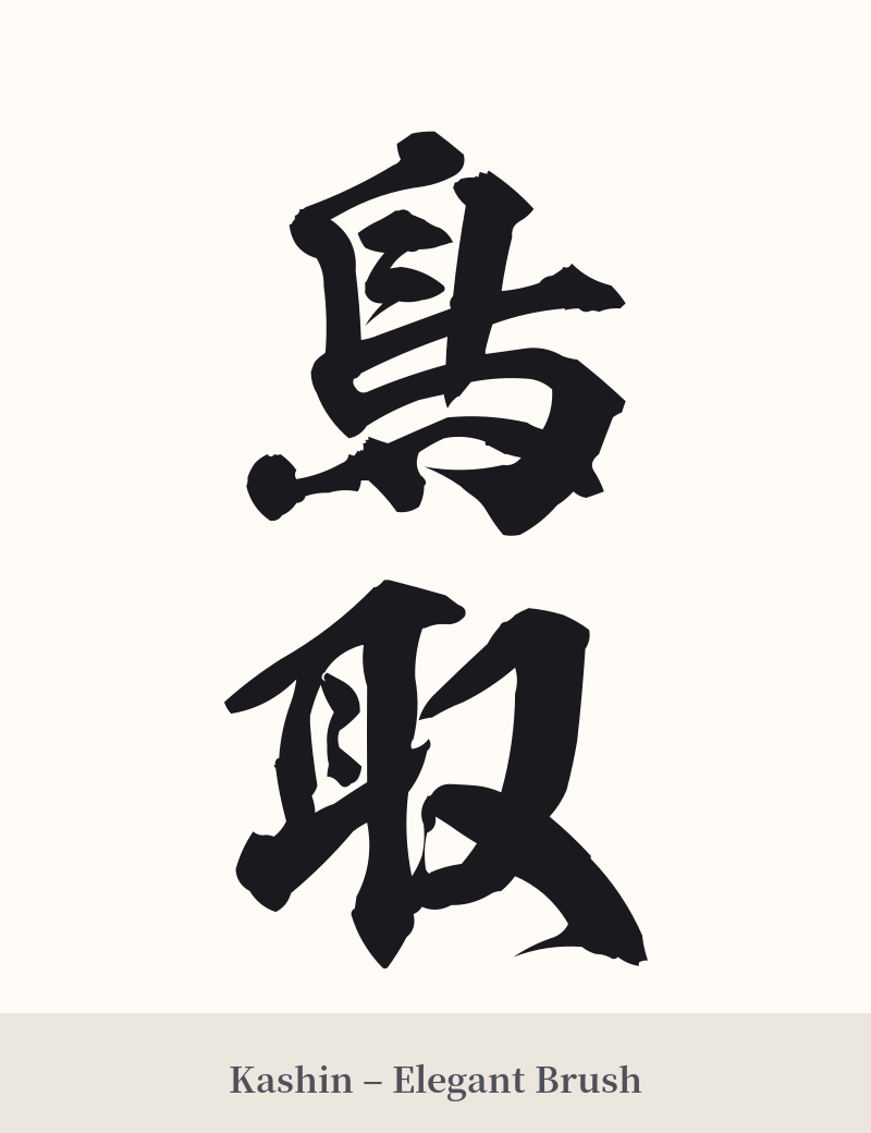
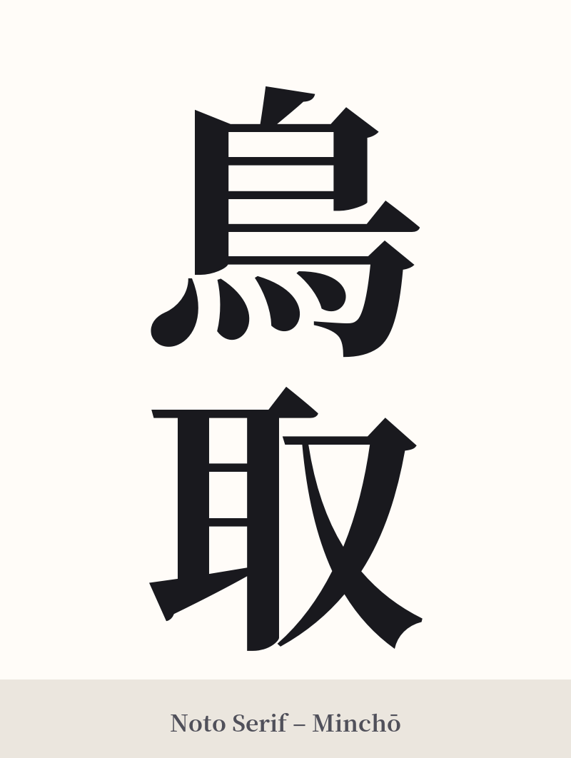
🖌️ Font Styles for 鳥取
The same kanji can look dramatically different depending on the calligraphy style. Choose a font that matches the mood you want for your tattoo or design.
🎨 Tattoo Suitability
📐 Tattoo Design Guide
For a 'Tottori' tattoo, the design should reflect its natural and historical essence. Given it's a two-character compound, horizontal placement often works best.
– Placement: Consider the forearm, the upper back across the shoulder blades, or the calf. These areas provide a good canvas for the horizontal flow of the characters. – Font Style: A semi-cursive (gyōsho) or cursive (sōsho) script can evoke the feeling of wind sweeping across the sand dunes or the flight of birds. For a more grounded and solid feel, a standard block script (kaisho) connects to the land's history and stability. – Visual Tips: To add personal context, consider incorporating minimalist imagery alongside the kanji. A few stylized lines suggesting sand dunes, a simple wave pattern representing the Sea of Japan, or the silhouette of a bird could beautifully complement the characters without overpowering them.
Comments