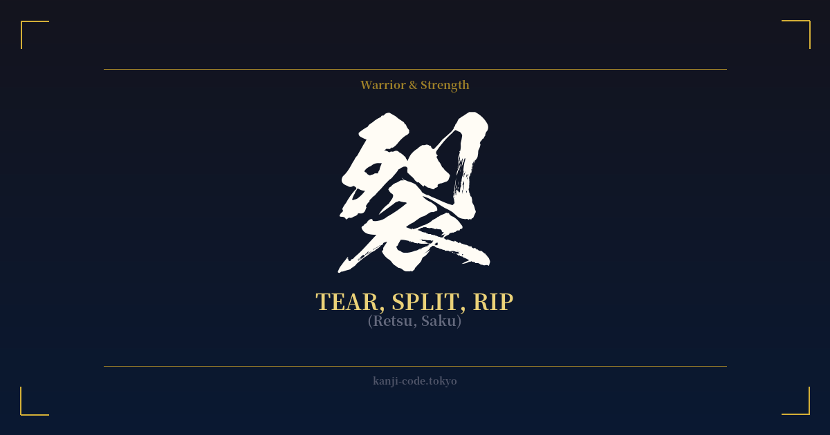
✍️ 裂 (Retsu, Saku) — Cultural Context
The kanji 裂 (retsu, saku) is a character of raw, physical force. Its meaning is visceral and immediate: to tear, to rip, to split apart. The visual construction of the character itself tells this story. It is composed of the radical 衣 (koromo), meaning 'clothing' or 'garment,' on the left, and 列 (retsu), meaning 'a row' or 'line,' on the right. Together, they create a vivid image of fabric being forcefully torn along a seam or line.
In its most literal sense, 裂 describes a physical action. You can use it to describe tearing paper (紙を裂く, kami o saku), ripping cloth, or the ground splitting open during an earthquake (地面が裂ける, jimen ga sakeru). This raw, physical power gives the character an aggressive and untamed energy. It is not the clean, precise action of a sword, which is represented by 切 (kiru, 'to cut'), but rather a more ragged and violent sundering.
This connection to violence makes 裂 a common feature in martial or combative language. A deep gash or laceration from a weapon is a 裂傷 (resshō). The character evokes the brutal reality of a battle—the sound of banners ripping in the wind, armor being rent, and flesh being torn. It’s the force that doesn't just defeat an opponent, but tears them asunder. This is not the noble spirit of a samurai, but the unbridled ferocity of a berserker.
Beyond the physical, 裂 carries powerful metaphorical weight. It can signify a deep and often irreparable division. The word 分裂 (bunretsu) means 'split' or 'division,' and can refer to anything from a political party fracturing to cellular division. A more dramatic usage is in 決裂 (ketsuretsu), which describes the complete breakdown or rupture of negotiations or a relationship. It implies a split so severe that reconciliation is impossible.
Historically, the term 精神分裂病 (seishin bunretsu byō) was used for schizophrenia, literally 'spirit-split-disease,' highlighting the character's use to describe a fracturing of the mind or soul. While this medical term is now outdated in Japan due to its stigma, its existence underscores the kanji's association with profound and painful separation. Choosing 裂 is to embrace a concept of breaking, division, and unstoppable force, whether for liberation or destruction.
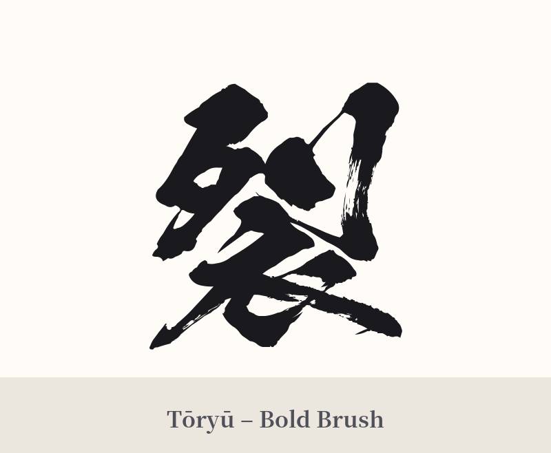
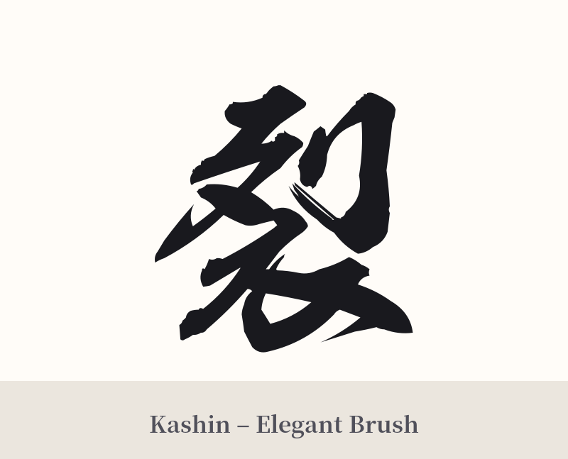
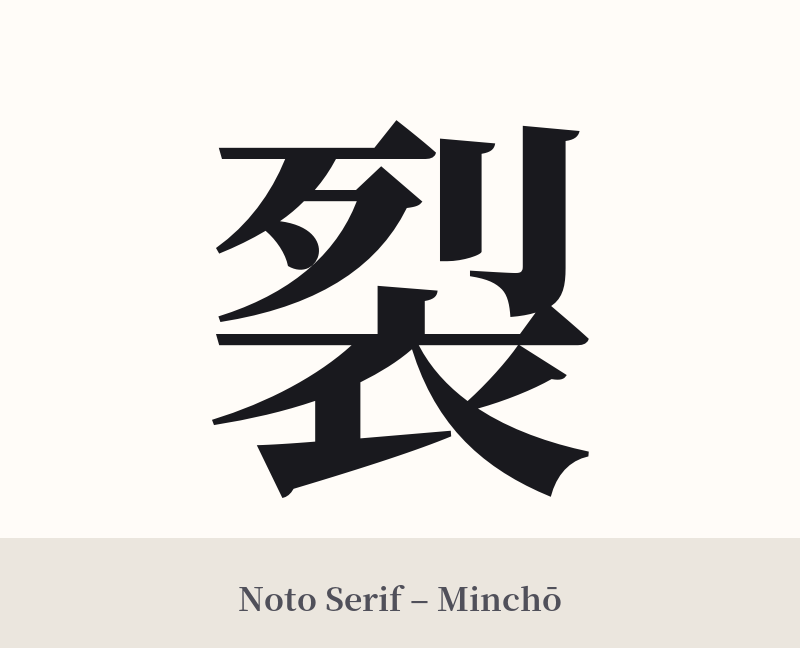
🖌️ Font Styles for 裂
The same kanji can look dramatically different depending on the calligraphy style. Choose a font that matches the mood you want for your tattoo or design.
🎨 Tattoo Suitability
📐 Tattoo Design Guide
The kanji 裂 carries an aggressive and forceful energy, and its design should reflect that. It's not a character for delicate or subtle styles.
– Font Style: Opt for bold, dynamic calligraphy. A rough, semi-cursive Gyosho or a wild, abstract Sosho style would capture the feeling of tearing. Look for styles that incorporate 'kasure' (かすれ), a scratchy, dry-brush effect that makes the ink look like it was applied with immense force and speed. Avoid clean, geometric, or print-like fonts like Mincho, as they clash with the kanji's raw nature.
– Placement: This is a strong standalone character. Place it where it can make an impact, such as the forearm, calf, upper back, or shoulder blade. Its vertical structure lends itself well to limbs, creating a sense of downward, tearing motion.
– Visual Elements: Consider integrating the kanji with imagery that enhances its meaning. It could be depicted as tearing through a background texture, or have abstract ink splashes radiating from it to suggest an explosion of energy. A touch of red ink, used sparingly, could symbolize passion, pain, or the violence of the act itself, but be cautious not to make it look overly graphic.
Comments