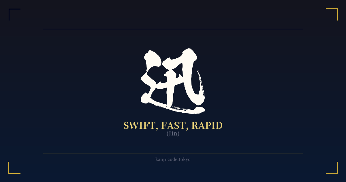
✍️ 迅 (Jin) — Cultural Context
The kanji 迅 (jin) encapsulates the essence of swiftness, a concept deeply admired in Japanese culture. It’s a character that doesn't just mean 'fast'; it evokes a sense of sudden, decisive, and almost piercing speed. Its very structure tells a story of motion. The character is composed of the radical ⻌ (shinnyō), which depicts a road or movement, and 十 (jū), which, in this context, is thought to derive from a pictograph of a needle, implying something sharp, penetrating, and quick.
This idea of swiftness is a cornerstone of the martial arts ethos. In disciplines like kenjutsu (the art of the sword) and iaijutsu (the art of drawing the sword), speed is not merely about moving quickly. It's about efficiency, precision, and eliminating all wasted motion. A samurai's draw had to be 'jin,' a single, fluid action from stillness to strike, faster than the eye could follow. The kanji 迅 perfectly captures this ideal of instantaneous, effective action.
Beyond the dojo, this appreciation for swiftness permeates Japanese aesthetics. Think of the calligrapher's brush moving with controlled velocity to create a line that is both powerful and graceful. Or consider the haiku, where a fleeting moment is captured with rapid, concise language. 迅 represents the beauty in that fleeting moment, the power of an action completed before one has time to fully process it.
In modern Japan, 迅 is found in compound words that emphasize urgency and speed, such as 迅速 (jinsoku), meaning 'rapid' or 'prompt.' It also appears in names, often for boys, like Hayato or Jin, imbuing the individual with the qualities of agility and quick-wittedness. As a standalone symbol, 迅 is less about the mundane speed of a car and more about the sublime speed of a falcon diving, a thought materializing, or a warrior's decisive blow. It represents a potent, almost primal form of quickness that is both respected and revered.
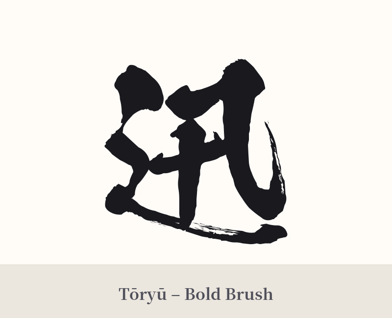
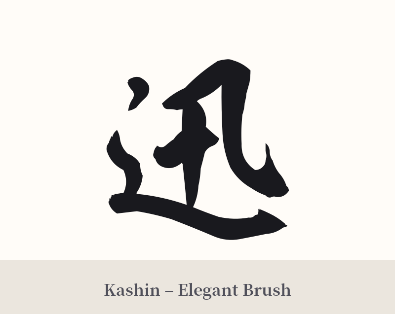
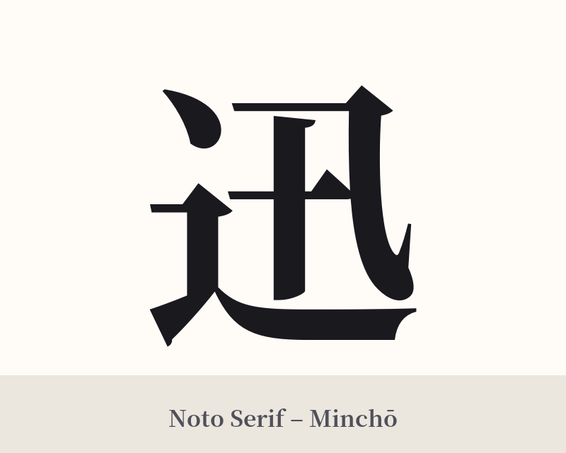
🖌️ Font Styles for 迅
The same kanji can look dramatically different depending on the calligraphy style. Choose a font that matches the mood you want for your tattoo or design.
🎨 Tattoo Suitability
📐 Tattoo Design Guide
The kanji 迅 offers fantastic design possibilities due to its dynamic nature. Its association with movement makes it versatile for various placements on the body.
– Placement: Consider areas that suggest motion or follow the lines of the body, such as the forearm, the calf, along the ribs, or on the shoulder blade. These placements allow the character to 'flow' with your own movements.
– Font Style: The choice of calligraphy can dramatically alter the feel of the tattoo. – A crisp, angular Kaisho (block) script can emphasize the precision and sharpness of the swiftness. – A flowing Gyōsho (semi-cursive) script can capture the fluid, unstoppable nature of motion. – A bold, expressive Sōsho (cursive) or a custom brushstroke style can make the kanji look like it was painted in a single, rapid gesture, embodying its very meaning.
– Visual Tips: To further enhance the theme, consider integrating the kanji with other elements. A few 'wind bars' trailing the character can amplify the sense of speed. A splash of ink, as if from a fast-moving brush, can also create a powerful and artistic effect.
Comments