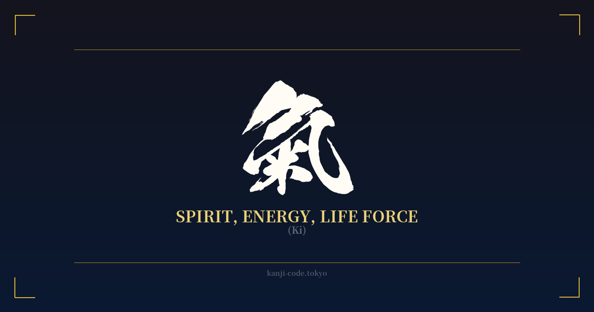
✍️ 氣 (Ki) — Cultural Context
The kanji 氣, read as 'Ki,' is one of the most fundamental and profound characters in Japanese and East Asian culture. It represents the unseen, flowing life force or energy that permeates everything in the universe. More than just a word, Ki is a cornerstone of philosophy, medicine, martial arts, and daily life.
The character's origin provides a beautiful visual metaphor. 氣 is a composite of two parts: the outer radical 气, meaning 'steam' or 'vapor,' and the inner radical 米, meaning 'rice.' The image is one of steam rising from cooking rice, symbolizing the essential, life-sustaining energy derived from nourishment. This elegantly connects the physical act of eating with the creation of intangible, spiritual energy.
In Japanese philosophy and spirituality, Ki is the vital essence that animates the body and mind. A person with strong Ki is described as 'genki' (元気), meaning healthy, vibrant, and full of energy. A lack of Ki, on the other hand, is associated with illness, fatigue, and low spirits. This concept is central to practices like Reiki (霊気), a form of spiritual healing that involves channeling this universal energy.
The influence of Ki is perhaps most famously seen in martial arts. In Aikidō (合気道), the 'Way of Harmonizing with Ki,' practitioners learn to blend with an opponent's energy rather than meeting it with brute force. The concept of 'kiai' (気合), a focused shout or battle cry, is not just about intimidation; it's a physical manifestation of one's concentrated spirit and energy, meant to overwhelm an adversary.
It is crucial to distinguish this traditional form, 氣, from its modern, simplified counterpart, 気. After World War II, Japan simplified many complex kanji for easier literacy. While 気 is used in everyday writing, the older form 氣 is often preferred for artistic, spiritual, and traditional contexts, including calligraphy and tattoos. Its intricate design is seen as carrying more historical weight and aesthetic beauty, better reflecting the profound concept it represents.
🖌️ Font Styles for 氣
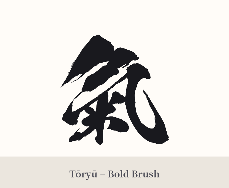
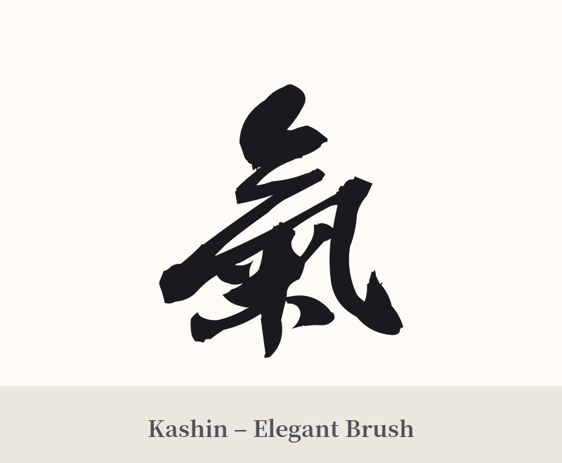
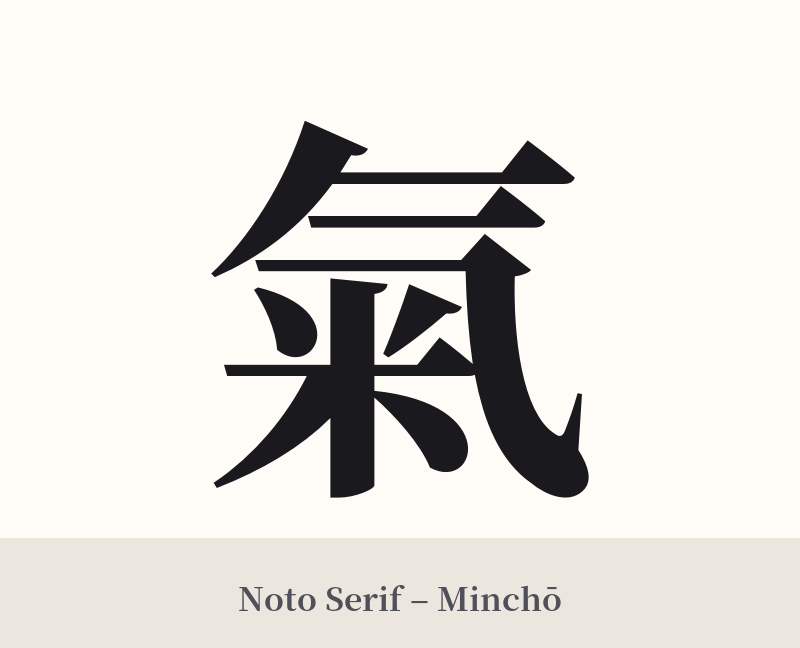
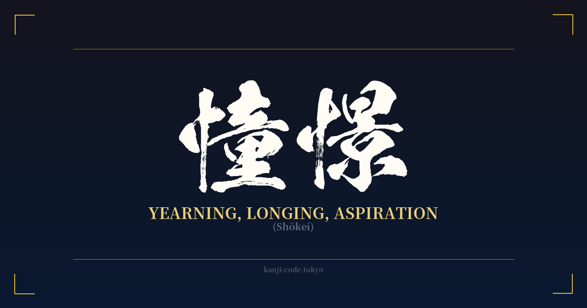
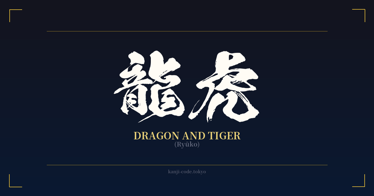
The same kanji can look dramatically different depending on the calligraphy style. Choose a font that matches the mood you want for your tattoo or design.
🎨 Tattoo Suitability
📐 Tattoo Design Guide
The traditional form of Ki, 氣, is visually rich and works best in designs where its details can be appreciated.
– Placement: Consider areas like the back, chest, or forearm. These larger, flatter surfaces allow the artist to render the ten strokes clearly without the risk of them blurring together over time.
– Style: A bold, calligraphic style is highly recommended. A 'Kaisho' (block script) style will emphasize its structure and balance, while a 'Gyosho' (semi-cursive) style can add a sense of flow and movement, visually echoing the concept of energy.
– Pairing: While 氣 stands powerfully on its own, it can be integrated into larger designs. Consider placing it within an 'Ensō' (a hand-drawn circle from Zen Buddhism) to symbolize the universe and the cyclical nature of energy. It can also be complemented by natural elements like wind bars, flowing water, or a lotus flower to enhance its spiritual meaning.
Comments