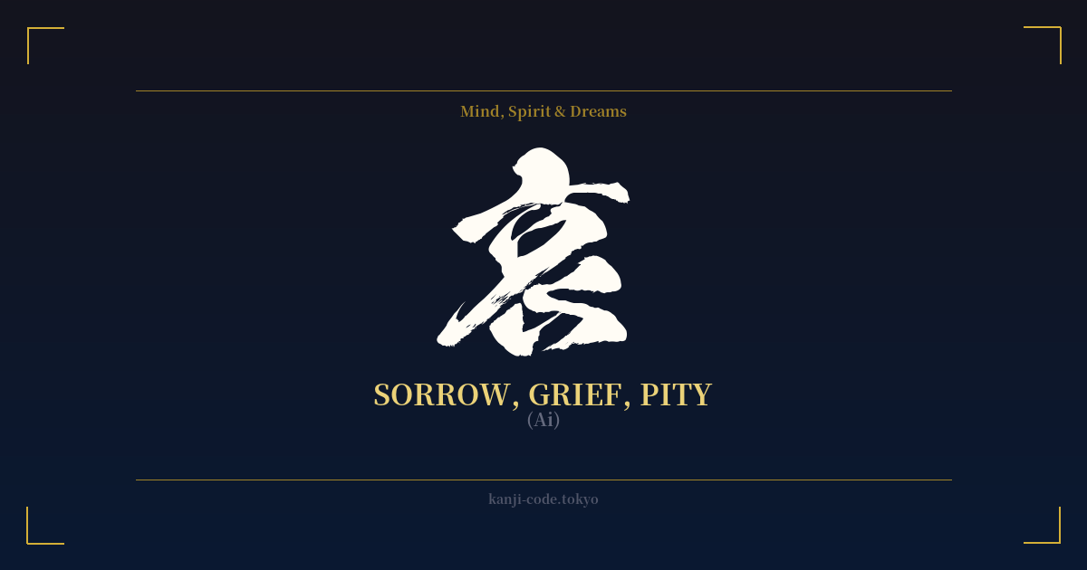
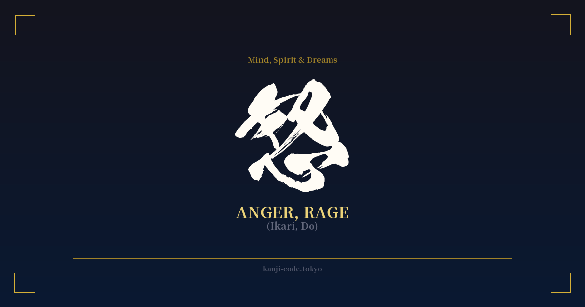
✍️ 哀 (Ai) — Cultural Context
The kanji 哀 (ai) delves into one of the most fundamental human emotions: sorrow. But its meaning in Japanese culture is far more nuanced than simple sadness. It encompasses a spectrum from heart-wrenching grief to a gentle, poetic melancholy.
The character’s origin offers a poignant image. It's a combination of 口 (kuchi), meaning 'mouth,' and 衣 (koromo), meaning 'clothing.' Together, they evoke a person wailing with their face buried in their sleeves—a powerful and universal depiction of grief.
This character is central to the key Japanese aesthetic concept of 'mono no aware' (物の哀れ). Often translated as 'the pathos of things,' it's a deep, gentle sensitivity to the transience of life. It’s the bittersweet feeling of watching cherry blossoms fall, knowing their beauty is fleeting. It’s the quiet sadness in an old folk song or the melancholy of a fading sunset. This isn't a crushing sadness, but a beautiful, empathetic awareness that all things, including joy and beauty, are temporary. This concept is a cornerstone of Japanese literature, art, and philosophy, famously explored in classics like 'The Tale of Genji.'
Beyond this aesthetic sense, 哀 also represents more direct forms of sadness. The word 哀しみ (kanashimi) means sorrow or grief in a very personal way. The term 哀れ (aware) can mean pity or compassion, the sorrow you feel for another's plight. It's the feeling that compels one to help someone who is suffering.
Words like 哀愁 (aishū) capture a specific feeling of melancholy or wistful sorrow, often tinged with nostalgia. In this way, 哀 is not just an emotion but a lens through which to view the world with empathy, depth, and an appreciation for the fragile beauty of existence. It acknowledges that sorrow is not just an endpoint, but a part of the human experience that connects us to each other and to the world around us.
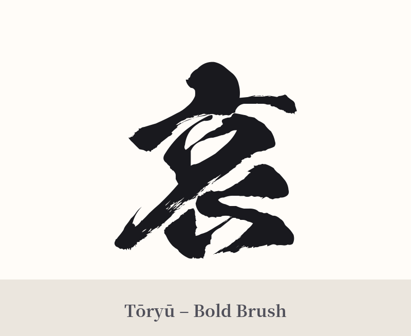
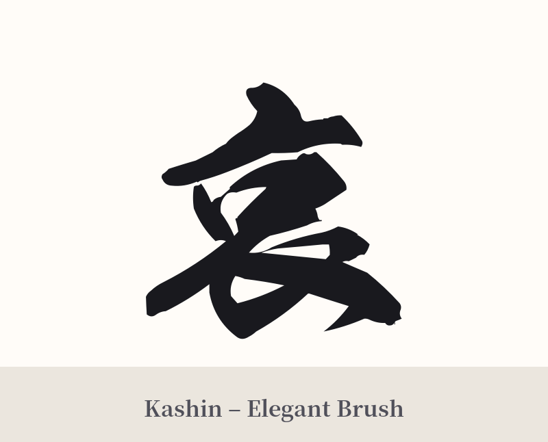
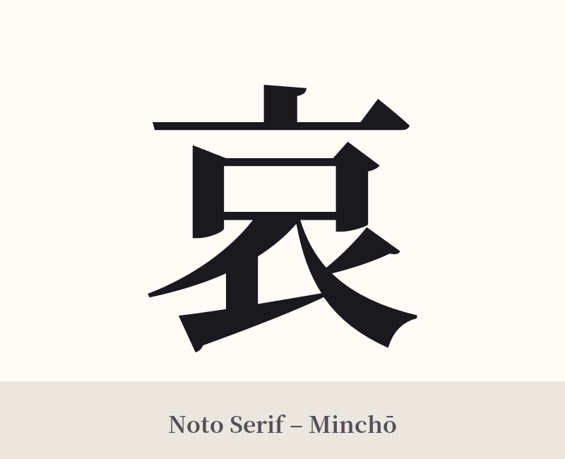
🖌️ Font Styles for 哀
The same kanji can look dramatically different depending on the calligraphy style. Choose a font that matches the mood you want for your tattoo or design.
🎨 Tattoo Suitability
📐 Tattoo Design Guide
Due to its deeply personal and somber nature, a tattoo of 哀 is often best suited for a more private and discreet placement.
– Placement: Consider intimate spots like the inner wrist, behind the ear, on the ribs, or over the heart. These locations reflect the introspective quality of the kanji.
– Font Style: The choice of font can dramatically alter the feeling. A flowing, semi-cursive style (Gyosho) can evoke the gentle melancholy of 'mono no aware.' A stark, blocky script (Kaisho) can represent the unyielding reality of grief.
– Visual Elements: Pairing 哀 with other symbols can deepen its meaning. A single falling sakura petal can emphasize transience, while imagery of rain (雨) or a crescent moon (月) can enhance the melancholic mood. Avoid overly aggressive or dark imagery, which could make the design feel melodramatic.
Comments