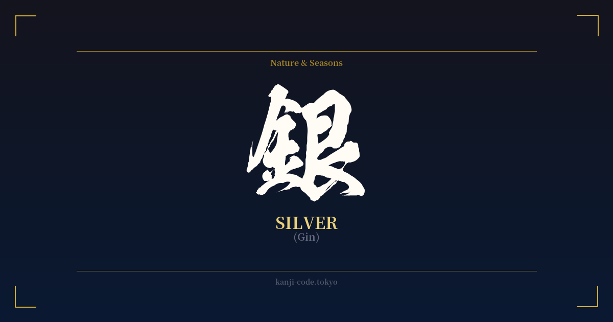
✍️ 銀 (Gin) — Cultural Context
The kanji 銀 (gin) is more than just the word for a precious metal; it's a symbol deeply woven into the fabric of Japanese culture, representing coolness, modernity, and a specific kind of understated elegance.
Structurally, the character itself tells a story. It is composed of two parts: the radical 金 (kin) on the left, which means 'gold' or 'metal,' and the element 艮 (gon) on the right, which provides the phonetic sound. This combination beautifully illustrates its identity as a precious metal, distinct from, yet related to, gold.
Historically, silver played a pivotal role in Japan's economy and its interactions with the world. During the 16th and 17th centuries, the Iwami Ginzan Silver Mine (a UNESCO World Heritage site) was one of the world's most productive, with its high-quality silver being a major export. This wealth funded powerful daimyo (feudal lords) and facilitated trade with countries like China and Portugal. The famous Tokyo district, Ginza (銀座), literally translates to 'Silver Mint,' a name originating from the Edo period when the official silver coin mint was established there.
Culturally, silver holds a different aesthetic space than gold. While gold (金) often represents opulence, warmth, and divine authority, silver embodies a cooler, more modern, and sophisticated beauty. It is associated with the moon's gentle light, the crispness of winter, and a sleek, refined style. This aligns with the Japanese aesthetic of shibui—a subtle, unobtrusive beauty that is elegant without being flashy. Silver is not loud; it is confident in its quiet value.
This symbolism extends into modern language and pop culture. The term 'silver generation' refers to senior citizens, acknowledging their value and experience. In the popular anime and manga series Gintama (銀魂), the title, meaning 'Silver Soul,' evokes the spirit of the samurai in a new, slightly tarnished, yet resilient modern age. From ancient currency to futuristic design, 銀 captures a sense of enduring, refined value.
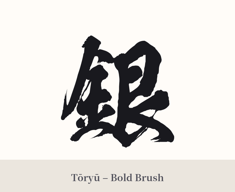
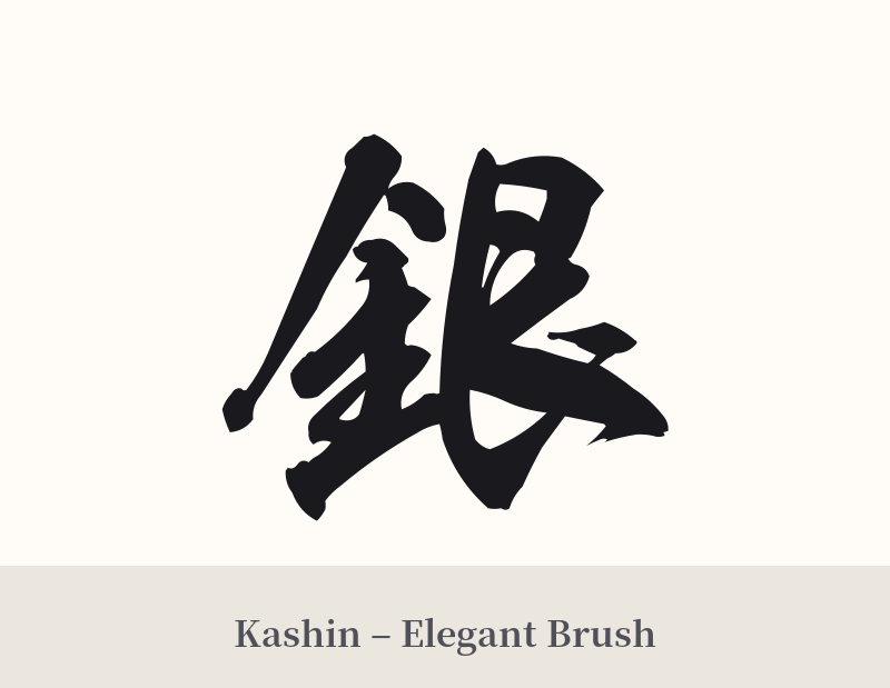
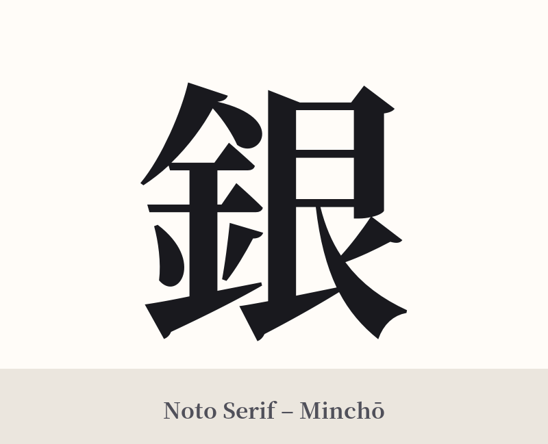
🖌️ Font Styles for 銀
The same kanji can look dramatically different depending on the calligraphy style. Choose a font that matches the mood you want for your tattoo or design.
🎨 Tattoo Suitability
📐 Tattoo Design Guide
The character 銀 is versatile and visually striking, making it a great candidate for a tattoo. Its balance of straight and curved lines works well in various styles.
– Placement: A single character like 銀 is well-suited for placements like the inner forearm, the back of the neck just below the hairline, the wrist, or the calf. These locations allow the character to be displayed clearly and elegantly.
– Style Suggestions: For a traditional and fluid feel, consider a semi-cursive (gyōsho) or fully cursive (sōsho) calligraphy style. For a sharper, more modern, or architectural look, a standard block script (kaisho) or a serif-style Mincho font is an excellent choice.
– Visual Tips: While black ink is traditional and recommended for longevity, the theme of 'silver' invites creativity. You could incorporate subtle grey shading or, for a more literal interpretation, discuss using actual grey or silver-toned ink with your artist, though be aware of how these inks age. The character pairs well with imagery of the moon, water, or bamboo to enhance its cool, elegant symbolism.
Comments